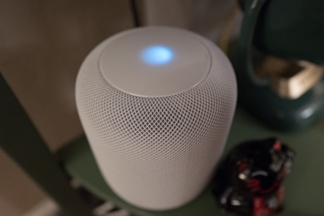
HomePod arrived yesterday at 9:40 a.m. PST; thank-you UPS for prompt delivery of my preorder. The device replaces Google Home, which will be dispatched to a new owner (hopefully), via Craigslist or NextDoor. Perhaps Big G’s assistant would have satisfied more if I lived the Google lifestyle like during my Android and Chromebook days. But I walk the Apple Way today, for better or for worse.
My initial reaction: Wow and uh-oh. The wow harkens back to the original iPod, which Apple released in October 2001. The company’s design ethic treated the overall experience as the user interface: Attach FireWire cable to Mac and device, music syncs. iTunes manages music on the Mac; for iPod, a simple scroll-wheel navigates tracks displayed on a small screen. The uncomplicated and understated approach defied the UX of every other MP3 sold by all other manufacturers. HomePod is a defining, roots-return that’s well-deserving of the portion of name in common with its forebear; both share in common emphasis on music listening as primary benefit.


