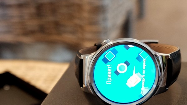
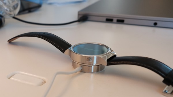
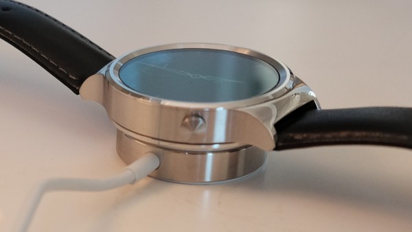
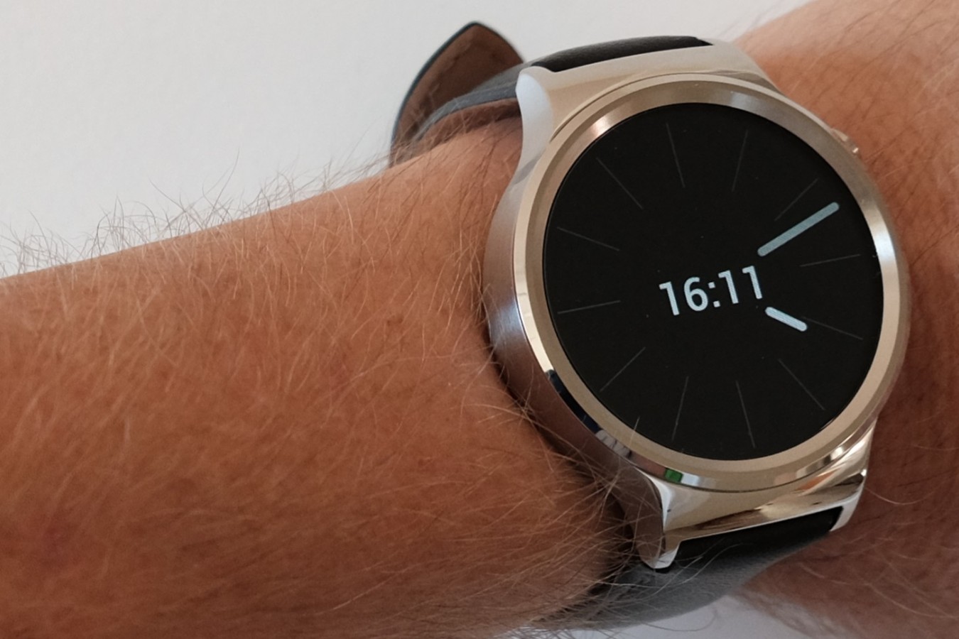
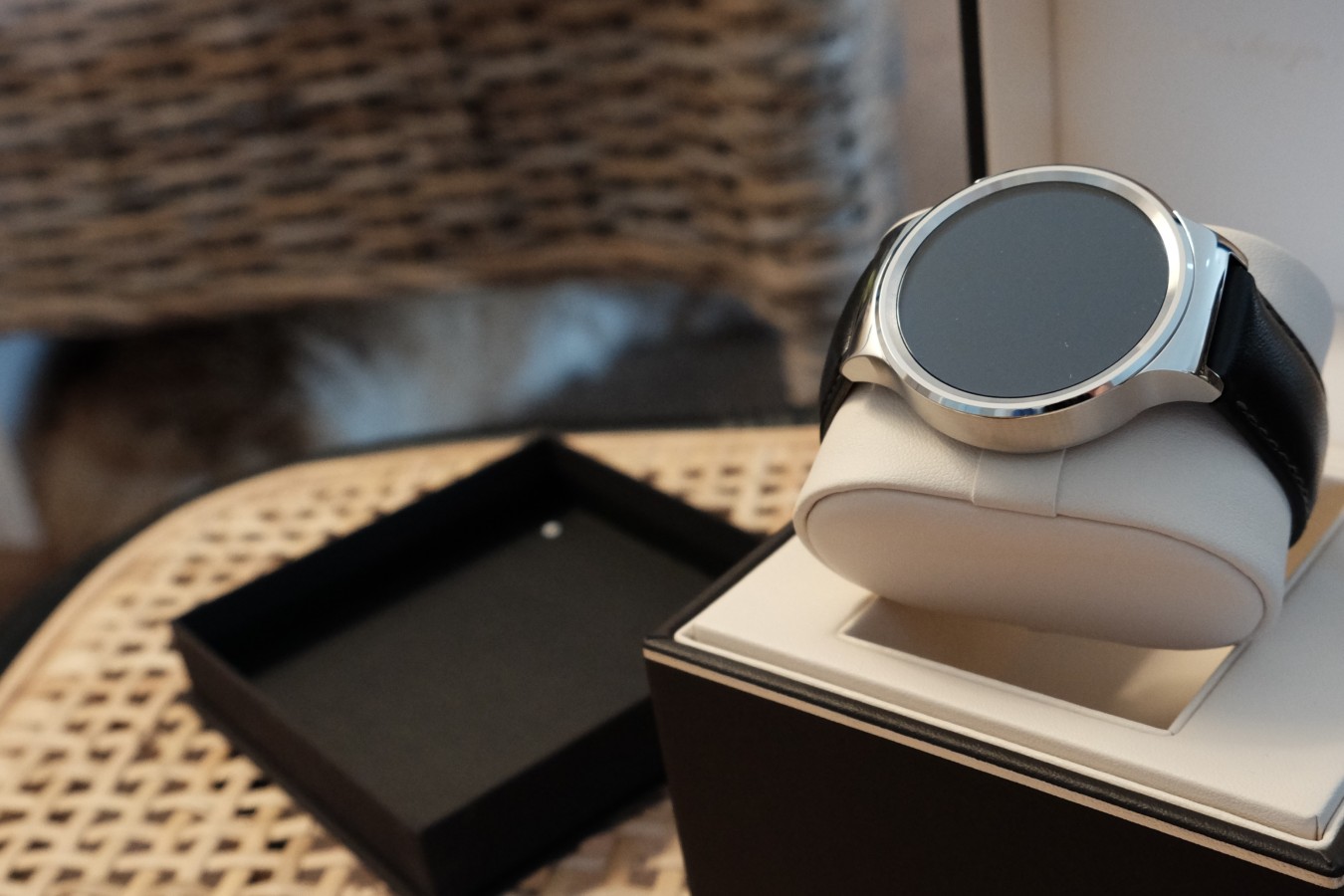
If you are thinking about buying a new iPhone to get Apple Watch, reconsider. Hard. There’s a new Android Wear timepiece that is just as stylish, if not more, but costs much less. If Huawei Watch isn’t the Apple Watch killer, it foreshadows what could be.
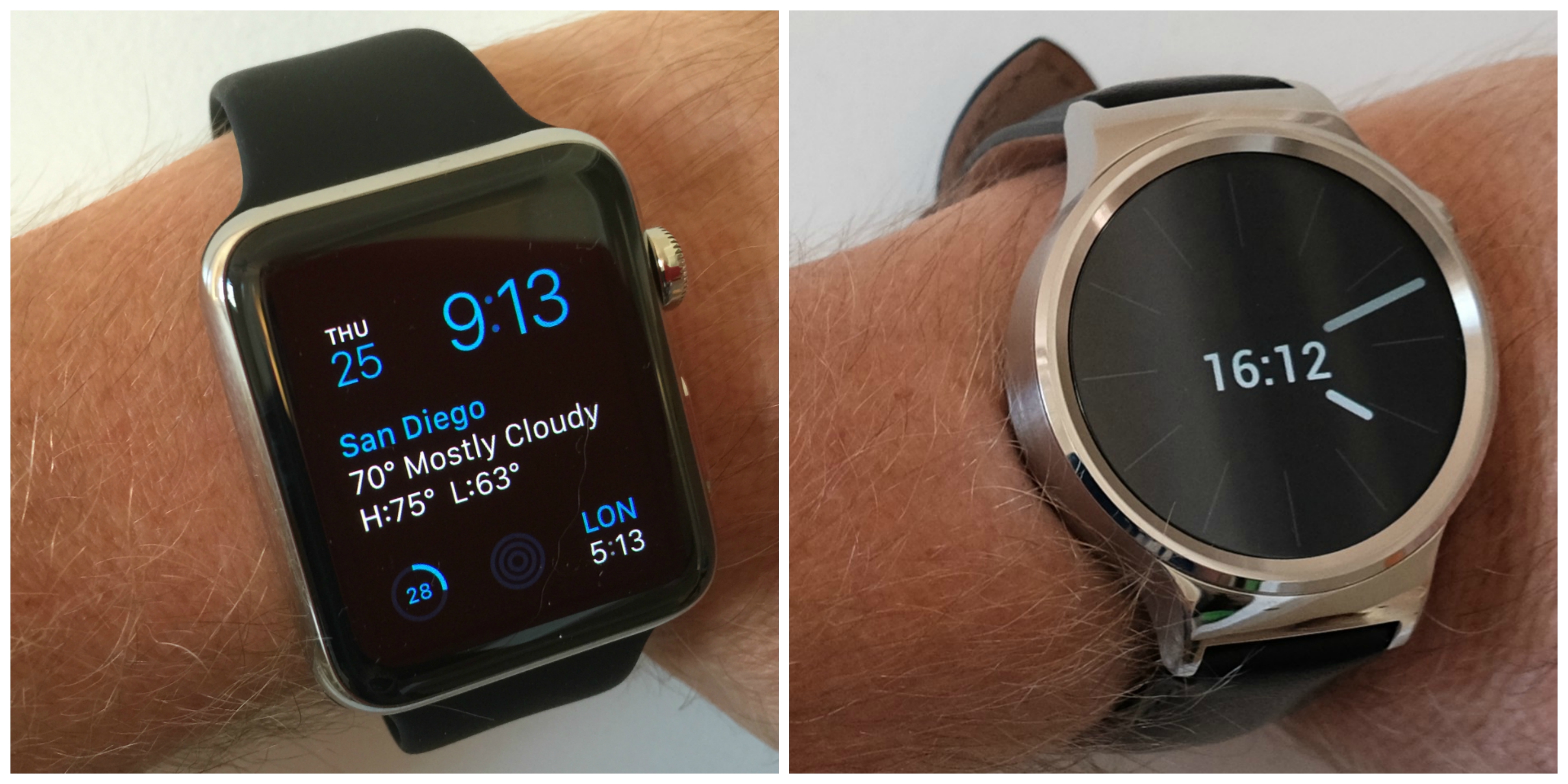
For the comparison today, my quick review focuses on the two smartwatches that I purchased, with which materials and attractive designs are most similar (other than their shapes—squairsh vs circular). To reiterate: I paid for both devices. Neither manufacturer sent a loaner for review. The one came from Apple Store and the other from Amazon.
Something else, and it’s a confession: I started out with prejudice against Huawei, being in the West a newer and unfamiliar brand coming out of China. But JR Raphael’s Computerworld review “Huawei Watch vs. the new Moto 360: A detailed real-world comparison” convinced me to choose the newcomer. Amazon delivered the smartwatch two days ago, Sept. 26, 2015. I used Apple Watch much longer; the device donned my wrist on June 24.
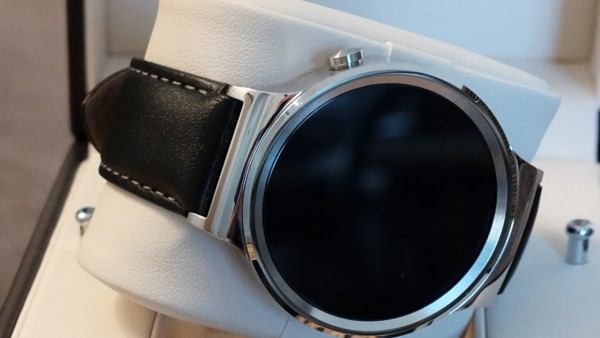
In 42-mm sizing with sapphire crystal and steel case, Huawei Watch costs $349 with fine leather band. Apple Watch: $599 with synthetic rubber strap. Both timepieces fit comfortably on the wrist, but the Huawei looks and feels more authentic with its traditional round shape and luxury leather strap. Apple demands another $100 to get comparable material band.
Pretty, Please
The two companies understand something vitally important about smartwatches that few competitors completely grok: Wristwear is jewelry and must look as good as it functions.
In January 2004, when working as analyst for Jupiter Research, I wrote about Microsoft and its partners’ early push into the smartwatch market: “A wristwatch is more than just a timepiece. It’s a piece of jewelry. Jewelry is a status symbol, too—think Rolex watches in some circles and body piercings in others, or both”. The tech has to look good, too. This attribute is vital because of precedent. Watches are worn as much for their looks as function, and appearance often matters more.
Something else: The devices you use establish status—having the newest, coolest thing. Apple understands this better than any high-tech company, or so I thought. Huawei delivers the handsomest smartwatch I have seen to date. Stated bluntly: iPhone is outclassed—and for a much more affordable price.
Still, style is all about personal tastes. Huawei sells six basic watch styles ranging from $349 to $799. Apple offers 60 different styles ranging from $349 to $17,000. The fruit-logo company takes fine jewelry to a fine art, with the choices of straps and enclosures, such as its pricey gold bling. If you want to make a fashion statement, and money isn’t a consideration, Apple will take your $10k-$17k with a smile.
Also regarding choice, Apple offers 38mm models with the ladies in mind (and men with smaller wrists). Strap designs from both companies are quick-release, so you easily can change the band to match your wardrobe.
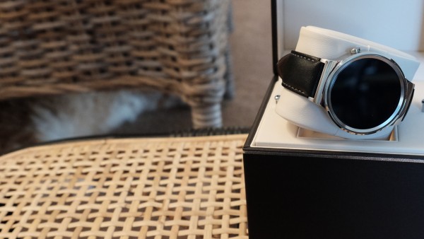
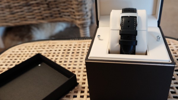
Something else that seems small, but matters: Both companies use superior construction and design for their boxes, which augments first impressions. But Huawei’s box is itself superbly crafted and booms fine jewelry. If the company’s objective is to impress craftsmanship and artistry, goal accomplished. I opened the box and stared, not wanting to spoil the beautiful presentation. My out-of-box experience with Apple Watch was good but it was WOW with the Android Wear device.
Fashion Functions
For all my bluster about style, high-tech fashion must be functional. There, the differences will set fanboys howling about why their platform ecosystem is better than the other. Either is excellent. I may prefer Huawei’s smartwatch to Apple’s, but both are as wonderfully functional as they are fashionable. The nuances will matter to you, depending on the benefits that are more important. Price is one. Platform is another.
Let’s start with glass and screen. Both watches sport sapphire crystal, as previously mentioned. But in my testing, Huawei Watch is considerably more readable outdoors, and here in perennially sunny San Diego visibility is a big benefit.
Huawei Watch screen resolution is 400 x 400 and 286 pixels per inch; Apple Watch is 312 x 390 and 326 ppi. I find the Huawei Watch screen to be subjectively brighter and crisper, but either is best of class.
The visual interaction matters on devices with such small displays, which on both are AMOLED. The watchOS UI is prettier than is Android Wear, but I find the latter’s simplicity and notifications usability and readability to be more functionally fashionable. Again, personal taste is the bigger influencer.
Both devices have excellent ambient-display modes that brightly-enough show time and notifications, such that the devices look like watches rather than blank screens on the wrist. That benefit demonstrates attention to functional fashion missing from, say Moto 360.
P-P-P-Personal
Personalization options differ. Apple provides a handful of homegrown watch faces. Android device makers and app developers have created dozens, and dozens and dozens and dozens… You own any Android Wear screen, while watchOS is a walled garden where you plant what the landlord lets you.
That said, apps are another means of self-expression and functional fashion. Apple Watch provides quick access to them on a single screen from a little touch—and ample room for them. Both smartwatches have 512MB RAM, but Apple doubles storage to 8GB for the apps.
Android Wear’s design philosophy is different, something that could change with Google’s annual Nexus launch tomorrow. For example, if I launch Google Music or Tidal on Nexus 6, the apps’ play controls automatically appear on the Android Wear device. Right, the third-party service, too.
Nuances like this, and many others, come down to digital lifestyle, and what benefits matter more to you. I almost never use apps from a smartwatch other than those that are contextually exposed or demand immediate attention—for the latter, like text messages, email, and other notifications.
Contextual Comparisons
Further notifications discussion is necessary, which raises question: What is a smartwatch, and how smart does it need to be? Wristwear is traditionally a glance-and-go device, an approach I see Google extending and Apple transcending. While either Android Wear or watchOS lets you independently interact with advanced app capabilities, Google’s platform better presents contextually relevant information that you glance at quick, and respond to or dismiss.
Sorry Siri fans. in my testing Google Now is the superior personal assistant, proactively offering useful notifications that makes any Android Wear device more contextually beneficial than Apple Watch.
Extending from there, in my testing voice interaction and response are comparable on either the Apple or Huawei, and it’s sometimes better on the latter. Comparing the two, I talk to the Huawei Watch more and gain better benefits from interacting with voiceless controls compared to the Apple or other the two other Android Wears that I have used. That said, Apple Watch lets you make and take phone calls on the wrist. It’s a helluva useful feature.
For many buyers, and I am not one of them, fitness tracking is a hugely important contextual capability. Both smartwatches pack heart-rate sensors. Apple Watch is supposed to be more accurate, but I get as good with the Huawei, which nailed my 52 beats per minute heart rate when taken today. While both companies provide excellent fitness tracking, Apple’s HealthKit is the killer app for the fitness obsessed.
Apple Watch is not supported on Android, but you can use Huawei Watch with iPhone—but I wouldn’t really recommend that as first-choice option. You get a little from one platform, while giving up too much from both.
Wrapping up: For Android users wondering where was the fashionable, functional wristwear that, at the least, matches Apple Watch, Huawei delivers. The smartwatch looks and feels great, offers classic style, sports quality material and craftsmanship, and costs considerably less than Apple Watch.
