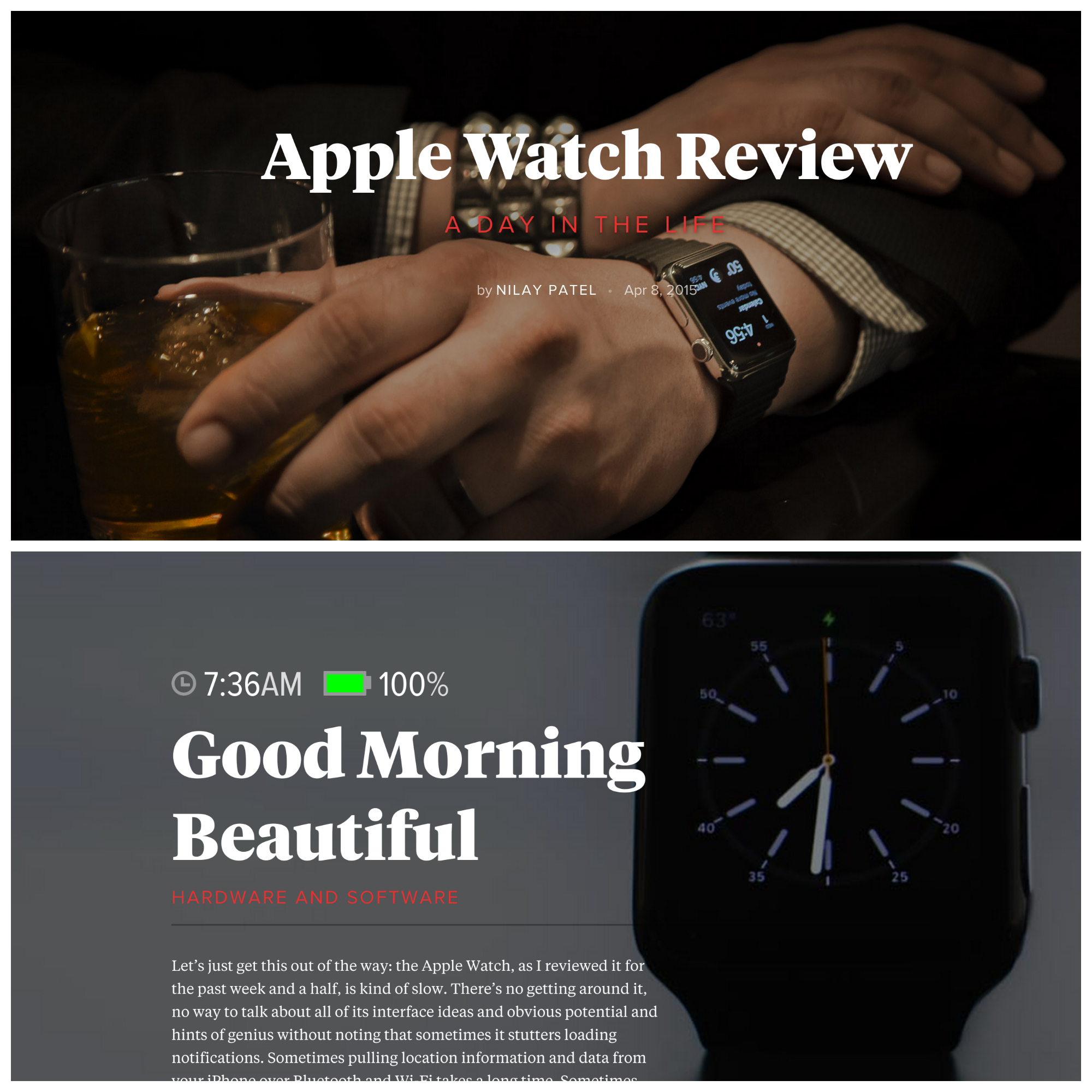
I am impressed with The Verge’s magazine-like presentation for the web, and the Apple Watch review is exceptional example. Presentation in PC browser or either of my Androids, Nexus 6 or 9, freshly flows from graphics to text overlay to paragraphs of experiential writing. Format, using the device during one day and fine touch of battery icon and time per major graphic, beautifully fits content and context.
Last month’s NeimanLab post “This is my next step: How The Verge wants to grow beyond tech blogging” spotlights changes ahead. “What The Verge has been doing the past six months, and will be doing for the next six, is turning itself into a site that covers pop culture, science, and even cars with the same voice they’ve trained on the world of technology”, NeimanLab assistant editor Justin Ellis explains. The Apple Watch review, posted today with a scad of others, illuminates transition underway. What impresses is writer Nilay Patel’s apparent honesty about the device’s benefits and shortcomings.
