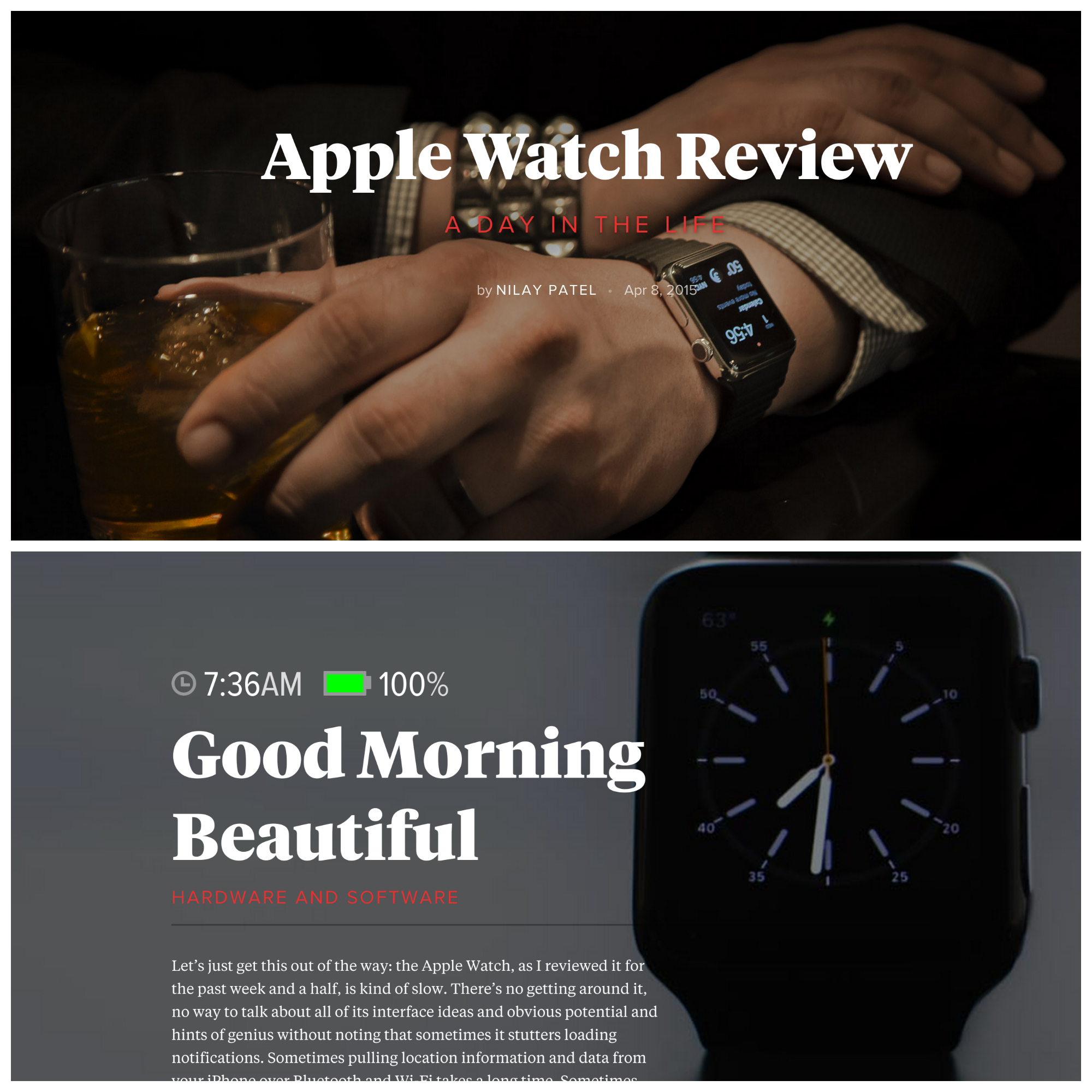
I am impressed with The Verge’s magazine-like presentation for the web, and the Apple Watch review is exceptional example. Presentation in PC browser or either of my Androids, Nexus 6 or 9, freshly flows from graphics to text overlay to paragraphs of experiential writing. Format, using the device during one day and fine touch of battery icon and time per major graphic, beautifully fits content and context.
Last month’s NeimanLab post “This is my next step: How The Verge wants to grow beyond tech blogging” spotlights changes ahead. “What The Verge has been doing the past six months, and will be doing for the next six, is turning itself into a site that covers pop culture, science, and even cars with the same voice they’ve trained on the world of technology”, NeimanLab assistant editor Justin Ellis explains. The Apple Watch review, posted today with a scad of others, illuminates transition underway. What impresses is writer Nilay Patel’s apparent honesty about the device’s benefits and shortcomings.
I can’t resist calling out the latter, for they so strongly stand against the praislings echoing the Apple mantra in other reviews across the InterWebs. Nilay writes in the first paragraphs after the introduction:
Let’s just get this out of the way: the Apple Watch, as I reviewed it for the past week and a half, is kind of slow. There’s no getting around it, no way to talk about all of its interface ideas and obvious potential and hints of genius without noting that sometimes it stutters loading notifications. Sometimes pulling location information and data from your iPhone over Bluetooth and Wi-Fi takes a long time. Sometimes apps take forever to load, and sometimes third-party apps never really load at all. Sometimes it’s just unresponsive for a few seconds while it thinks and then it comes back.
Apple tells me that upcoming software updates will address these performance issues, but for right now, they’re there, and they’re what I’ve been thinking about every morning as I get ready for work…Committing to technology that’s a little slow to respond to you is dicey at best, especially when it’s supposed to step in for your phone. If the Watch is slow, I’m going to pull out my phone. But if I keep pulling out my phone, I’ll never use the Watch. So I have resolved to wait it out.
That’s generally not my experiencing using Moto 360, which runs Android Wear. More:
I’ve gotten really good at using my phone with one hand while I walk to the train…But you simply can’t one-hand the Apple Watch. It’s the simplest thing, but it’s true: because it’s a tiny screen with a tiny control wheel strapped to your wrist, you have to use both hands to use it, and you have to actually look at it to make sure you’re hitting the right parts of the screen. You have to carry your coffee cup in your other hand if you’re not interested in spilling on yourself. If you’re like me and you refuse to use both backpack straps so you can be a One Strap Cool Guy, this means your bag will sometimes fall off your shoulder while you screw with your smartwatch, and you will be a No Straps Smartwatch Guy Murdered By NYC Traffic. Please do not die this way.
Calling out this kind of user experience in context of a daily commute is excellent editorial. Many users may have unrealistic expectations. But he makes me wonder about voice-action/dictation functions. I mostly use Moto 360 with no hands. “OK Google” opens a range of interactions. More:
There’s virtually nothing I can’t do faster or better with access to a laptop or a phone except perhaps check the time. It’s not just the small screen or the quick in-and-out interaction design, it’s actual slowness…
It’s disappointing to see the Watch struggle with performance. What good is a watch that makes you wait? Rendering notifications can slow everything down to a crawl. Buttons can take a couple taps to register. It feels like the Apple Watch has been deliberately pulled back in order to guarantee a full day of battery life. Improving performance is Apple’s biggest challenge with the Watch, and it’s clear that the company knows it.
Moto 360 can bog down sometimes, too, but nothing like what Nilay describes, and he should do so for a digital lifestyle product like this one. Perhaps my focusing on the negatives seems unfair, but this theme—Apple Watch is slow—flows through the entire review. The Verge gives the timepiece a score of 7 out of 10. Ah hum, Moto 360, which review is nowhere near as splashy, rates 8.1.
But my larger point shouldn’t be lost: The site moves in a promising direction, with respect to original content and its presentation.
