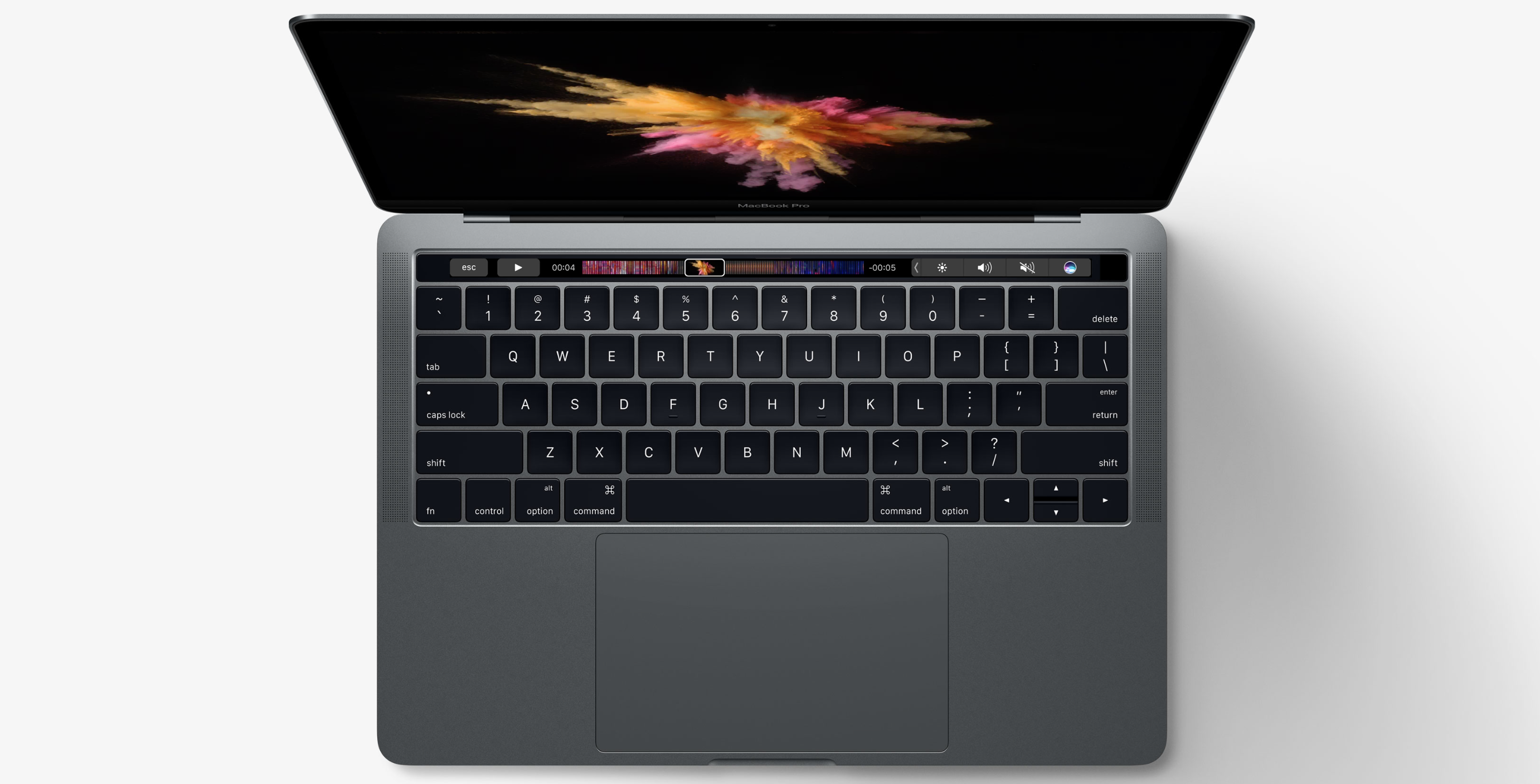
For fervent fanboys who drink Apple Kool-Aid like water, the new MacBook Pro unveiled last week is a thrilling update. But excitement isn’t sure for the thinking public considering buying one or wondering whether or not to cancel an already placed purchase before it ships. Anyone perplexed by what Apple decision-makers are thinking, and whether the new laptops are good value, must first understand the underlying design-ethic and answer: Is it rationale?
Apple is finger-obsessed and has been since before the first Mac shipped, as I explained in March 2010 BetaNews analysis: “What 1984 Macintosh marketing reveals about iPad” (Also see from this site, in April 2010: “The Most Natural User Interface is You“). The company lags behind Google getting to the next user interface, which is more contextual and immediately responsive: Voice, meaning touchless interaction, rather than touch, supported by artificial intelligence. By contrast, Apple isn’t ready to abandon the finger-first motif, as Touch Bar makes so obviously apparent.
Out of Touch?
My BetaNews colleague Mihăiță Bamburic says that “Apple is Out of Touch“. His probing analysis aligns with my contention that under CEO Tim Cook’s leadership, the company releases too many “products without purpose“. I wonder if that will be the case with Touch Bar, conceding it’s too early to say. Much depends on how customers, and more immediately developers, respond to the tech.
Perhaps the best comparison for illustrating Apple’s design ethic behind Touch Bar is contrasting Microsoft’s approach to Surface Pro and Surface Book. The Redmond, Wash.-based company treats keyboard and screen as a combined canvas for the fingers. Users can prattle away on a more traditional keyboard or, additionally, touch the screen and even draw on it. Arguably, because of Windows 10 limitations, the user experience can be sometimes kludgy. But there also is much to be said for offering touchscreen and keyboard as dual-motif.
In some ways, Google’s design ethic is better with Chromebook Pixel, or so I say from ongoing usage. Because apps run in a browser, each in its own tab, the eyes stay more focused on the screen and within fairly fixed plane. There is less distraction switching tabs when eyes are largely looking at the top of the display compared to, in the case of macOS, glancing down to the Dock to open or close apps. Google’s approach doesn’t disrupt workflow as much as more traditional desktop motifs. While Chrome OS lacks the polish of either macOS or Windows 10, it can be better productivity tool—at least on the Pixel.
Stated differently: What Google and Microsoft design ethics share in common is plane of the eyes. The fingers are drawn to where they need to touch, meaning the screen, and also the keyboard. But not one or the other.
Apple’s design ethic is very different, by focusing on the plane where the fingers go across the keys. Touch Bar is a contextual extension of the keyboard. Google and Microsoft provide contextual information more where they eyes naturally look—the screen. Touch Bar draws attention downward, as does the larger trackpad. Apple envisions users happily using two hands to manipulate apps across the keyboard plane. Competing, touchscreen UIs draw the fingers to the display plane and where the eyes look. One well-chronicled side-effect: Gorilla Arm—aching from repeated lifting to touch the screen.
Anachronism or Visionary?
The question, and one I can’t answer without testing: Does Apple’s design ethic improve productivity or increase distraction? The answer might not be the same for every user. But I wonder about the benefits of a small touch strip on the keyboard versus the utility of, say, contextual, gridded blocks like those that Windows 10 presents across a screen that users can tap.
The Cupertino, Calif.-based company asks developers to support the contextually-responsive strip. Adobe is committed with Photoshop and Microsoft with Office. For now. How many other developers will do likewise later? Much depends on how users respond to Touch Bar. If a minority of them use it, the incentive to adapt apps will be low. On the other hand, massive adoption should entice developer support.
That adoption comes at a price, however, because Apple raises the barrier to purchase. Meaning: Buyers will pay more to get Touch Bar than they did for the newest innovations on the previous generation of laptops. The 13-inch MacBook Pro starts at $1,799 and MBP 15 at $2,399. As a measure of cost, these are not mass-market machines, and sales volume often drives developer support.
Much depends on the soundness of Apple’s design ethic. Is a laptop with touchless display an anachronism, when people touch screens, or even command their devices, tens to hundreds of times a day? Whether they be laptops, smartphones, or smartwatches? Or is Touch Bar visionary, and as an extension of the plane of the keyboard contextually useful enough? Only buyers can say after new MacBook Pro models ship.
But what is certain: How different is Apple’s design ethic compared to Google, Microsoft, and many other computing device manufacturers pushing touchscreens and contextual, voice interaction. The fruit-logo company has succeeded by separating from the pack many times in the past. Will Touch Bar be the same? I’ve got some ideas coming in a follow-up post, and fanboys won’t like them.
Editor’s Note: A version of this story appears on BetaNews.
