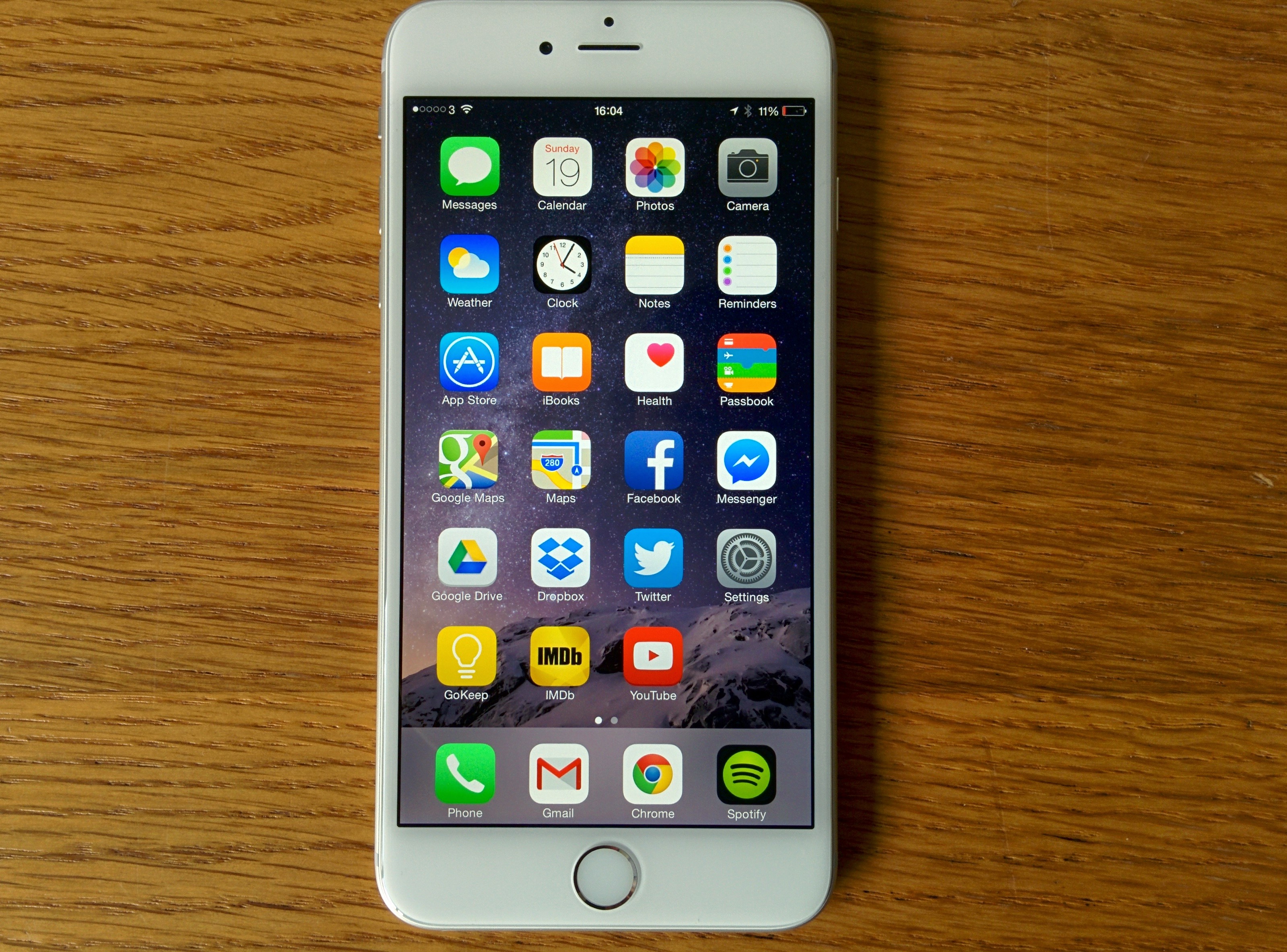
Whenever I receive loaner devices, I ask to keep them for months because long-term use reveals much. Initial reviews often miss important usability benefits or problems only prolonged usage reveals. No one can get to every feature or receive all the benefits in one day or week.
Something else: As I often say, in news reporting, or reviews, bias is inevitable. Time helps extinguish the new thing glow that can bias reviews and make them more favorable than the products deserve. As the glow darkens, sounder perspective brightens.
I don’t recall ever seeing a tech example as good as “iPhone 6 Plus Long-Term Review: Beautiful Freak Is The iPhone’s Future“, which Forbes published today. Gordon Kelly’s followup isn’t just a must-read for potential iPhone 6 Plus buyers but also for other tech reviewers, who should look to his piece as a blueprint to imitate. Every reviewer should do something like this for flagship products that large numbers of people will want to buy. Writers would better serve their audiences.
The lengthy piece (you will want to kick back in a cozy chair with coffee and pastry) dispatches the drama in the opening paragraphs (better get popcorn instead). Gordon writes:
Things start ugly. On the surface the iPhone 6 Plus is a beautiful phone, but it is also one of the most impractical designs I’ve ever used. My frustration over the last month stems from two things: form factor and finish…where my form factor issues lie are in Apple’s refusal to adapt the design of the iPhone 6 Plus for its increased size. Big phones are harder to grip than small ones so most phablets have either a curved rear, a textured finish or both. The new iPhones have neither.
He is right to dispatch design-usability problems first. Handling—or in this instance dropping—is a huge concern. “I’ve already dropped the iPhone 6 Plus four times…and I haven’t dropped any phone in a long time”.
My observations are similar about iPhone 6, which is so much smaller and more manageable in the hands and still is slippery. He calls the easily mishandling a “great shame” because of the “best craftsmanship I’ve seen”. He’s absolutely right: “In obsessing over the ergonomics, Apple has forgotten about the ergonomics of the human hand. Without a case, the iPhone 6 Plus will drive you mad”.
Gordon’s focus is benefits and detriments, which matter much more than specs and features, all throughout the review. Durability, the other topic up top, and handling are important considerations for potential buyers and only properly understand from prolonged device usage.
Given Apple’s design obsession, and the importance of ergonomics in choosing the right smartphone, particularly one so large, Gordon wisely explores the many compromises that put form before function—such as the protruding camera lens, excellent but not best-of-class screen, or slow charging. Benefits are many, including call quality, long battery life, photography, and value, among others. None of these can be fairly assessed from using the device for a week or two.
The final recommendations are sobering, such as this:
In terms of design Apple has shot itself in the foot. The iPhone 6 Plus looks great and it [is] superbly well made, but its lack of hand-friendly ergonomics and ludicrously slippery finish are completely nonsensical. Even if you could use the iPhone 6 Plus one-handed it would be dangerous bordering on foolish to do so. A case or at least a textured skin (I prefer dbrand) is the way to go.
I read the entire—lo-o-o-o-ng—review, which says much positive about Gordon’s perspective and how he presents it (burp—oh, excuse me that’s the coffee and pastry).
Photo Credit: Gordon Kelly
