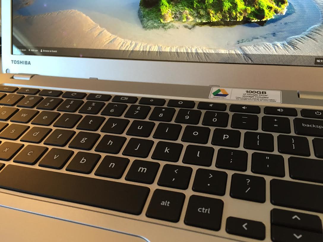
This afternoon, I received the Toshiba Chromebook 2, purchased 24 hours earlier from Amazon. The computer tests my taste for the contextual cloud, as I contemplate moving back to the Google lifestyle abandoned in early summer 2014. While in some ways my creativity flourishes on Apple products, I also feel encumbered. Synchronization still stumbles across Apple devices; informational utility of Siri sucks; fumbling around with apps across the user interface is distracting and time-wasting.
While having used Toshiba laptops in the distance past, this is the first I paid for. I chose the Chromebook for what it has that nearly no other does, 1080p IPS panel. The screen type offers bright and bountiful viewing angles. Most other Chromebooks rely on TN panels that are typically 200- or 250-nit brightness, or likely less than your smartphone. There is one, good viewing angle—straight on! The Toshiba tops 300-nits, which is similar to my 13.3-inch MacBook Pro (late-2013 model). The published numbers I’ve seen vary, with the most consistent 339 and 320 nits, respectively.
Distraction-free Computing
Chrome OS is nowhere near as pretty as OS X, but the browser motif is remarkably functional. Chrome fills the screen and contains most task-related actions to a single, horizontal quadrant that also is more eye level. You look away from the working screen area less often, as the eye shifts from browser tab to tab. Tabs are tidy. Anyone could mimic such behavior by running the Chrome browser full screen on Mac or Windows PC and using only cloud services and web apps. Try this for a week and see if you find the tabbed browser a less-distracting, less-time-wasting way of working—and more productive, too.
Even after a few hours using Chromebook, it’s apparent how exhausting is the more traditional desktop UI. On OS X Yosemite or Windows 8.1, cursor movement across vast areas of the computer screen distracts and disrupts concentration—and the eye constantly casts downward (unless, say, the Dock is repositioned). That’s the big lesson I get from using Chromebook, which the Toshiba reminds in just 10 minutes use.
From that perspective, Chromebook is a creativity-booster, because I am not as much distracted. Think of the moving from room-to-room scenario, which is a well-documented memory aberration. You think up some brilliant idea and rush to the next room, but can’t remember after crossing the threshold. Distraction disrupts short-term memory, and there is too much of that using the typical desktop OS UI.
That said, I find dim, TN displays to be distracting—no, disruptive to concentration. I regret selling my Chromebook Pixel last year, and the Toshiba is first laptop in the category I would use; because of the widely-viewable IPS screen.
From Box to Fire
I opened the Toshiba Chromebook 2 box with lots of trepidation. Consider the comparison: My Mac laptop has 2.8GHz Intel Core i5 processor, 8GB RAM, and 512GB hard drive. The screen’s native resolution is 2560 x 1600. By comparison, the Chromebook packs 2.58GHz Intel Celeron N2840 processor, 4GB RAM, and 16GB hard drive. I don’t care so much about features as benefits, among which are performance and utility.
Out of the box, my Chromebook wouldn’t boot. Typically lifting the lid should start up the computer. Neither that nor pressing the power button would light up the screen. So I assumed the battery was dead, something I have never experienced with a new laptop. Plugging in and lifting the lid solved the problem, but the Chromebook showed 64-percent charge. Uh-oh. I hope that doesn’t foreshadow trouble.
My vision is a bit wonky, as I need to get new eyeglasses (and will sometime soon). Text is way too small for me at the native 1920 x 1080 resolution. I jacked font-size to “Very Large”, which just looked too strange. So I pumped down to 1536 x 864, holding firm at “Medium”. I am not exactly satisfied but will adapt. Screen brightness and viewing angles matter more, and they satisfy.
I watched some videos on the Chromebook and Mac, and they look sharper on the Apple, from YouTube. Perhaps someone else wouldn’t see enough difference, but I do, and more noticeably looking at photographs. Detail is sharper, and the color more accurate (my opinion could change either way with prolonged use), on the Mac.
How a laptop feels is a benefit often overlooked by manufacturers. MacBooks are cold, because of the aluminum. Chromebook 2 feels gritty to my fingers, which also isn’t pleasing. The impression comes in part from the lettering and numbering on the keys, which I can feel. But typing is silky smooth and the trackpad really responsive. Chromebooks are writing workhorses, and the Toshiba is no exception.
I can’t yet attest to performance, which is one of many discussion best saved for a review.
