Last week, I had opportunity to use Apple Watch, making it third of the modern smart variety that I have experienced (the others being LG Urbane and Moto 360). The differences between the platforms are quite startling and worth highlighting. They begin with diverging design ethics derived from the fruit-logo company’s app-centric heritage and Google’s place in the cloud.
For people who use either Android handset or iPhone, existing device really determines what watch platform you choose, if any—that is for now. Down the path you go. But where it leads is somewhere else, not the same destination. One platform is more responsive to you in varying contextual situations. The other requires more direct interaction, but gives other benefits.
(Note: Because I don’t obsess about health measurements, this post offers no comparison about the benefits either platform might offer; I didn’t test or evaluate the features.)
Apple Watch is app-centric, deriving from the platform maker’s longstanding PC and mobile device heritage. Apple’s business is about platforms and applications, and the company profits directly from products it develops and sells to businesses or consumers. In approaching mobile devices, Apple leverages its strengths as an end-to-end hardware/software developer. The smartwatch, like the company’s other devices, pulls informational relevance to applications.
Android Wear devices are more cloud-centric, deriving from Google’s legacy delivering services from the web. The company’s business is about information and services. Google mostly profits indirectly from content or information someone else created. Its intellectual property is tied to the means, not the end. Big G already offers services in the cloud via the browser, and, contrary to Apple’s design and economic objectives, seeks to shift relevance to the Web rather than to the device.
Google Now makes Android Wear more useful than Apple Watch, because of proactive, contextual awareness. This difference directly derives from the aforementioned worldviews—utility of apps vs the web.
For example, I really like that when out and about when glancing at my watch, a Google Now notice flashes, giving minutes to drive home. Apple promises more contextual capabilities when Watch OS 2 releases in autumn. But Now is now—no waiting on promises that may or may not practically manifest.
Something else: Notices in general look better because of flatter UI and the clear, underlying glance, swipe, and go design ethic. On the Moto 360 and Urbane round watch faces, actions to dismiss or see more information are right and left per item. That’s a more natural motion than Apple’s way, which requires more scrolling up to see, say, a text message before closing by tapping “dismiss”.
To reiterate: Google is more motivated to deliver contextual services because that’s the profit center; Apple sells devices, which legacy are apps.
Apple Watch is overly complicated compared to Android Wear. To use either Moto 360 or the Urbane, I installed the mobile app, turned on the watch, and paired. That’s it. While the process started similarly for the other device, I repeatedly referred to the 96-page user manual I downloaded from Apple’s support website.
Apple touts the utility of the crown, but I see it adding unnecessary complexity to the user experience. All activity should occur on the screen, by touch or voice response. The fruit-logo company’s approach favors apps, for which crown control offers some benefits. But for an entity rampaging about the post-PC era’s benefits, there is too much personal computing in the UI design ethic. The device should be more contextually aware and responsive, requiring as little touch as possible.
Apple Watch offers more direct utility compared to Android Wear. App-centricity gives the user a broader range of capabilities managed or initiated from the watch. Meaning: Apple’s timepiece is more like a computer on the wrist than those supporting Google’s platform.
Day-to-day, I use either Moto 360 or the Urbane for glancing quickly at information, such as time, notifications, and weather, or asking questions or initiating actions from vocal command “OK, Google”. While Apple Watch usage is similar, I interact more with the screen and the installed apps. Additionally, I don’t find that Apple’s assistant offers as accurate or meaningful responses to questions. Is she offended by “Hey, Siri?”
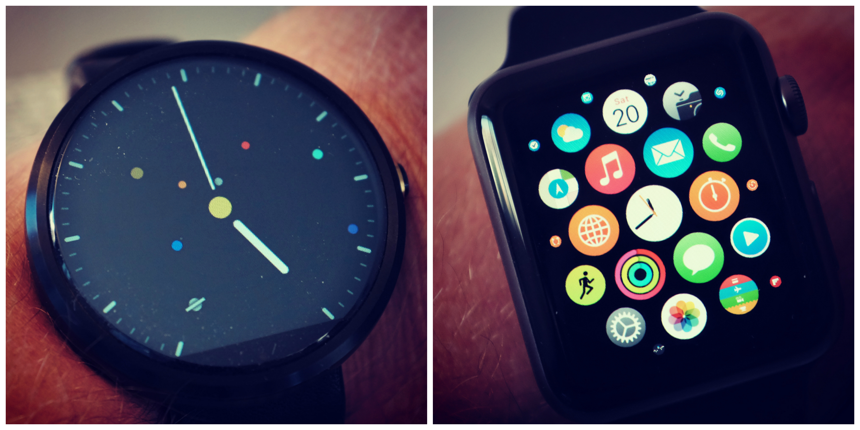
Round is the better Android Wear watch. In experimenting with rectangular shaped Android Wear timepieces and comparing to Moto 360 and the Urbane, Google’s platform is better contextual companion when circled rather than rectangled (it’s a verb now). Much of that is about how swiping works and what makes sense functionally from an obvious design perspective.
Apple Watch extends the familiar rectangular experience of iPad and iPhone. I presume one reason for how swiping works—more often from the corner rather than the side or up and down—is about the shape. The rectangle, like app-centricity, extends from Apple’s worldview and its legacy devices and platforms.
There is something Dick Tracy watch-like about Apple’s timepiece. I refer to making or answering phone calls from the wrist. The speaker isn’t great-shakes quality but it is useable enough. I hear lots of distortion, but, hey, that’s okay. The capability offers great benefits while driving. You can make or receive calls without using an in-vehicle accessory or Bluetooth earpiece. This kind of capability shows one of the benefits when a single vendor controls the entire platform.
Apple’s watchband design is more clever and convenient than existing Android Wear devices. Would you like to change your style without wearing a different watch? Apple Watch features a simple mechanism for swapping bands. I do mean simple. Depress a button on the back and slide off the strap, then slip in another.
The underlying design ethic recognizes something that should be duh obvious about watches: They are as much jewelry as smart accessories.
Google’s idea of personalized jewelry are Android Wear watch faces. Developers can create their own, and they do! Users can chose from many different ones in the Play store. By contrast, Apple Watch owners must customize preselected faces. Their choices are considerably more limited. Do you make the device more your own by how you dress up the screen or by the strap you attach?
Apple’s own watchbands are outrageously expensive. When was the last time you paid $150 for a wrist strip? The point: All that watchband-changing convenience isn’t just about making you look and feel good but reaping huge accessory profits for Apple. In the jewelry business, margins reach as a high as 90 percent. You have to wonder how many pennies Apple pays for every leather strap selling for a Benjamin and a Grant (e.g. $100 and $50 bills).
Apple Watch user experience is more intimate and endearing. For contextual utility, I prefer Android Wear. Once Google Now is enabled on the phone, the watch proactively provides contextually useful information, while more of the interaction is quick, tap or speak and go.
By contrast, Apple requires more direct interaction with the device, which conveniently and easily runs apps. As such, the broader utility is smartwatch as phone companion rather than dependent device. The increased interaction, and its benefits, creates stronger emotional bond with Apple Watch than Android Wear timepieces—and I greatly enjoyed using Moto 360 and Urbane.
Everything comes down to digital lifestyle. Apple provides utility around apps, devices, and trendy design. Google harvests your activity to bring relevant information to you where you need it. One way is more user-initiated interactive, while the other is more proactive—and both approaches fit the supporting platform’s larger lexicon lifestyle. For simplicity and contextual informational utility, Android Wear is better. For intimacy and on-device application utility, Apple Watch is better. That is for now. These platforms are evolving.
Editor’s Note: A version of this story appears on BetaNews.