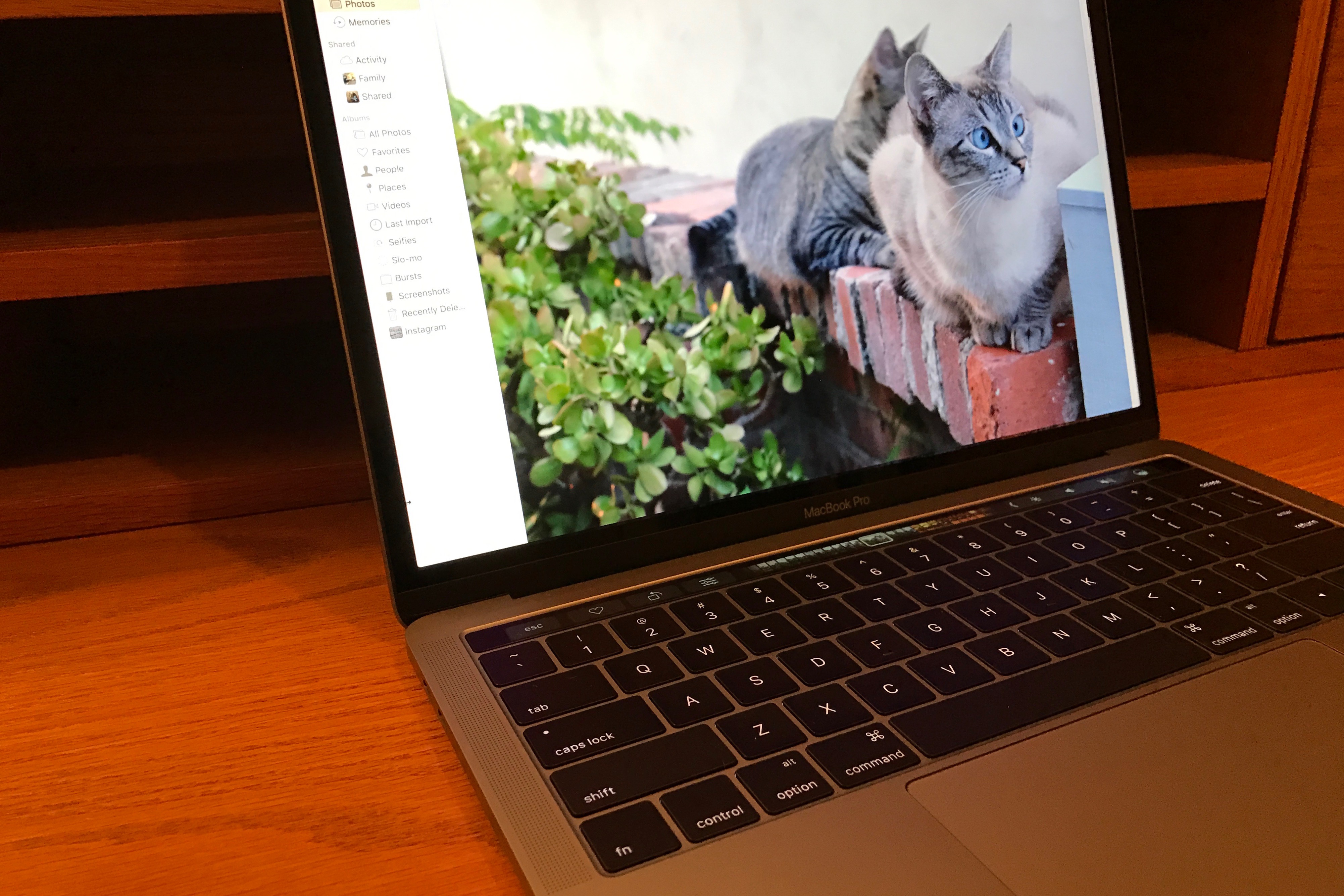
A few hours after setting up 13-inch MacBook Pro with Touch Bar, I can tell you who it’s for. Surely you wondered, and maybe you even considered this pricey portable to be an insane release. Mea culpa, for thinking something similar. But no longer. The laptop lives up to my early expectations—and more.
I ordered new MBP, after serious deliberation, the day Apple announced it; Oct. 27, 2016. Better to get into the front of queue before backorders begin and cancel later should there be second thoughts. Or third. Or fourth. I had them. Often. But in the end took the risk. Apple Store indicated my order would arrive sometime between November 17 and 24. However, after shipping on the 13th, delivery date revised to the 16th but the beauty arrived today. Oh La La.
My interest was less the newfangled Touch Bar and more the butterfly keyboard and brighter, more-color accurate display. Typing is absolutely fantastic. While the keys are noisy, they deliver great feel and response. The 500-nit screen is more matte than glossy, and everything looks painted on the screen, it’s so natural.
The computer is a joy to look at, and to use. I couldn’t be more surprised or awe-struck. The visual and tactile ergonomics are absolutely fabulous. The laptop is thin and sleek; I bought the handsome space grey (silver is the other color).
Why am I so crazy, considering the starting price is (gulp) $1,799? I am just returning to work after a forced summer sabbatical related to eye surgery that lets me wear glasses to read and frees me from them for distance. I’m ready to write, write, write, and MacBook Pro with Touch Bar felt—figuratively—like the tool to do just that.
Not to say that I had a bad kit, which is where doubts crept in. My Early 2015 MBP had 3.1GHz Core i7 processor, 16GB RAM, and 256GB SSD. The Late 2016 replacement is 2.9GHz Core i5, 16GB RAM, and 512GB SSD. After a few hours use, I can’t say that the new outperforms the old for raw computing. But keyboard, screen, and (gasp) Touch Bar improve my writing speed and creativity, after short use. Yup.
Something else, and this isn’t the first time I’ve made the point with respect to Apple design: Product benefits matter more than features, and one benefit too often overlooked is joy. How does the thing make you feel. I feel happy typing on the new MBP, for its dazzling beauty and also for how the Touch Bar contextually changes depending on application or what I’m doing. You’ll have to wait for my full review for more on the feature.
The whole dongle situation is a bit annoying but it’s not for the first time. I remember when Apple dumped legacy ports for USB with the original, Bondi Blue iMac in 1998. Bye Bye printer and other connectors then. So long USB ports and SD card slot now. But I’ll manage.
What’s insane maybe isn’t: Apple releasing MacBook Pro with Touch Bar (also in a 15-inch model) for such hefty price without touchscreen. Consider that PC shipments fell for eight consecutive quarters, including Q3. Timing is kind of nonsensical, unless reconsidering Pro in the name. MBP isn’t a mass-market machine. The laptop’s target market are creative professionals (eh, like writers)—people who need fine tools.
Conceptually, I couldn’t make sense of this thinking before actually seeing, feeling, and using the laptop. MacBook Pro is sculpture—a work of art—but one you can use rather than just look at. For a change, Apple form meets function. Or so it would seem from my “wow” first perceptions. We’ll see if I still feel so lovey-dovey and productive when writing my eventual review. Stay tuned.
