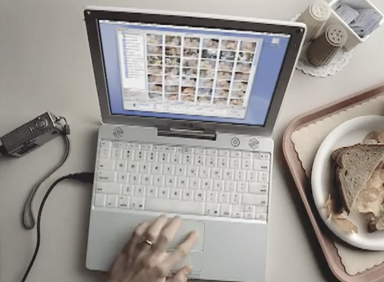
My prevailing thinking on why high-tech products succeed or fail boils down to four criteria. Editor’s Note 2/8/2014: I expanded the number to eight and wrote book about them: The Principles of Disruptive Design.
A product must:
- Build on the familiar
- Do what it’s supposed to do really well
- Allow people to do something they wished they could do
- When displacing something else, offer significantly better experience
Build on the familiar. Apple has done a damn good job on this one. I would consider most of the company’s recent product releases—iPhoto is as good an example as any—to satisfy this criteria. With iPhoto, the images lay out in a familiar scrap-book-like fashion. Apple starts from a point of familiarity, rather than try inventing or reinventing new processes. By contrast, I see Microsoft’s design approach as more cumbersome.
Do what it’s supposed to do really well. Why is it that high-tech designers waste so much time dumping in useless features that make products too hard to use and then wonder why no one uses the features? Microsoft is a great example of complexity, whereas, Apple is an example of good simplicity. Take iPod, which plays music easily and conveniently and compare that to Pocket PC handhelds, which try to do many, many things. If I buy a toaster, what I’d like to be able to do is pop in the bread and wait for the buzzer to tell me the toast is brown and crispy.
What I don’t want is to use a six- or seven-step Wizard (that would be the Microsoft approach), so that I can pop in the bread and pull down the handle. And I really don’t want a toaster that makes coffee, surfs the Web and checks my appointments—and happens to burn the toast. I chuckle at some of these so-called smartphones that are really dumb ideas because they do things you don’t need and in the process are bad phones. A toaster should be a toaster, a phone should be a phone first above anything else.
Allow people to do something they wished they could do. Apple understands extension really well. Using iPhoto again, the product doesn’t just present the photos in familiar fashion but lets people do things they wished they could do with those pictures, like resize them, view hundreds at a time or organize them more meaningfully.
When displacing something else, offer significantly better experience. The high-tech graveyard is stacked over with the corpses of dead products that failed the “better enough” test. I remember when 8-tracks were suppose to replace vinyl records (yes, I’m that friggin old!). My parents christened our 8-track player with whatever The Ventures album contained the “Hawaii Five-O” theme song. I think they bought maybe four or five 8-track tapes after that. The 8-track asked too much of people, starting with bringing in a new format, without offering something better.
By contrast, CDs and DVDs are outstanding examples of products that passed the “better enough” test. A buddy hooked me on CDs in 1982 with Men at Work’s “Down Under.” CDs delivered seemingly superior audio fidelity, a sturdier format and fulfilled on the portability attempted with cassette tapes. DVDs did for movies what CDs did for music. You know you have a runaway, transforming product when people run out and repurchase stuff they already own for the new high-tech wares.
I’m waiting to see what defining technology—and right now it’s not ebooks—that will move people repurchase printed books with something else, the same way the rebought whole music and movie collections to get CD and DVD versions.
Do you have a UX (user experience) story that you’d like told? Please email Joe Wilcox: joewilcox at gmail dot com.
