I want to take a look at just one of the ways Apple, with its puny computer marketshare, out-markets Microsoft. It’s all in the presentation.
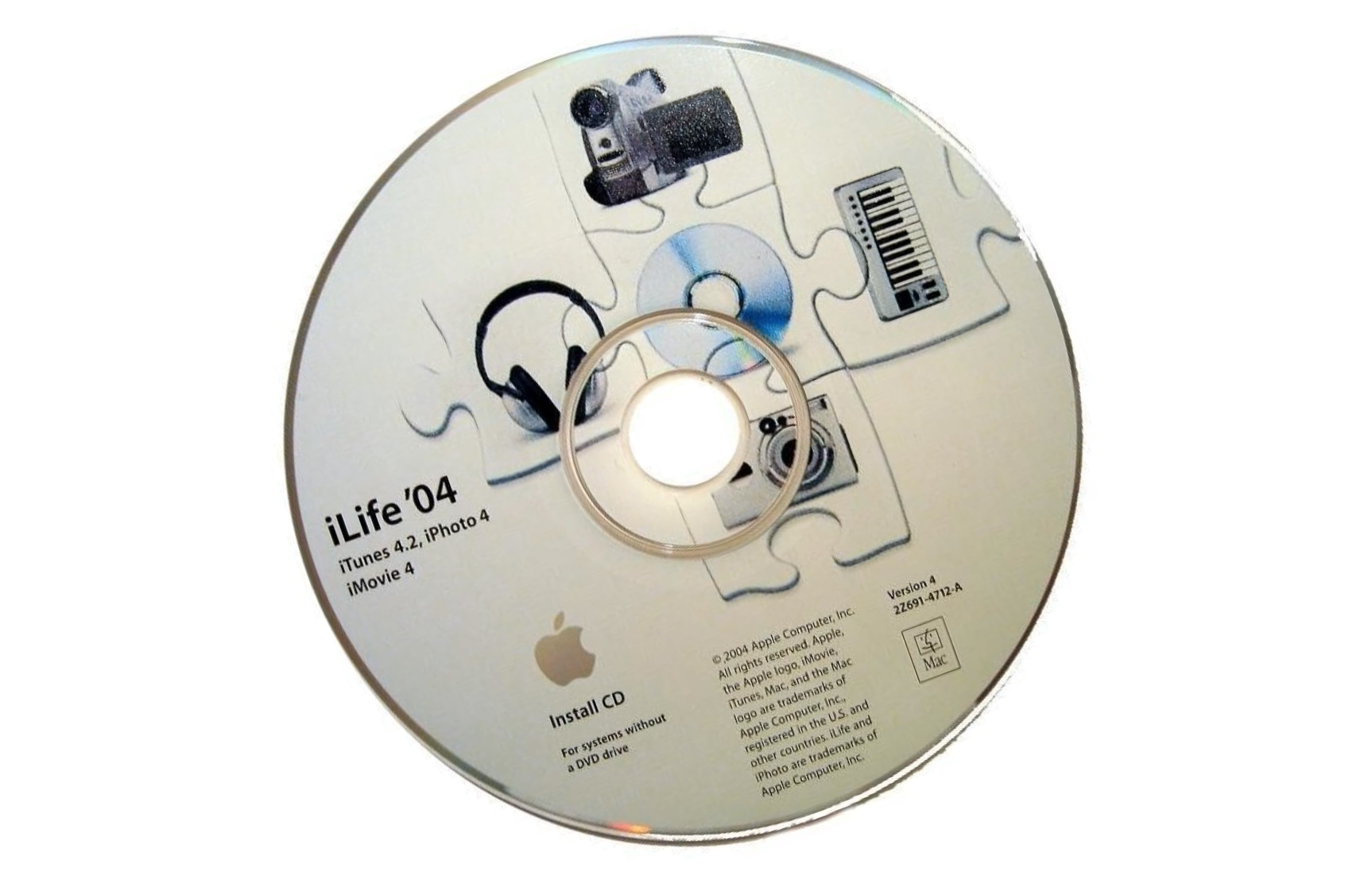
Gander at these two websites: Apple’s iLife `04 and Microsoft’s Plus! Digital Media Edition. Each site hawks the respective company’s digital media suite. But, Apple does a much better job making its product enticing. [Update: 10/2009: Links removed because the original websites are gone.]
Under each iLife heading is a tagline that denotes action: Make your own music; organize your music; sort and edit your photos; edit your own video; create your own DVD. The first rule of good sales is to make the customer feel like the product already is his.
So you put the product in his hand or you let him test drive the car and then refer to it afterwards as “his” car. The common element is feeling of ownership. Apple’s presentation does this subtlety but effectively by the use of “your,” but in the connotation of taking action, or empowerment. Each section on the different products—GarageBand, iTunes, iPhoto, iMovie and iDVD—entices with the “what you can do” and then bullets a list of features.
Multiple links lead to further information pages for each product, but Apple doesn’t stop there. Sub-options across the top of each product page lead to a third layer of information. Using GarageBand as an example: Play, Loops, Record, Mix and Accessories. The reader must delve deeper for the information, but it’s there—and plenty of it, too.
The Plus! DME page should be as enticing, but it’s not. Microsoft’s four headings—Photos, Music, Home Movies and Portable Devices—don’t come across with the same sense of empowerment. Apple’s iLife page sells through subtlety, by demonstrating to the reader how much she can do with the cool product. Apple’s narrative talks to the reader. Microsoft’s text reads like a sales brochure, with in essence what are a series of cumbersome sales bullets strung together like sentences. The sub pages marginally improve, but don’t offer the depth of explanation or enticement of those for iLife. That’s not to say Microsoft does everything wrong. The Plus! DME main and sub pages offer plenty of chances to try out software, and on the Photo Story page there are fun and humorous examples of finished image narratives.
It’s too bad, because Plus! DME is a fun product for Windows XP users. But, presentation has long been a Microsoft weakness, and it goes right down to product design. Too often, Microsoft makes new processes for doing things, creating a cumbersome learning curve as opposed to building on familiarity. Whereas, Apple takes a simpler approach.
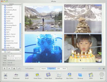
 For example, part of iPhoto’s appeal is its subconscious familiarity. The images are laid out just like on a page—that’s a semblance of how they might be in a physical photo album. But, Apple extends the familiarity by doing something many people wish they could do with their photo albums: The pictures can be resized on the fly. Likewise, images import as digital rolls of film, with an accompanying date, a familiar process for physical film.
Simplicity appeals, yet is too often overlooked. I’m amazed at the human mind’s tendency to make things more complicated than they need to be. When I was in high school, I won 95 percent of my first chess games with new opponents in four moves. Virtually no one looked for the four move check mate. It was so obvious, it wasn’t. Opponents looked for the complicated play. Of course, that trick usually worked only once.
Complication is something I’d like to see Microsoft do more without. Take the complicated product names, such as Windows XP Media Center Edition, MSN Direct Watches or Plus! Digital Media Edition. The operating system folks are the worst offenders. The Office folks are a little better, with products like Word, Excel, Outlook or OneNote. The names may not have zing, but at least they’re not tongue twisters.
The first rule of good product name marketing is to watch the syllables. The rule works in writing, too. There are good reasons why book titles tend to be five words or less—and short on the syllables.
Apple, by contrast, picks memorable or evocative product names. Short and simple, too.
You don’t think that little “i” in all those Apple product names is just shorthand for Internet? There are lots of subtle connotations carried in the use of “I.” Comes to mind: The book I, Claudius. The “I” as statement of self, of something important. The name may read iDVD but we hear I, DVD. I Movie. I Photo. The “I” denotes something special, something important, something you should take notice in. The best is when an Apple name makes that personal, as in I Chat for product iChat.
Other Apple product names are evocative in a different way. GarageBand is classic. Everyone knows what a garage band is and the hope said group has of breaking out, making the big time, if only the group practices hard enough and gets the sound just right. Apple’s approach to operating systems is to spice up the boring numerical name, like Mac OS X 10.2, with something catchy. Jaguar. It’s a fast cat or classic car. Mac OS X 10.3 as Panther, a cat that prowls and stalks, maybe in this case Windows.
How effective are these names? Just look at iPod or iSight. My fourth grader refers to video conferencing as iSight. She’s convinced Apple invented the technology.
I have to believe that someday, Microsoft is going to catch on to the simpler approach, starting with product names. Many of the codenames are cool. Mira, Spanish “to look,” was the codename for tongue twister Windows CE for Smart Displays. Mira, that’s cool. The first version of Windows XP Media Center Edition was codenamed Freestyle. Oh, the marketing Microsoft could have done with that. Longhorn might even force a change. People will be calling the next version of Windows Longhorn for so long, the codename may just stick. I hope it does.
Part of Apple’s pop-culture charm comes from the product names, which move right into the every day vernacular. Whenever Microsoft learns that simpler, smarter, cooler product names make sense, I’d watch for the worm in Apple.
