Two weeks ago—and it sure seems longer—I switched to iPhone 6. With my 92 year-old father-in-law three days in the hospital, and ready to be discharged, I thanked my lucky stars for the preorder; standing in line outside Apple Store or the local Verizon shop wasn’t an option on September 19. Luckier still, I spotted and stopped the FedEx truck in the neighborhood on my way to the hospital.
But being at Apple Store, rather than preordering, would have made a difference. After handling iPhone 6 Plus, the larger device appeals to me more. For most people upgrading from older models, the Plus will be too big. I thought the same applied to me, until handling one last week. My first impression was fabulous, starting with the screen and how the device felt in the hand—not too large at all.
Google groupies and Windows Phone preppies laugh at iPhone 6 or the Plus as “Me-too” devices that catch up to or fall behind other high-end smartphones. That’s because these people mistake the forest for the trees, using a cliché. The trees are features and the forest are benefits, which are finely balanced—and that’s this review’s major focal point: Benefits.
I switched from a fabulous phone, the Nokia Lumia Icon, which I used as part of summer experiment “Microsoft All-In“. By the specs, Icon is much better than iPhone 6. Comparing the two, Apple’s smartphone is, well, smarter. I wouldn’t have known without first using both devices.
Why I’m “All Out”
Choosing iPhone 6 over Lumia Icon wasn’t a singular decision. It fits into a larger lifestyle lexicon, where “Microsoft All-In” just didn’t work for me. But I had hopes, in mid-June.
For nearly two years before this summer, Chromebook was my primary—and often only—PC. I briefly switched to MacBook Pro for about a month in July 2013, but returned to Chromebook so my daughter could take the Apple laptop to college. Google gives great, no-fuss computing, but there are annoying limitations creating content and Microsoft nagged my subconscious. I built my tech writing career covering the company, around which there remains considerable audience.
With Windows 8.1’s release, new CEO’s tenure, cloud offerings’ maturity, and Surface Pro 3’s launch, Microsoft intrigued all the more. Something else: In early Spring, I developed serious vision problems (by August healing and now mostly resolved), and Microsoft offers exceptionally readable font technology. So I dived all-in, with hopes of staying there.
Let me say this: Surface Pro 3 is excellent—as far as the hardware goes. The hybrid tablet-PC concept is a winner. But I consistently rammed against a wall: Available apps and the way I want them (in Modern UI). Additionally Windows 8.1 is quirky, and many of the problems are cloud-sync and service related. The experience particularly jarred coming from Chromebook, which management is easy and where sync is smooth. Ongoing software and services usability problems sapped my time and productivity until finally enough was too much.
So, at the end of August, knowing back-to-school would be a good time to sell, I Craigslisted SP3. The device got a good home—University of California San Diego freshman, giving up just $200 equity before tax on my original purchase price. I took the cash down to DC Computers, which is in my neighborhood, and bought a used 13-inch MacBook Pro Retina Display. OS X Yosemite Beta 4 running on my Mac is smoother than Windows 8.1 general release on Surface Pro 3, with no lost productivity from glitches or other annoyances. At the time, I planned to keep the Icon, as the Mac would be more compatible companion than Chromebook, which better fits “Google All-In”.
I really like the Nokia phone. By most measures that matter to me, Windows Phone 8 exceeds its desktop sibling. Performance is smoother, sync surer, user interface more uniform, meaningful apps availability better, and built-ins like Mail superior. Then there is the hardware, where the the camera and videocam are showpieces. But the supporting platform ecosystem is inferior to iOS, which is reason enough to go Apple for computing, mobile, and supporting cloud services.
On September 30, Microsoft unveiled Windows 10. Yuck.. I’m a put off by the user interface. Combining the classic Start Menu with Tiles produces something hideous. Whatever Microsoft gained with innovative touchscreen design is lost in Windows 10. The new motif is butt-ugly, and, sadly, wipes away any regrets I had selling Surface Pro 3. This is what happens when a company designs for the install base—putting fear of losing customers ahead of taking risks that eventually benefit them.
How I ordered iPhone 6
Deciding to switch is one thing. Making it happen is another: Because my budget is super tight, I needed to fund my iPhone 6 purchase without paying full, non-contract price—an option not obviously available for preorders starting September 12. My local Verizon store rep had a solution: Buy a $250 Ellipsis tablet, which 4G LTE line would be eligible for immediate upgrade. Out-of-pocket expense would be $200 less than iPhone 6’s full price. Just to make sure there would be no glitches, the rep offered to manually switch the device to a flip phone in Verizon’s system, ensuring no last-minute hiccups.
Problem: I don’t need another Android tablet and nothing about the Ellipsis piques my interest. My sister came to the rescue. She works for a company that provides tech services to enterprises—the majority using Microsoft software and services—and needed an off-contract Verizon phone. She already agreed to buy the Icon, which looked to better sync with her lifestyle, but also wanted a tablet. Sis scooped up the Ellipsis, too, while I agreed to pay the $10 a month service. Her two purchases and additional Craigslisting provided just enough funds to break-even.
As Midnight PDT approached on September 11, I staked out the Apple and Verizon websites. Around 11:58 pm, refreshing the Verizon page brought up the order option. I chose the 128GB space grey model and had the preorder completed by 12:03 am, even before Apple Store came back on line. The phone arrived early afternoon on September 19, after which I drove down to the carrier store for activation on my line and to square up the other for the tablet, which I mailed with the Nokia smartphone to my sister the next day (If not for my father-in-law’s hospital discharge, the two devices would have shipped that day).
My First Impressions
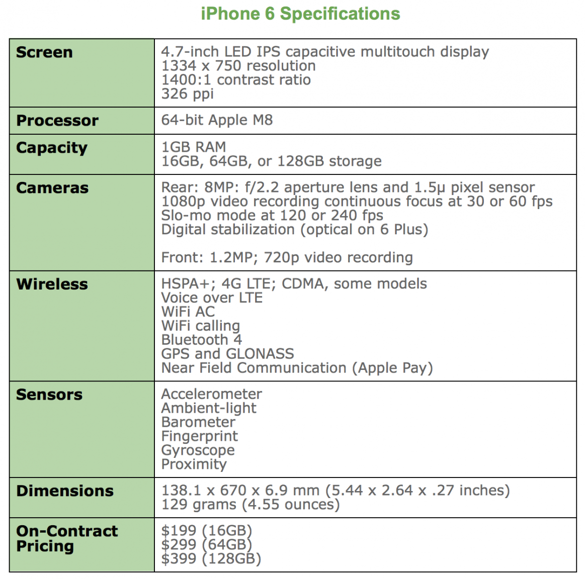
At a time when 1080p screens with 400 pixels per inch (or more) are the standard among high-end smartphones, Apple’s device is little better than 720p (1334 x 750) and 326 ppi, which is same as iPhone 5s. While most newer high-ends pack 5-inch or larger screens, the iOS device is 4.7 inches. When 16-megapixels is increasingly standard for mobile cameras, Apple’s handset is 8MP. By these and many other metrics, iPhone 6 offers less than competing handsets—Nokia Lumia Icon among them.
But by measure of benefits, Apple’s smartphone is in many ways superior. As such, this review is organized by them, rather than features. My metaphor for the difference. The sleeve placed around a Starbucks cup is a feature. Protecting your hand from burning is a benefit. While related, they are different.
Aesthetics
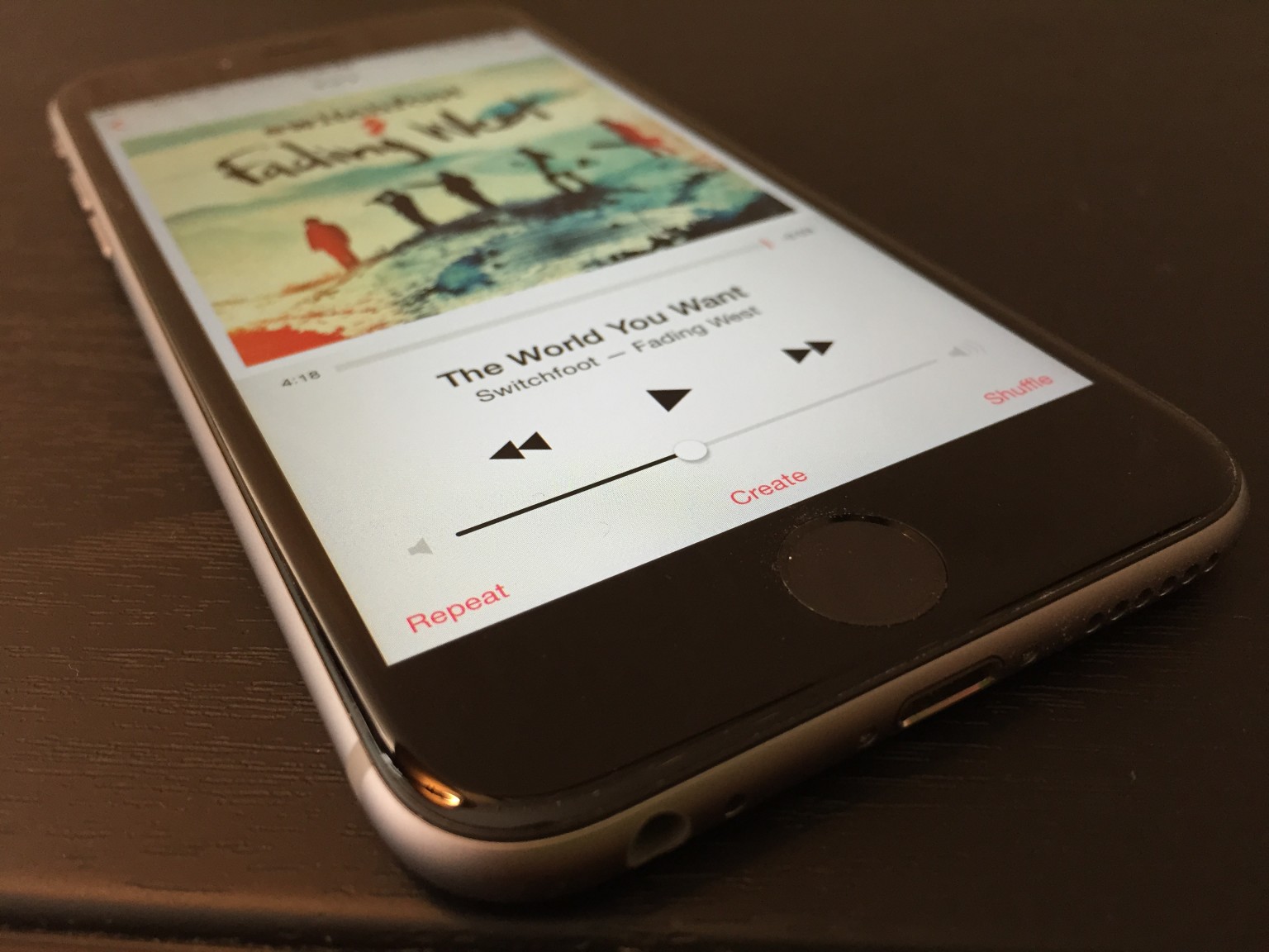
The design of both the 6 and 6 Plus is reminiscent of iPhone classic—the original sold starting in June 2007. Rounded corners and curvy frame are the visible characteristics they share. Other reviewers point to iPod touch similarities, which is true of thinness, but the prominent aesthetic—rounded corners—inherits from the original.
The similarities only begin there. iPhone 6 finely balances benefits against features in ways much like the classic. In 2007, Apple stripped back features available on other phones, such as 3G and MMS, to balance others: battery life and responsive interaction of the new sensors and touchscreen.
Balance is the overall design aesthetic and priority placed delivering benefits before the fanciest features. By the specs, iPhone 6 is inferior to the newest handsets from HTC, Motorola, Nokia, and Samsung, among others. Android and Windows Phone fans are quick to point out the lower specs, such as the “Welcome to 2012” meme referring to Google Nexus 4 features.
However, my experience favors Apple’s decision to deliver more by giving less. iPhone 6 is extremely enjoyable to use, and joy is a benefit often overlooked in tech design. How you feel using a device matters much more than how you think about features. There, balance—how all the features fit together to deliver benefits—and the device’s design mean everything.
iPhone 6’s design is understated, which is a long-standing Apple aesthetic (see my June 2005 analysis). I’ve seen some complaints online about the plainness and critics calling the top and bottom back bans ugly. Picky. Picky.
Plainness isn’t the problem. Apple is sometimes guilty of putting form before function, and this is where aesthetics can undermine usability. How a phone feels and how well it stays in hands and fingers are intertwined benefits. While I find that iPhone 6 feels quite good to hold and can be operated with one hand, the surface is too slick. I can’t get good enough grip, and the curved rather than flat frame is one reason why. This is the first iPhone for which I strongly encourage using some kind of case. This baby eventually will slip from your hands otherwise, and Apple should be faulted for squandering benefits.
Sight
The screen delivers some of any smartphone’s most important benefits. As such, I obviously wondered what the experience would be stepping down from Icon, which 5-inch display is 1920 x 1080 resolution and 441 ppi. Great, surprisingly. iPhone 6’s screen is brighter, offers greater contrast, and is more viewable outdoors—unexpected because the Nokia is quite usable in bright sunlight. These are benefits set against others, such as providing satisfactory battery life.
Nice touch: Standard and Zoom modes. For my ailing, aging eyes Standard is just fine, however.
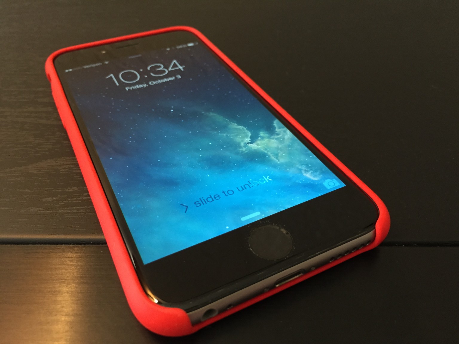
Pretty much anything viewed on the iPhone 6 screen looks superb. People upgrading from iPhone 3/G/GS or 4/4S might be overwhelmed by the spaciousness, while most 5/5s users will be pleased. If I can go down in screen size and resolution and be satisfied, surely someone moving up will be, too.
That said, my satisfaction somewhat slumped seeing the 6 Plus inside Apple Store. The differences are immediately obvious. The larger phone’s screen is crisper, the glass seemingly less reflective, and the desktop so vivid it looks painted on. I actually had to check to ensure I hadn’t picked up a dummy phone with paper mockup pasted on.
Some people will wonder why 1080p is Plus-only. Welcome to the Apple way. Since Tim Cook came on as COO and continuing as CEO, the company finely tunes product SKUs, often offering less one place and more somewhere else to maximize margins on the front end of the manufacturing cycle. Later, as the product lifespan extends, Apple iterates, by downstreaming capabilities from costlier iDevices or adding features that match or catch competing devices. Think of it as the “little better” method. Apple makes each new device a little better until the next, big release resets and starts again.
I explained the concept 5 years ago in post: “How Does ‘Incremental’ Define Apple?” Excerpt:
Apple engages in tried-and-true retail practice. It’s good business. Clothing stores take a similar approach. There are teens who must have the newest wears from Aeropostale, American Eagle, Gap, or Hollister at full price; they can’t wait for sales. They want to be cool…
As a product’s lifecycle progresses and Apple maximizes margins at the front end, incremental improvements begin. The company typically starts by improving the hardware for the same price. Later, Apple adds better hardware or features and cuts the price. Eventually, Apple retires the product and introduces another ‘one more thing’.
iPhone 6 is just that. Plus offers a little better, and 6 will get a little better during the next upgrade cycle. Meanwhile 5s with 16GB storage sells for $99 on-contract, or half what it did before its successor launched.
Sound
iPhone 6 gives great audio—if you attach headphones or speakers. But the tinny, internal single speaker lacks much, particularly when smartphones like HTC One M8 offer so much more. That said, placement on the bottom frame (in vertical orientation) assures that notifications and phone rings can be heard. On Icon, by comparison, a case can largely silence the back-facing speaker.

Connected to headphones, Beats Music or iTunes streaming sounds fantastic. There’s an immediacy to fullness and breadth of soundstage that’s good to a fault. For example, with quality cans—Grado RS1e—I hear imperfections in the encoding, which on some tracks my ears perceive as over-modulation or muffled vocals.
Photography
More megapixels is meaningless, as I have asserted for years. Apple wisely sticks to 8MP, which is the reasonable limit, because cameraphone sensors are tiny (I would prefer 5MP). The greater packed the sensor with pixels, the more artifacts and other aberrations appear in photos. Like iPhone 5s, the 6 offers 1.5 micron pixels, which, among other benefits, let in more light than the standard 1.1 micron pixels, which tightly pack on 16MP phone shooters.
The f/2.2 aperture lens is good choice, and in my testing finely balances with sensor and software. I can’t emphasize the importance of the latter and choices made when shooting and post-processing. In 2012, I used the 5MP Samsung Galaxy Nexus to shoot San Diego Comic-Con. One reason: The phone produced surprisingly good photos in low light, mainly because of the superb balance of features and wise settings choices made in auto mode. Something else: Google promised and the smartphone delivered instant-shutter response.
The catchup capability is one of iPhone 6’s best photography benefits, particularly in HDR mode. Shutter response is fast. Immediate. But there is more: In my early testing, iPhone 6 smartly chooses aperture, ISO, and shutter speed—and that’s best observed in low-light settings. Color accuracy and white balance are generally spot on.
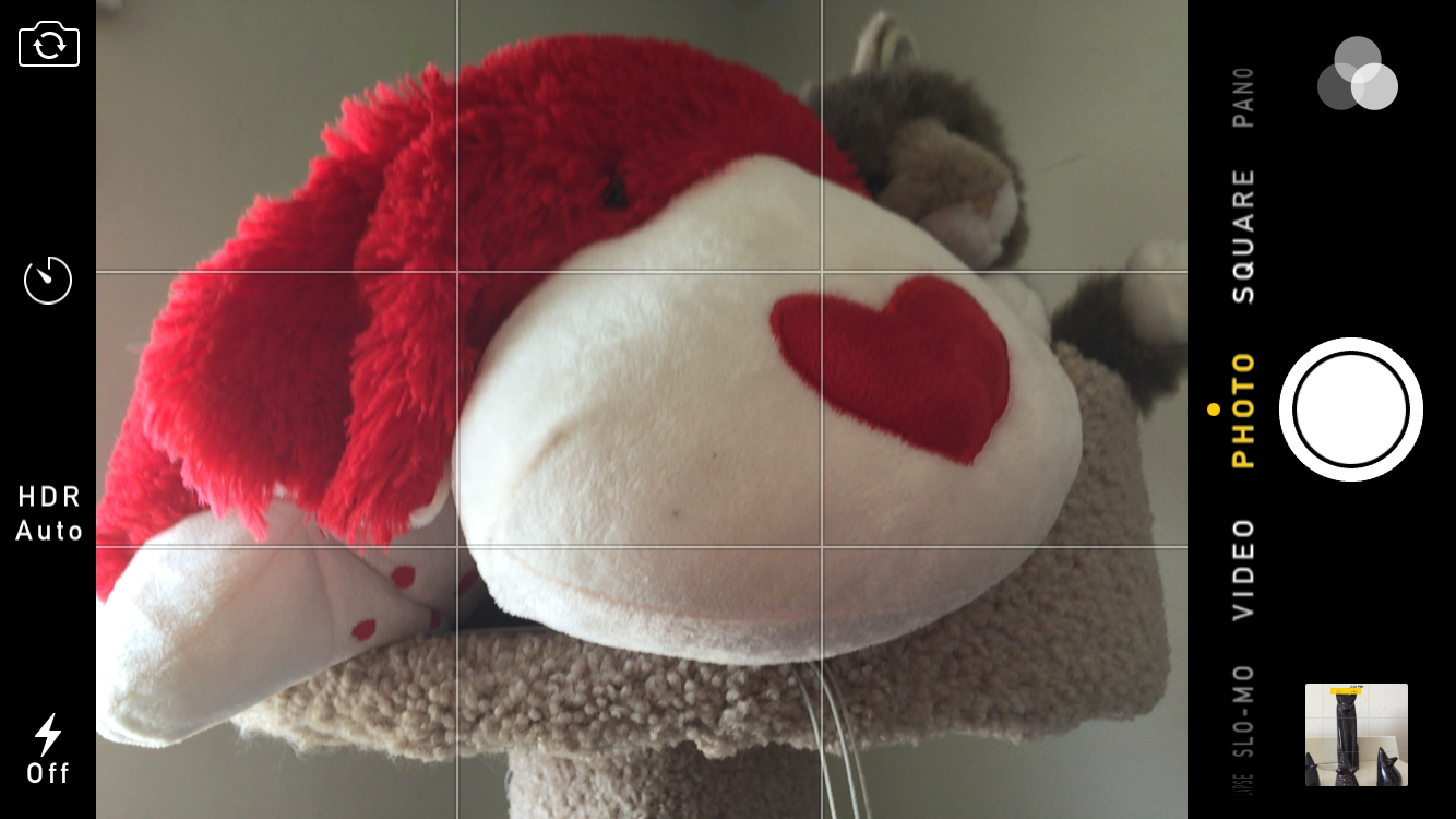
Most people are not professional photographers. They wouldn’t know f-stop from exposure compensation. Rather than presenting confusing controls and numbers, Apple provides a nifty slider for adjusting exposure—lightness or darkness the user sees in the screen preview. Just tap the display. Other niceties, many carried forward from iPhone 5s and iOS 7 or long available elsewhere, include auto stabilization, face detection, and panorama mode.
However, optical stabilization is only available on iPhone 6 Plus, which is an instance where a “little better” means a lot. The technology is rather nifty, using the gyroscope in conjunction with the lens, which position changes, to reduce camera shaking that often blurs photos. Jim Harmer’s Plus photo review is excellent primer for understanding the benefits. However, getting them means buying a considerably larger and heavier iPhone.
Reality check: Nokia phone cameras are legendary—and for good reasons. While Icon and iPhone 6 both produce excellent photos, differences matter—such as optical stabilization on the Lumia, which gives finer control when shooting images, offers via DNG a RAW option, produces superb images despite the 20MP handicap, and provides better post-editing options using Nokia software, such as ability to blur the background (e.g., produce bokeh) after taking the photo. Icon also has a dedicated shutter button. However, the device is a slower shooter compared to iPhone 6 or Google Nexus handsets.
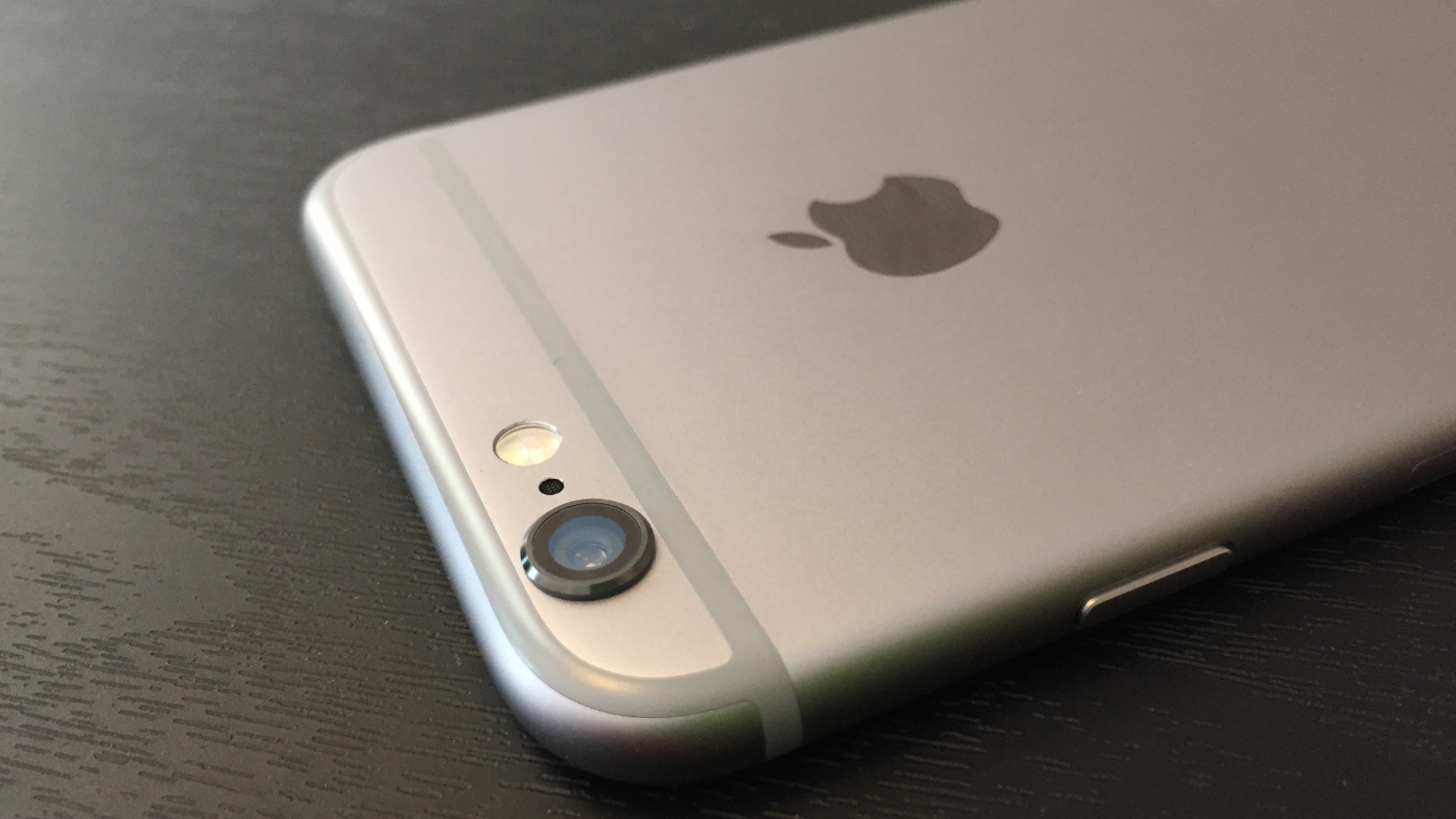
Most people will find iPhone 6 photography to be satisfying at the least. There is no non-pro compact camera with fixed lens—meaning without telephoto—that I would recommend over this smartphone. That said, in another form before function move, the handset’s body is thinner than the camera can accommodate, such that the lens juts out from the enclosure. It’s an unacceptable design compromise that puts the lens at greater risk of damage and is, unfortunately, another reason to buy a back-fitting case. By contrast, Nokia insets the lens on the Icon and nearly identical Lumia 930.
Videography
Apple delivers some nifty tricks shooting videos, and one is desperately-needed catchup: Continuous focus, a feature found on the Icon and Nexus 5, for example. Fixed focus is one of older iPhones’ biggest videography handicaps. On the 5 and 5s, you can tap to focus to start but there’s trouble if you or the subject moves. In my testing, iPhone 6 adjusts focus as promised. Finally!
Neat trick: Slow-motion at 120 fps or 240 fps, with the latter the default but only 720p. Slo-mo is super fun, but good luck easily exporting clips and keeping the slow speed. Direct upload from phone to YouTube is my method, as prescribed by phoneArena’s helpful how-to guide.
The videocam can capture 1080p at 30 or 60 fps, and the latter is beneficial for shooting moving objects or finer-editing later on. Time-lapse videography enables other creative options, and Apple claims something called “Cinematic Video Stabilization”, which supposedly lets you GoPro without buying one.
I haven’t yet conducted extensive tests of the audio, which for some strange reason is something too often overlooked by phone designers. C`mon, if the video is going to look good, it should sound that way, too. Nokia claims four directional microphones on the Icon (and 930) that can produce some smashing sound shooting vids. If iPhone 6 audio with video is as good as 5s, it’s enough.
Some advice: If camera and videography matter most to you, and nothing else, the Icon and near-identical Nokia Lumia 930 are my recommendation, rather than iPhone 6 or any other smartphone (even Nokia’s 41-MP shooter). However, as will be explained shortly, considerations like apps availability and supporting ecosystem make Apple’s device the better choice for most people. By the way, for anyone wanting 4K video-shooting capability, most major phone makers offer it, including Samsung and Sony. iPhone 6 won’t satisfy your 4K dreams.
Longevity
Question everyone should ask about a smartphone: “How long can I use it before the battery dies?” Strangely, I don’t have an answer after two weeks using iPhone 6. My best response: Long enough. Time period between charges is so great, I can’t keep track.
Apple claims 24-hour talk time over 3G, 14 hours watching videos, or 12 hours Internet over LTE or WiFi. I care about shooting photos and videos and uploading them to the cloud, while rumbling across social networks or using mapping programs. These functions are more meaningful measures—and in my random, incomplete testing I easily get through the day with juice left over.
Responsiveness
Performance is an important benefit, and subjectively either elicits joy or generates frustration—and the latter emotion is one every manufacturer should avoid. I smile and assume you will, too: iPhone 6 is speedy enough, even short a couple cores compared to most other high-end smartphones. Either scrolling or opening apps and browsers is fluid and fast.
If you’re looking for benchmarks, apologies but there are none here. They are for geeks hung up comparing features rather than looking at benefits. What matters more: How the device does daily tasks that are most important to you. By that measure, I have no complaints about subjective speed. However, I would say same about iPhone 5s. If you own the device and performance is your major buying criteria, expect to be surprised by the subjective speed sameness.
Sizing up the Digital Lifestyle
Smartphones are not isolated devices. If they were, I would use Nokia Lumia Icon today for photography and videography benefits. Companies like Apple, Google, and Microsoft sell lifestyle platforms around which someone builds stuff. Windows Phone is the weakest among the majors—Android and iOS being the other two. Apps choices aren’t as mature, and cloud offerings are comparatively meager. For example, homegrown Apple and Google apps and connected services are absent.
Don’t like Internet Explorer on Windows Phone? Suck it up, there’s no Chrome for you. But Google’s browser is available for iOS. YouTube? Google Now? Google Maps? Nada, nada, nada. But all are available on iOS as well as Android, and, honestly, they look and use better on Apple’s platform. Sure, Google sometimes sprinkles more features into Android apps, but in my testing their iOS counterparts give better benefits.
Apple is the Switzerland of mobile apps and cloud computing. I call iOS the “eat your cake and have it, too” platform. You can jump into the Apple lifestyle, while choosing from Google’s and Microsoft’s too. Meanwhile, the majority of the newest, third-party cloud-connected lifestyle apps are available for Apple’s platform first. Yum. Yum.
Google groupies will wave the comparable number of Android apps and selection. But it’s not how many but which ones that matter. Number of apps is a feature, while meaningful selection is a benefit. The most useful Android apps also are available for iOS, or exclusively. These factors greatly influenced my decision to abandon Icon for iPhone 6—and I could as easily picked an Android.
Let’s cherry-pick pieces from the Apple lifestyle, which would be relevant to any iPhone 6 buying decision:
Command me. iOS gives good speech-to-text capabilities, like Android and Windows Phone, but Siri, still sucks. If she was a living employee, the company would have fired her long ago.
Even without Cortana, the Windows Phone 8-packing Icon gives meaningful and helpful answers to voice requests. For example, my 92 year-old father-in-law is at that age where someone thinks lots about the past. So we look back together, every day. When I ask Windows Phone for “This day in history”, Bing search produces a relevant list, the first link to history.com. If I say exactly the same to Siri, she often brings up the address for a museum in another town.
But I have little praise for Microsoft here. In the past, when Siri couldn’t directly answer a question, I relied on the web searches she presented. But with iOS 7—and, sadly, carried forward to iOS 8—Bing is the search engine. Sorry, Google delivers more meaningful results.
Griping aside, Siri will get you around town and provide relevant, contextual information—there, Apple Maps is a help rather than hindrance (no more misdirections). She’s not as proactive as Google Now, but as such not as snoopy. There’s something stalker-like about Big G’s app/service that creeps me out.
Call me. iPhone 5s offers HD calling, which T-Mobile supports. Successor 6 serves up Voice over LTE, which on Verizon is oh-so much better. There are two benefits when the feature is enabled in Settings:
- CDMA users can call and Internet at the same time (something GSMers have done for ages).
- Call quality is crystal clear—such beautiful voice, the person on the other end sounds like a radio announcer.
Additionally, Apple claims support for “up to 20 LTE bands”, WiFi is AC, and WiFi calling is available (from carriers offering it).
Granted, talking is like the last thing many people do on cell phones any more. But those who do will delight in these benefits.
Cover me. As the Switzerland of mobile platforms, iOS offers the best cloud cover of them all. These benefits aren’t exclusive to iPhone 6, but I would be remiss ignoring them, since they’re core to any digital lifestyle. Simply stated: Connected-apps are aplenty.
For simplicity, let’s focus on the Apple Way. New to iOS 8 is iCloud Drive, a feature you shouldn’t enable unless using Yosemite on a Mac, which I am. Doing so will cause problems accessing stuff stored on iCloud from other devices. The service is almost simple to a fault, because it’s not obvious on iOS devices; access is from apps rather than a file manager (which is available on Yosemite or iCloud for Windows).

iCloud Drive finally catches competitors offering content access anytime, anywhere, and on anything (well, for the latter if an Apple-supported platform). Sync is excellent, in my limited testing. “Set it, and forget it” is the design ethic, an attribute that made the original iPod so compelling. Simple sync is a huge benefit, and it works well with other Apple apps and services, such as calendar, contacts, and mail.
I’m puzzled by Apple selling new iPhones with so much storage while offering so many benefits in the cloud. I’ll reason that one out for a future analysis, perhaps.
Share me. With this platform release cycle, Apple introduces a goddam useful feature that surprisingly is overlooked in press coverage and reviews: Family Sharing. Think of it as “fair-use” applied to personal, digital content. I’ve complained for years about ebooks, music, movies, and the like being tied to a single account and not easily shared. Hey, mom can buy a CD or DVD and let the kids watch or lend it to grandma—but not her digital downloads. Sharing is a humungous benefit.
According to Apple: “Once you set up Family Sharing, family members get immediate access to each other’s music, movies, TV shows, books, and apps. Download what you want with a tap anytime you like. All without having to share an Apple ID or passwords”.
This benefit alone is reason to consider iPhone 6 or another iOS device and Apple’s reward to long-time content buyers. Six people can share.
Pay me. I haven’t tested Apple Pay yet, because the feature isn’t available but supposedly releases this month. iPhone 6 includes a NFC chip for the Touch ID-to-pay system, around which there is surprising support. My bank and credit card are on board, as well as some of my favorite retailers. It’s anyone’s guess whether or not this thing succeeds, but you will want either of the new iPhones to use it.
One More Thing
If this was “Edge of Tomorrow“, I would reset and not buy iPhone 6. I would purchase 6 Plus instead. But it isn’t an option. The device is sold out just about everywhere. My local Verizon store says none are expected there until late October or sometime in November, which is well outside my 14-day return window ending today. Oh well. I’m satisfied enough with iPhone 6 and believe that most buyers will be, too. Well, unless they wanted Plus and couldn’t find one.
Some people will label me a flaming fanboy for liking iPhone 6. I refer them to others calling me anti-Apple. Take your pick, but pay attention this: I am first to concede that by the specs iPhone 6 falls short of most major competing smartphones, including the Nokia Lumia Icon that my sister now loves.
Specs don’t matter and distract from what does. A smartphone isn’t the sum of its features but balance of benefits. Apple understands this principle and handsomely applies it to iPhone 6. Google gets it, too, which is why Nexus devices are so good. Which is better? The answer depends on what benefits you need more.
Editor’s Note: A version of this review appears on BetaNews.
