Finely balanced and contextually practical are the terms that best describe my first impressions of Google’s flagship Android. Nexus 6P preorders are about to ship, and I was fortunate to receive a review model but with short embargo lift: Delivered Oct. 16, 2015 before every blogger and reviewer on the planet blasted out simultaneous reviews and first-reactions on the 19th. I choose the latter, because a scant three days isn’t enough time to rightly evaluate the smartphone.
Much of my experience is cast in moving from the previous flagship, Nexus 6, although there was a day between them where iPhone 6s Plus and I fitfully danced. The 6P is in many respects what its predecessor should have been: Smaller. Much as I like the larger Motorola-made phablet, its Huawei-manufactured successor has greater physical and feature balance. Both are superb smart devices, but the newer Nexus is better tuned to practical purposes.
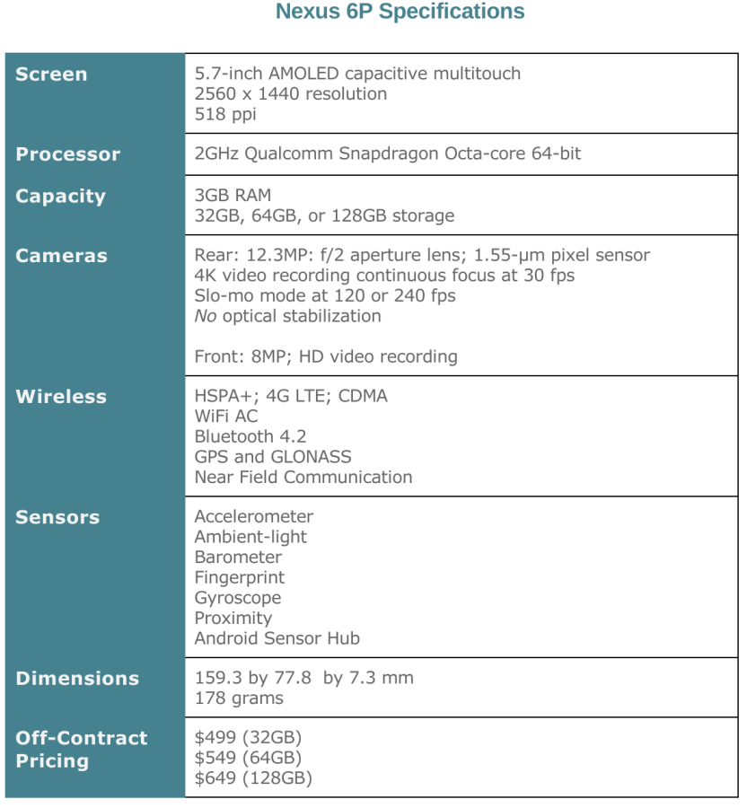
Consider dimensions. Nexus 6 measures 159.3 x 83 x 10.1 mm and weighs 184 grams. The 6P is 159.3 by 77.8 by 7.3 mm and weighs 178 grams. The difference in width and depth supporting the 6-inch display make the Motorola much more cumbersome. The Huawei is flatter and thinner, although the screen real estate is less at 5.7 inches. I expected to be put off, because the bigger display is so useful, but better balance in the hand— 6P is more comfortable to hold and less lofty to maneuver—is a huge benefit.
In portable devices, physical balance is everything.
On Balance
Nexus 6P is not a remarkable-looking phone. Its design is unassuming; understated. As such, I didn’t exactly coo taking it out of the box. But upon closer examination and handling, I quickly appreciated the smartphone’s charms. In many respects, again qualifying three-days impression, Nexus 6P is exceptional by being unexceptional.
The human concept about exceptionality is one thing done well: You’re an Olympic runner, stock broker maven, or gifted surgeon. But in product design exceptionality is something both more and less—this is particularly true for personal tech devices used every day. The exceptional thing stands out not for the one attribute but the many combined. That is: How they balance.
Consider your automobile. Balance is hallmark of design, starting with aerodynamics and how the vehicle turns. An aerodynamically unbalanced auto will vibrate or burn fuel faster. Likewise, an unbalanced dSLR camera will be clumsy in the hand when telephoto lenses are attached, if design isn’t balanced.
That’s physical balance. Another type is just as important, and that’s the balance of features against benefits. The two are often confused, when they are so clearly separate. My favorite metaphor: The holder that goes around a Starbucks coffee cup is a feature. Keeping your hand from burning is a benefit. While related, the two things are different. Not all features deliver benefits and some can take away from the user experience—like when, say, GPS and mapping app rapidly drain a smartphone’s battery. In good design, balance of benefits is even more everything.
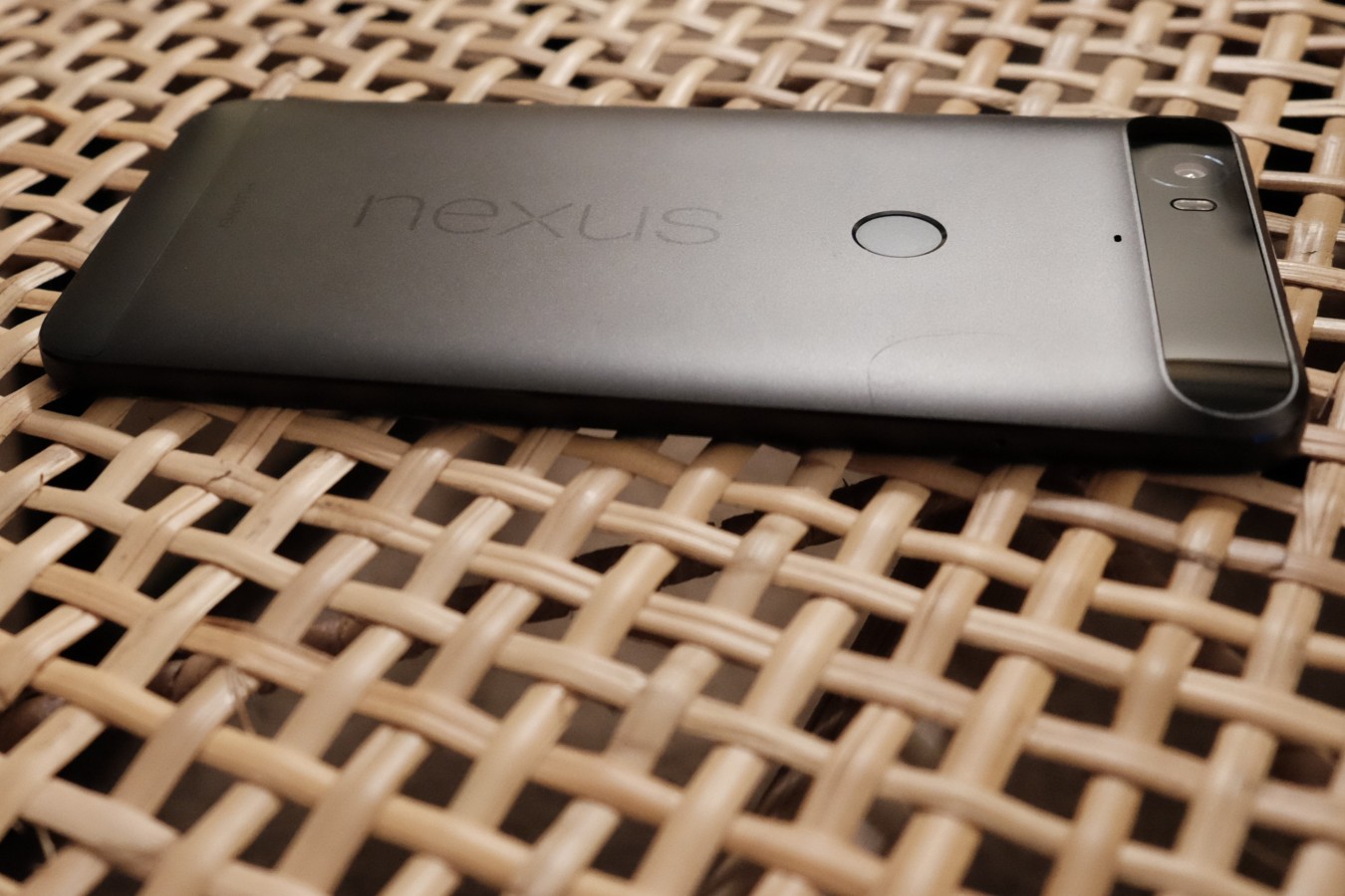
Nexus 6P has excellent physical balance and feels comfortable in the hand, even when moved around quickly. The aluminum enclosure is a bit slicker than I prefer but not so much that I would encase it. I carry the handset bareback.
On Benefits
For the rest of this arguably first look, I will focus on features and benefits that made an impression. Because, again, three days is not enough for meaningful review. That will come later some weeks or even month(s) from now.
Setup. Google really disappointed me during the migration from Nexus 6. Setup prompted to use feature “Set up nearby device” to move my settings and stuff. Oh, yeah, baby! That’s a feature on 6P running Android 6 Marshmallow but not one I could find on the older phone, which runs Lollipop. Still, The Huawei device easily restored apps and settings from online backup. I would have liked text messages, too, but the process was still easy enough even though not as excitingly simple or as complete.
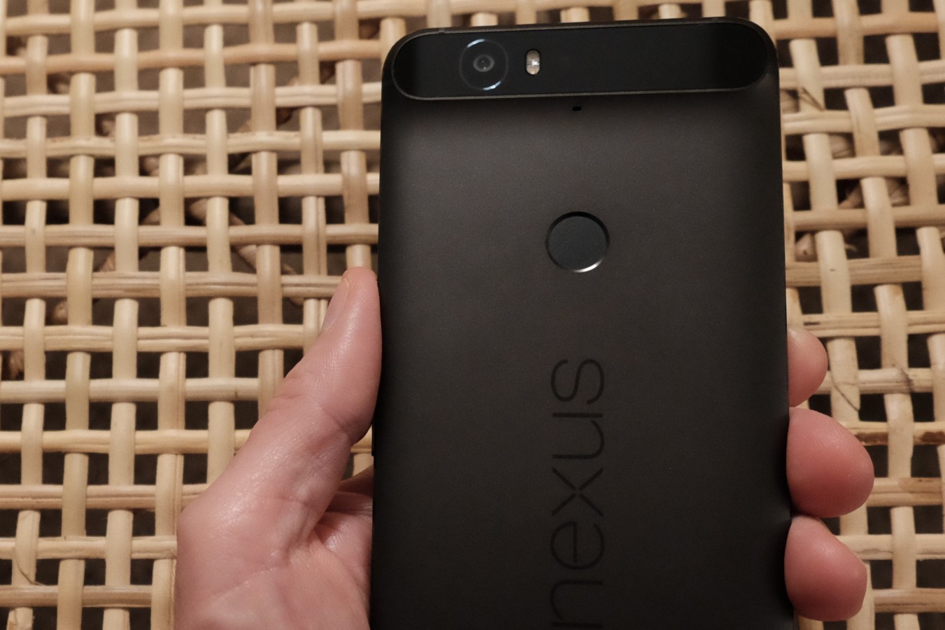
Nexus Imprint. The first physical feature to wow me hides behind the phone. About three-quarters up the back is a circular sensor sized just right for my forefinger. Google calls the thing Nexus Imprint. Picking up the device and placing my forefinger on the round indentation wakes and unlocks the 6P; the feature is also available on Nexus 5X. The sensor is finely sensitive and brilliantly balances benefits—hardware against software. With respect to balance in design, the sensor is perfectly placed. My finger finds it easily and quickly.
If there is a flaw with the fingerprint sensor it is the great sensitivity. I carry phones in my right front pocket and tend to mindlessly caress them when walking, or standing for prolonged periods. The action could bring my finger in contact with the sensor and activate the phone. Imagine the embarrassment of accidentally ringing someone about whom you are griping with another person. I can envision such scenario occurring. Google or Huawei could confirm, but you’ve been warned.
Life-changing is how I describe the fingerprint sensor. I am more likely to grab the smartphone because waking and using is so much easier. Benefits also need purpose, and Nexus Imprint is big with it.
Controls. Like other Nexus devices, Huawei places power and volume controls in the upper right side of the phone when held in portrait orientation. Apple puts the volume buttons on the left, which I prefer. While I am right-handed, I hold a phone in the left, which frees my dominant hand to do other things. Held against my left ear, volume controls are inconveniently positioned. I would prefer to manipulate them with my thumb, as can be done with iPhone. My preference; you might feel differently.
Now On Tap. Other controls also are where you would expect them. But the virtual Home button gets new capability, which also will be available to other Nexuses running Android 6. Google calls the feature Now on Tap, which is a misnomer. The feature activates with a short press, not a tap. The action brings up Google Now info cards that offer contextually-meaningful information that is relevant to what’s on the screen. Maybe it’s an app, email message, or webpage.
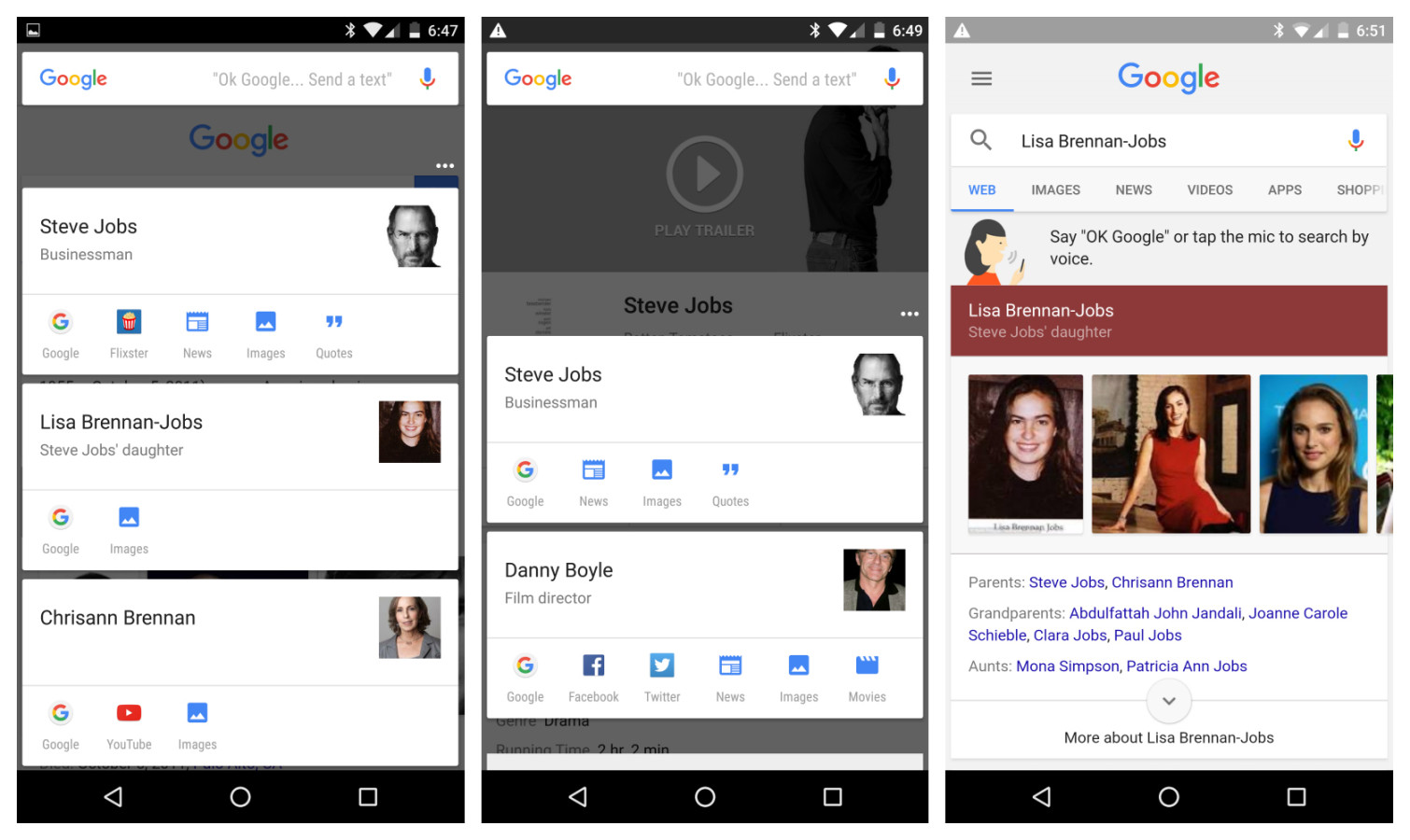
Since the movie “Steve Jobs” opens in theaters nationally this week, and Apple’s cofounder is such an iconic figure, I searched for his name; timely enough, right? The far left screenshot shows the info cards presented by Now on Tap. I clicked the Flixter icon, which opened the app, then long tapped again from within (middle). Tapping the info card for Jobs’ daughter brought me to the final screenshot you see.
Now on Tap is another life-changer. In just three days, I frequently use the feature. Google search and informational services take on usefulness unlike any previous experience with them. The utility is fantastic, although limited. Too often, I am greeted with “Nothing on Tap”.
Against the unassuming design, Nexus 6P is a canvas across which Google paints context.
Voice assistance. Another control, but with no buttons: Improved voice response, which Google pioneered on Nexus One, released in January 2010. In another feature not exclusive to the 6P, Marshmallow extends voice response to apps supporting it. I said: “OK, Google, play the ‘Steve Jobs’ movie trailer”. The smartphone bellowed: “Here you go”, then YouTube launched and started streaming what I asked for.
My problem, and perhaps yours will be: Figuring out which apps support the feature.
Apple is all wrong obsessing about touch—it’s an anachronism. Touchless interaction is the future of computing. Just think “Star Trek” the Original Series. Google illuminates the more sensible user interface, even though it’s a work still in progress.
Screen. Resolution is 2560 x 1440, same as Nexus 6, but 518 pixels per inch compared to 493. Text is crisp, which is as much about Google’s font selection. Visually strong elements look gorgeous. An ambient mode dimly lights the screen when you physically move the phone or there is a notification.
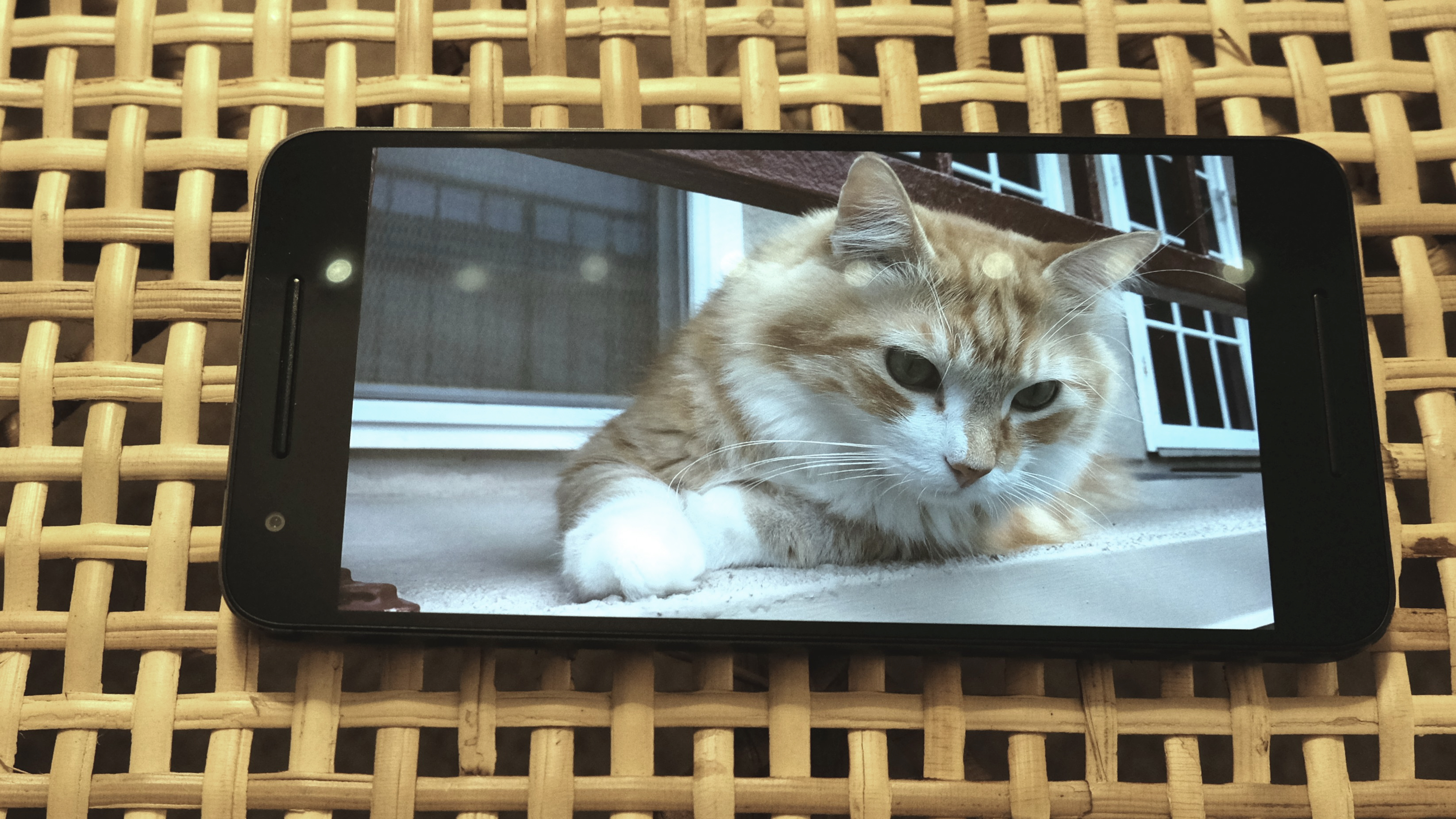
Audio and video consumption. On October 17th, I conducted some quick video comparisons between the Nexus 6P and iPhone 6s Plus. My purpose was audio—to see how the front-facing speakers sound alongside the Apple device’s single grill. Separation and definition are superb and the overall clarity is pleasing. But the video differences captured more of my attention. The 6s Plus skin tones are more accurate but dull. I find the 6P video renders to be warmer and richer.
I also plugged in my Grado RS1e headphones and listened to music on the Tidal app, which streams music losslessly. Oh my. I could hear more detail compared to either Nexus 6 or iPhone 6s Plus, which was quite unexpected. That, again, demonstrates finely-tuned balance between hardware and software—in this instance audio processing.
Photo and video shooting. Many people will want to know about the cameras’ capabilities—front and back, which I at this early stage have given light testing. My initial impression: Most users will be satisfied. But the shooters need more thorough testing before (or if) receiving my seal of approval.
The rear camera is 12.3 megapixels at aperture f/2. Larger pixels on the sensor, not more megapixels, is better: 1.55 micron pixels, which with the aperture promises excellent low-light performance. The front camera is a generous 8MP at f/2.4; 1.42 micron pixels.
The rear camera will capture 4K video at 30 frames per second. Slo-mode is available at 120 fps or 240 fps. Circling back to balancing features—here, software, hardware, and services—is Google Photos. Functionality doesn’t much differ from Nexus 6 or other Androids. But new and upcoming features, like automatic photo and video sharing among invited groups, emphasize simplicity and hide complexity.
Performance. The best two measures of a device’s balance of features are responsiveness and battery life. Starting with the former: Wow. While Nexus 6 is by no means a slowpoke, its successor is a perky performer. “Blink and you will miss it” is the metaphor. Marshmallow is silky smooth running on the 6P.
Under the hood is a 2 GHz Qualcomm Snapdragon 810 (v2.1) 64 bit Octa-core processor and Adreno 430 graphics chip. RAM is 3GB. My review unit has 64GB storage, but 32GB and 128GB options also are available.
Battery. I can’t say much because there hasn’t been enough testing time. I received Nexus 6P around Noon on October 16th. Setup and sync consumed massively. I write this sentence at 8:45 a.m. PDT on October 19th, with one charge between and 14 percent remaining. Uh, that sure looks damn good to me. Battery capacity is 3,450 mAh, and Google claims topping off for 10 minutes extends life by 7 hours. Oh, Baby.
Google. One more feature/benefit remains: Increased integration with search services and those related to it. You can see for yourself in Settings, where Marshmallow presents “Google” under “Personal”. You are given tremendous (presumed) control over privacy, security, and who gets to see what about you. For example, in a twist on Apple’s allowing ad blockers, Google gives you direct say-so. Under “Ads”, Marshmallow lets you “instruct ads not to use your advertising IB to build profiles to show you interest-based ads”.
That’s a wrap. I generally like Nexus 6P, which is available in three colors: Aluminum (silver), graphite (black), and frost (white). This is going to be my full-time smartphone for the foreseeable future, which will enable a thorough, real world review later on.
Editor’s Note: A version of this review appears on BetaNews.
