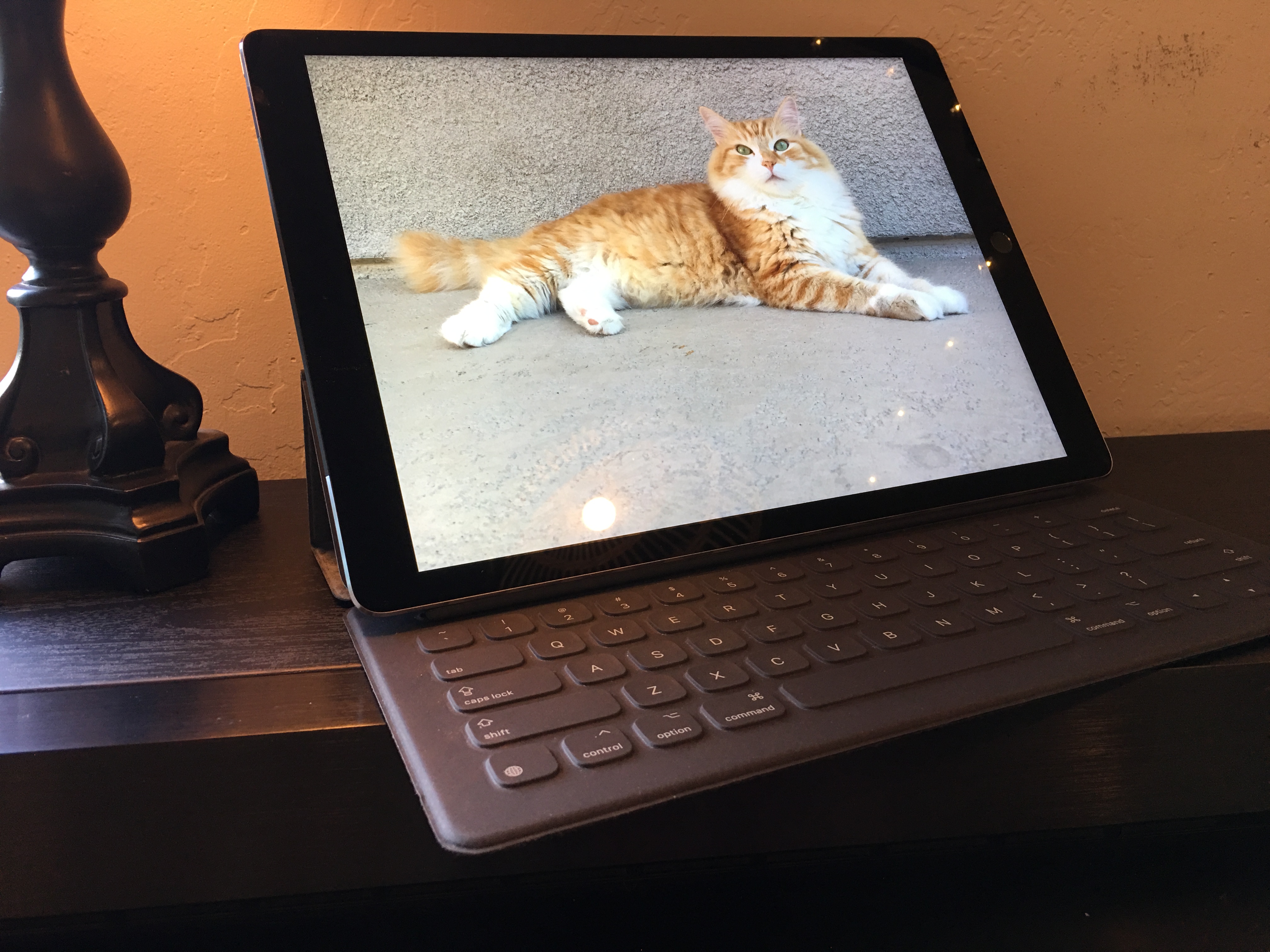
Day 10, and it’s difficult to wonder where nearly two weeks went. Yet here I am with iPad Pro, and more settled than last weekend, when griping about how the tablet frustrates me.
I want to start by discussing Apple’s Smart Keyboard, which is a $169 accessory that I recommend for everyone who doesn’t plan on using fingers and Pencil as primary, ah, utensils. Typing is amazingly smooth and accurate. The keys present terrific travel, without requiring too much force while still giving plenty of tactile response. Shocked best describes my reaction to the experience. Sometimes what’s missing brings something more: Ommission of the trackpad, which either is brilliant conception or Apple chief designer Jony Ive and team getting goddamn lucky.
By removing all that wasted space given to the trackpad and spread around it, the keyboard is closer to the body and arms, which I find improves posture, reduces stress on the wrists, and increases overall typing accuracy, Somrthing else: Proximity creates intimacy with the tablet you won’t have with a laptop.
Additionally, the shorter distance overcomes the great usability flaw with vertical touchscreens: Guerilla Arm, which primary is an aching ailment of the biceps. Reaching to touch the screen is more moving the forearms forward. Had Apple included a touchpad, and thus increased the reaching distance to the screen, Guerilla Arm would surely result (as it does on laptops). By accident or design, what’s missing is something more.
The 12.9-inch Retina Display, with 2732 x 2048 native resolution at 264 pixels per inch, is super sharp, while colors and contrast pop off the screen. What I ike best: The 4:3 aspect ratio makes the display more square than rectangular, expanding the landscape for content. Webpages and apps present beautifully, with a caveat. Websites stuck in the 1024 x 768 past present oversized everything. The worst offenders render mobile sites only optimized for smaller screens and/or lower resolutions. Meaning: They don’t scale. Same applies to apps, too many of them, that need resolution/scaling tweaking. Are you listening, developers?
Touch overall impresses, much as I would expect from an iPad but with greater urgency. If the Pro is to be a PC replacement, not companion, and one without a trackpad, touch needs to be accurate. Where your finger goes the cursor must follow, and it does most of the time. Touch responsiveness is best of class and almost mind-reading.
In landscape mode, touch is more intimate than other iPads, when using Smart Keyboard. Because of the screen’s proximity, I can rest my forearms on the desk and reach most everything necessary primarily using thumbs and also first two fingers. That positioning makes faster the processing of messages in Apple Mail, for example. Other apps, and even general navigation, benefit, too.
iPad Pro presents a split-screen view but no windowed apps for multitasking. That said, the aforementioned proximity to the screen makes moving among app icons a fairly fast, and not at all cumbersome, activity. Manually switching apps/tasks isn’t the hardship that I had anticipated.
[lightgrey_box] Also in this series:
- “Meeting Apple’s Big-ass Tablet“
- “iPad Pro is Bigger Than You Think“
- “How Apple iPad Pro Frustrates Me“
[/lightgrey_box]
Performance is another stunner. Years of PC-configuration mentality must be put aside before considering the tablet as possible primary personal computer. There’s Apple’s A9X chip, 4GB memory, and 128GB storage set against laptops with Intel Core processors, 8GB (or more) RAM, and as much if not greater SSD. Comparison is less, less, less. But responsiveness is more, more, more. Damn, does this tab feel fast.
That said, iOS idiosyncrasies are in place. When resources shift to one thing from another, something is left behind. I learned when letting be browser tabs with text input but not saved to, say, WordPress. Going back to the tab, refreshed it, wiping away my input content. That’s behavior I hadn’t seen on Android tablets, although Chrome OS can idle and refresh browser tabs leading to similar result.
That gotcha aside, everything about iPad Pro is perky. Buzzing around my brain: What if Apple bridged its tablet/laptop gap by shipping 12-inch MacBook’s successor with A9X chip instead of Intel Penitum M. The little laptop is mighty speedy for its size and processor class. A9X series would differentiate MacBook from every other thin-and-light laptop.
Moving along to Pencil, a $99 add-on, I’m impressed based on my limited testing, with two caveats: I need to work more with the stylus, and I am no artist; someone who draws would better evaluate the input device. But I recognize the promise, which will get fuller treatment in a follow-up post. For now: IPad Pro presents in its 12.9-inch display a broad canvas upon which artists can draw or annotate.
Wrapping up, I’m not in love with iPad Pro, but I like it more each day. Some of the quirks are devastating to the typical workflow that is easily achievable on a laptop. These topics will get fuller treatment later on in this series. As my month with iPad Pro progresses I increasingly see that more can be achieved by adapting habits and accepting the user experience for what it is rather than what it is not. I learned that from seeing the many benefits presented by removing the trackpad and Apple’s design choices doing so, for example.
While the tablet has been in my possession for 10 days, I placed the order earlier. February 13th is when I must decide to keep iPad Pro, and continue this series, or return within the 14-day buyer’s remorse period. Installment five will reveal which choice I made (or will make).
Editor’s Note: A version of this story appears on BetaNews.
