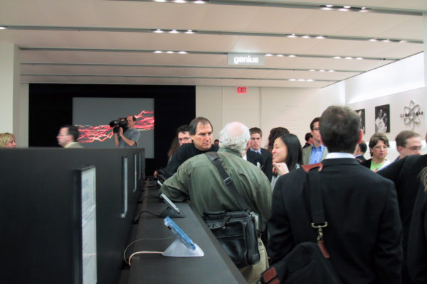
Fifteen years ago today, the first Apple Store opened at Tysons Corner Center in McLean, Va. I was there, covering the event for CNET News. Four days earlier, then CEO Steve Jobs briefed journalists—bloggers, bwahaha, no—across the way at upper-scale Tysons Galleria. Most of us thought his scheme was kind of nuts, as did analysts, and news stories reflected the sentiment. Recession gripped the country and rival Gateway was in process of shuttering more than 400 retail shops. Timing was madness.
But companies that take big risks during economic downturns are most likely to reap rewards later. Retail would be Apple’s third walk across the tightrope during 2001. The others: iTunes (January); OS X (March); iPod (October). I’ve said before that these four are foundation for all the company’s successes that followed, including iPhone. But 15 years ago, battling the Wintel duopoly with less than 2 percent global PC market share, Jobs figuratively walked a tightrope across the Grand Canyon carrying original Macintoshes in each arm.
Risky Business
Apple’s cofounder set an ambitious goal of achieving 5 percent global PC market share by selling a digital lifestyle around the Mac and supporting software as a hub. He also sought to promote the fruit-logo brand in high-traffic locations. For example, when Apple Store opened, Tysons Corner Center averaged about 57,000 customers a day—or more than 21 million shoppers a year. He also wanted to take control of the sales process, which often was lost in computer stores, where Windows PCs reigned king.
A decade-and-a-half later, Apple’s PC marketshare is 7.4 percent worldwide and 13 percent in the United States, ranking fourth in both regions, according to IDC. Not that the achievement much matters. Success selling iPhone eclipses the Mac and accounts for the majority of Apple revenues; 65 percent during fiscal second quarter 2016.
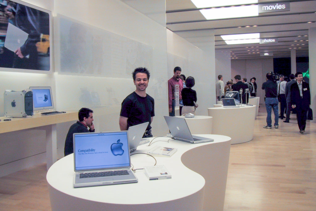
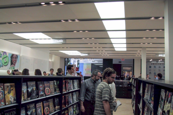
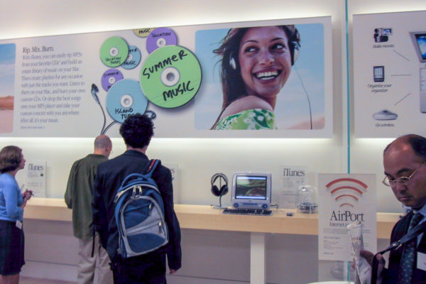
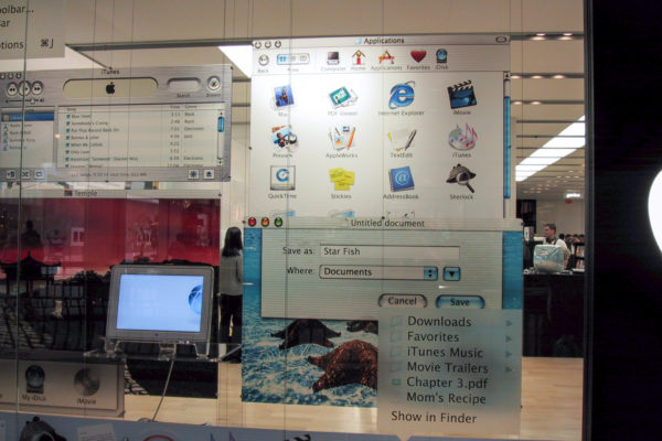
Apple Store’s look was unique and quite distinctive in 2001, particularly for a shop selling computers. The style is widely imitated today. Here’s how I described the Tysons shop 15 years ago today: “The store sports hardwood floors, high ceilings, bright lights, and clean lines—similar to the look of the trendy clothing retailer Gap. The similarity is not surprising, considering Mickey Drexler, CEO of the Gap, is a member of Apple’s board”. San Francisco-based Fisher Development, which also constructed Gap stores, built the first Apple retail shops. “Contributing to the clean look of the store is the lack of network cables connecting computers to the Internet, as Apple has incorporated AirPort wireless networking to link Macs and other products to the Net”.
The high ceilings and wide space—4,500 square feet—made Apple Store No. 1 feel more open and less cluttered than other computer stores of its day and many even now (except for copycats like Microsoft Store). The shop’s design then and now is consistent with Apple’s generally understated approach to design. Even the more grandiose shops featuring walls of glass are understated, as much now as Tysons was 15 years ago.
The only bright colors are found on marketing materials placed throughout the store, including info iPads placed alongside Apple branded gear. Otherwise, the tasteful stores are quite stark, so that the shoppers’ eyes are drawn either to the colorful marketing posters and signs or to the products on sale. Low tables draw shoppers’ eyes down to the products. Goods placed at eye level actually create distraction—there is too much else to see. Apple used the low-table concept well at the Tysons store and improved it in following redesigns.
Repeating and expanding on Job’s previously stated goals, Apple Store was about five things:
1. Exposing more people to the Apple brand and products.
2. Inviting new users to the Apple experience—the Apple community.
3. Providing a place where Apple could showcase the benefits of the Mac lifestyle.
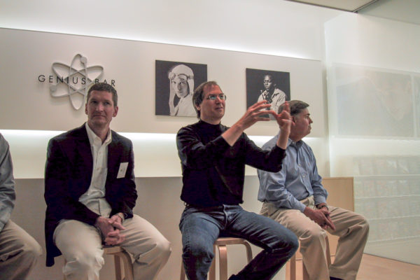
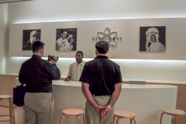
4. Through the Genius Bar, giving customers a place to come to for technical assistance.
5. Honing Apple manufacturing and distribution, which would later benefit products like iPod and iPad.
Four Quarters
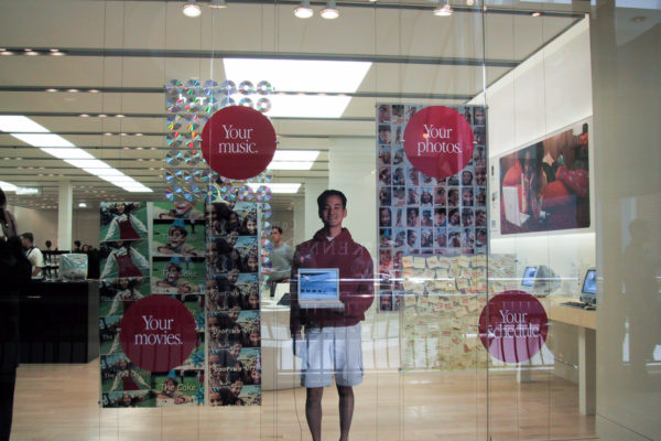
The store’s design reflected these five goals and the layout organized into four distinct quadrants. The first quarter, Home and Pro, featured Macs for business—Power Mac, Power Mac G4 Cube, and PowerBook G4—and iBook and iMac for home.
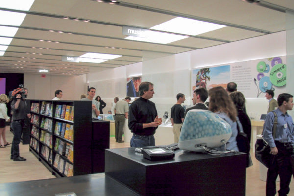
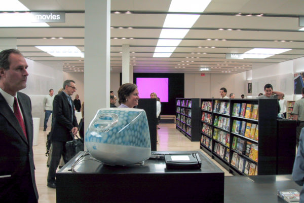
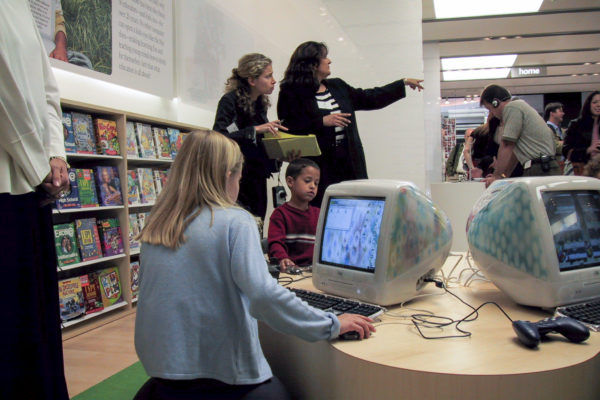
Music, Kids, Movie, and Photos made up the next two quarters, what Apple called Solutions, where the tots could play games on iMacs, shoppers could use digicams to take photos and make movies, or people could create music CDs. “You can make a movie in the movie section”, Jobs said during the May 15, 2001 press briefing, or “burn a CD right in the store” to take home. Such activity was simply unheard of anywhere in computing retail at the time—make it, burn it and take it to go. Related, Jobs said that shoppers would be encouraged to take time using Macs to do these activities. About 18 months earlier, Apple’s CEO started pitching Macintosh as the aforementioned “digital hub” for creating content. Letting people play in the stores helped introduce Windows users to the Mac lifestyle. Of course, Apple stores are so busy today, it’s difficult to play this way.
Down the store’s middle was Software Alley, where Apple also displayed six models each of digital cameras, digital camcorders, MP3 players, and PDAs. Anyone remember Palm handhelds or Rio music players? Apple once sold them. Software Alley is long a relic of the past. Apple has relegated software to the side walls—what little there is. Mac App Store inside OS X offers cleaner, faster distribution.
The final quarter, at the back of the store, was strangely themed Etc. This is where Apple placed larger peripherals, such as printers and scanners, a huge gallery with 10-foot video screen (for software and video demonstrations) and the Genius Bar. Long gone: The red phone—or “hotline”. Jobs said that if the Genius couldn’t answer the technical question, he or she could phone for help. It was a cute marketing gimmick supplanted by Web search. Fifteen years ago, people walked up to the Genius bar, sat on a stool and asked for help. Today, they must make an appointment first.
Five Quarters
On this day looking back, past meets present. Apple announced the opening of a new flagship store, in Union Square, San Francisco, Be there 10 a.m.. local time, May 21 for the grand opening, if you’re local. The shop adapts a five-quadrant design that eschews and extends openness concepts with renewed purpose better reflecting Apple in decade 2010. The scale commands wealth and importance—the world’s most valuable company based on market capitalization rather than in 2001 the wannabe begging for crumbs falling off Microsoft Windows’ plate.
Like the first Apple Store, the flagship of its future is all about building community and brand allegiance—sense of belonging to a specific digital lifestyle. Think public market or town hall, as underlying design concepts.
Fourty-two foot glass doors (that’s no typo) grant shoppers privilege inside what could best be described as a cathedral of computing. Pagans, please enter and worship from the fruit of the tree of Apple.
The first quarter is The Avenue, or what the company calls a “boulevard” of “interactive themed windows” showcasing its branded hardware, software, and services. Fifteen years ago, when encouraging people to burn CDs and make movies, Apple staffed stores with specialists to assist customers. They’re back in droves along The Avenue—whom the company calls Creative Pros.
The second quarter is Genius Grove. Here Apple plants technicians that customers can water and watch grow. Okay, I jest, because the quadrant is so remarkable and unbelievable for its decor. Rather than sit at a bar, as in the original Genius concept, customers gather around and under trees receiving assistance from Apple techs. Trees!
Under the original store concept, the Genius was god (except when needing to use that red phone), looking down on the stool-sitting customers. Now the techs are more eye level with the people they assist (which can be said in the company’s other stores about the overflow tables).
The Forum and The Plaza make up the third and fourth quarters; the latter will only be included in select Apple Stores, and Union Square is one of them. Both areas are the main gathering places where the company seeks to build community around its brand and individuals’ creative activities, showcase talent (using its products hopefully), and provide a space where people with similar interests can meet.
The Forum’s signature landmark is a (cough, cough) 6K video wall promoting “Today at Apple”, which programs are educational or fun (Game Night!). The Plaza’s defining characteristic is openness—24 hours a day, to the public, with free WiFi and acoustic entertainment (on some days).
The final quarter is The Boardroom, where entrepreneurs, developers, sole-proprietors, or other small-and-medium business owners or personnel can gather for specialized services, including training.
Same but Different
The organizational design concepts, and their underlying objectives, between the first Apple Store and the opening in Union Square on Saturday are not that different. Scroll up and look at the five goals again. They largely still apply.
What’s different now is timing. In 2001, Apple sought to keep a close-knit, rabidly loyal fan base satisfied and from their community expand their numbers. Customer satisfaction and retention were the levers pulling new user acquisitions.
Fifteen years later, Apple commands a global brand, with more than 1 billion iOS devices actively used daily. Customer satisfaction and retention matter even more, particularly as the pace of innovation slows and competition from the Android Army increases. The new Apple Store concept is all about creating a common area—open for people to gather and for those with common interests to meet.
The risks aren’t as great as 2001. Scratch that—the risks are different. A decade-and-a-half ago, Apple had everything to gain. In 2016, sitting atop the tech pyramid, the company has everything to lose. Or to keep. We shall see which perhaps at the 20th anniversary. Eh?
One more thing: I recently found my entire set of photos shot during the May 15, 2001 press event with Steve Jobs. I used the Canon PowerShot S20, which was one of the first two 3-megapixel compact digicam available. The gallery presents them together for the first time.
Editor’s Note: A version of this story appears on BetaNews.
