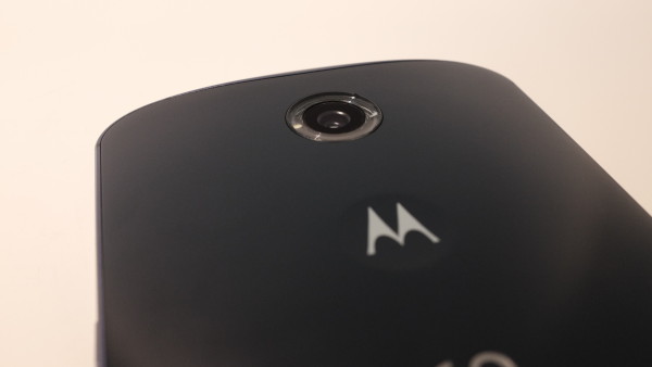
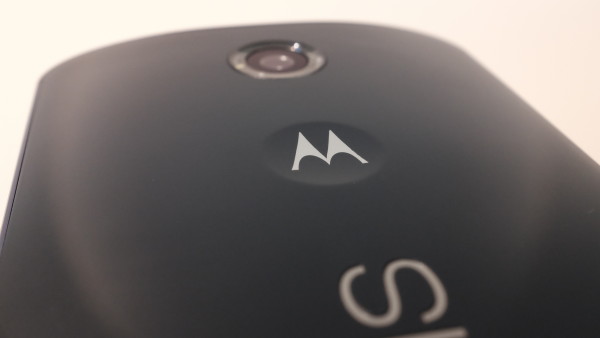
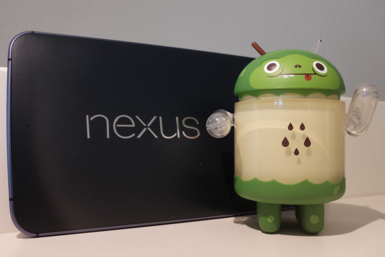
When isn’t a cell phone too big? The Motorola-made, Google-branded phablet answers that question for me, and may very well for you. From Samsung’s introduction of the original Note, I scoffed at large-screen smartphones—and, honestly, the seemingly stereotypical gadget geeks using them. But big is better, and my arrogant attitude about phablets and the people buying them was unwarranted.
Simply stated: Nexus 6 is the best handset I have ever used. The experience is so fresh and delightful, the emotional reaction reminds of using the original iPhone that I purchased on launch day in June 2007. N6 shatters my negative preconception about phablets, particularly unwieldiness when used daily. That said, I made some lifestyle changes, including choice of clothing, to accommodate the mobile’s massive size.
Size Matters
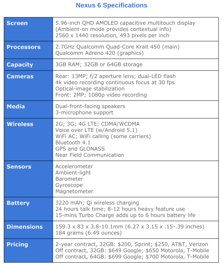
Big it is, measuring 159.3 x 83 x 3.8-10.1mm (6.27 x 3.15 x .15-.39 inches) and weighing 184 grams (6.49 ounces). Length is slightly greater than iPhone 6 Plus, which measures 151.8 x 77.8 x 7.1mm (6.22 x 3.06 x .28 inches) and weighs 172 grams (6.07 ounces). Considering screen sizes—5.5 inches for the Apple and 6 inches for the Googorola—Nexus 6 is modestly larger when evaluated against the benefits delivered, such as greater display real estate and front-facing speakers.
The Apple handset is considerably more narrow when held in portrait orientation. Greater width means Nexus 6 fills more of the hand by comparison, but the dimensions better present content, which is a benefit best appreciated when comparing the devices side by side. Webpages look more natural, not as cramped, on the N6, and Android Lollipop’s Material Design strips back distraction, while emphasizing what matters.
My hands aren’t large, but I nevertheless find Nexus 6 comfortable to hold in one hand. The width is quite manageable thanks to the flat bezel and back shell that curves outward. By contrast, iPhone 6 Plus is way too slippery, because of the aluminum enclosure, its flatness, and the overly-rounded bezel. As explained in my iPhone 6 review, I regard the rounded outside frame to be a design flaw. Either of the two newest Apple handsets are the first for which I must recommend a case as means of reducing the likelihood of drops and protecting against them. Despite its size, Nexus 6 grips easily such no case is required. I use mine bareback, so to speak.
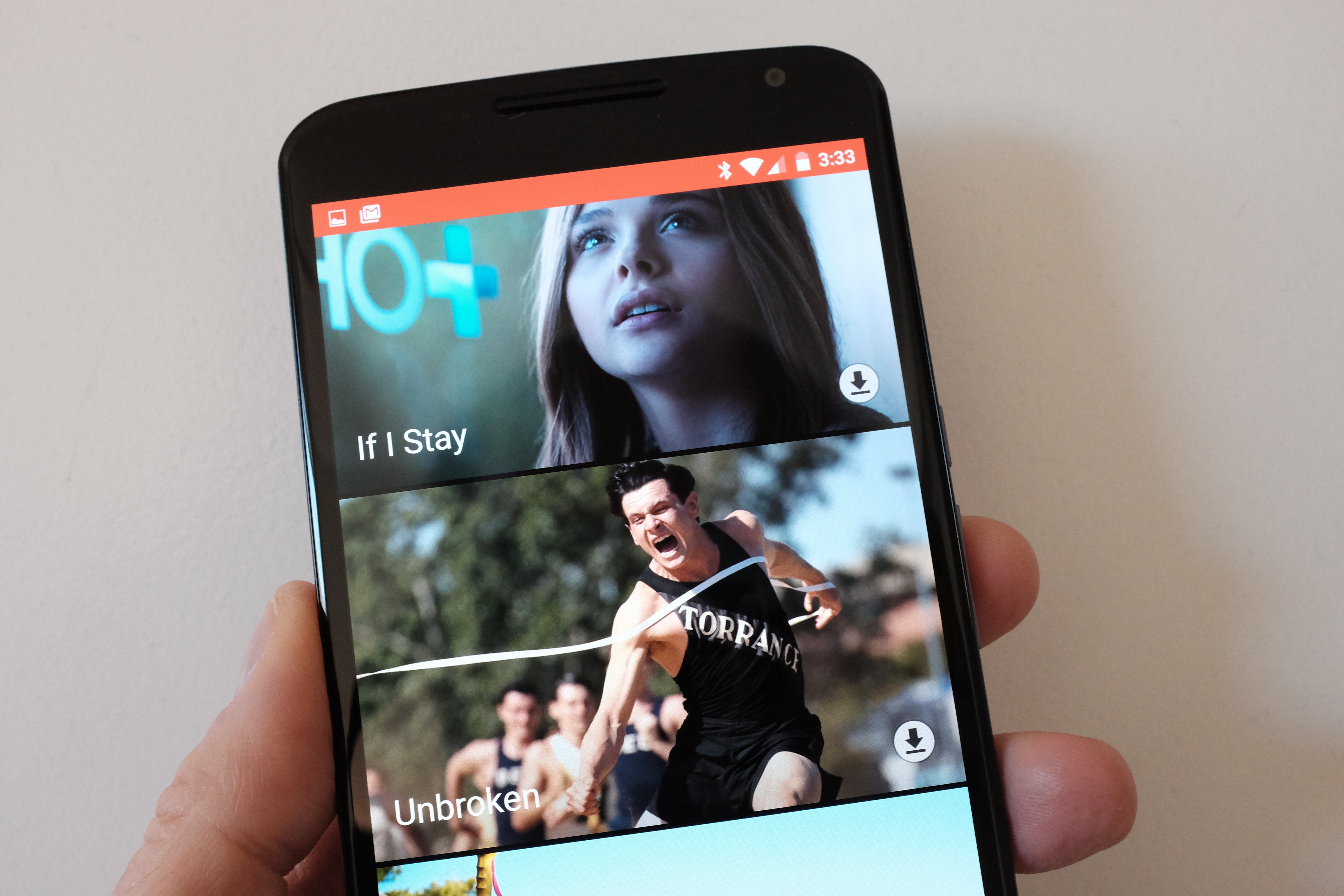
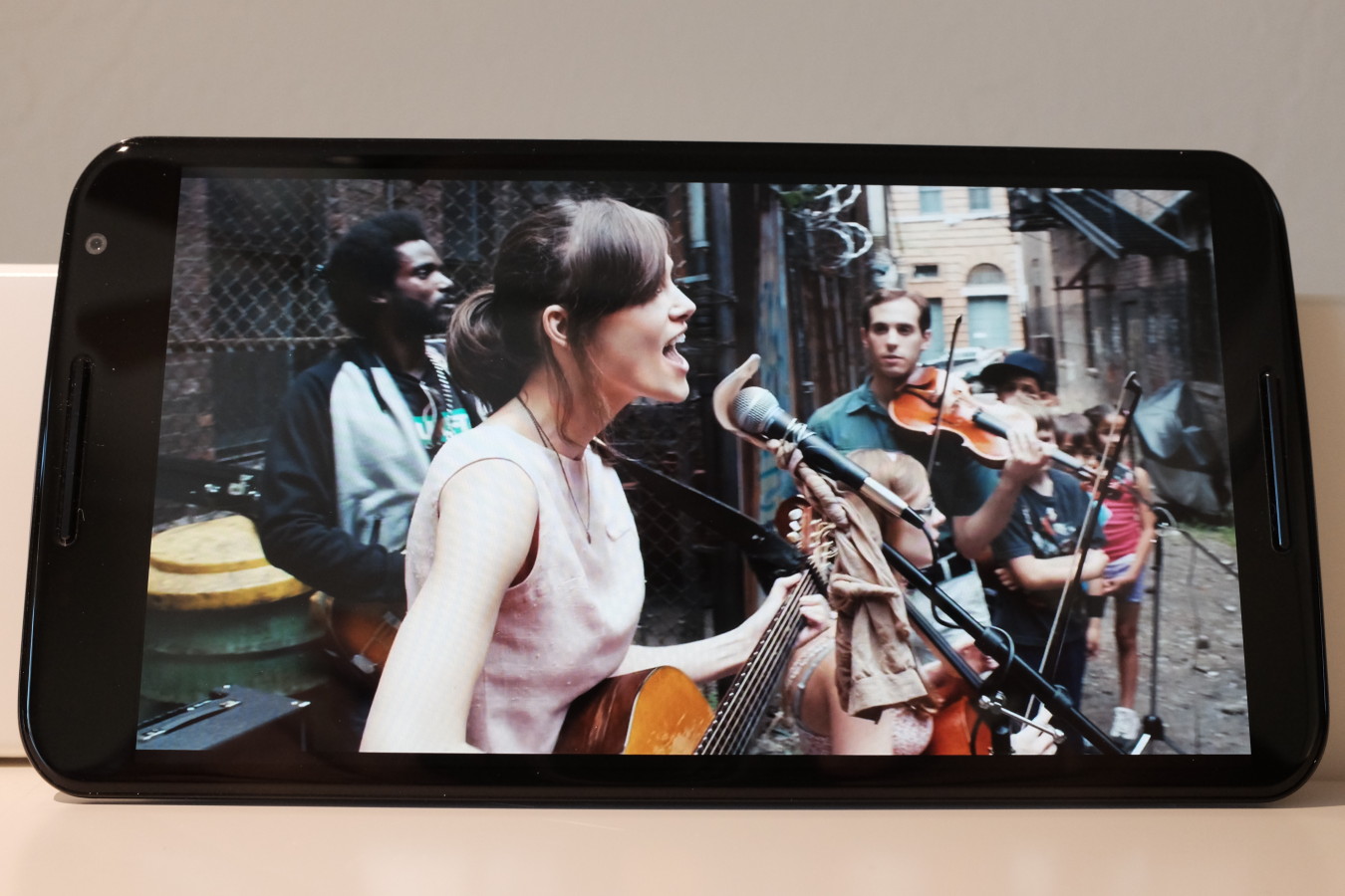
Some Notifications are stunning[/caption]Content consumption, and even some creation, is damn satisfying on the Nexus’—let’s be Mr. Spock specific—5.96-inch AMOLED display. Resolution is 2560 x 1440, and pixel density is 493. I thought the iPhone 6 Plus 1920 x 1080, 401-ppi screen was magnificent, until seeing Nexus 6. Colors pop and contrast is rich.
I typically grab Nexus 6 before any tablet, and my mainstay slate is Nexus 9. Superior-quality display is but one reason. Most Android apps, and their notifications, are better optimized for the phablet-size. Magazines I used to happily read on iPad Air and grumpily consume on N9, such as Economist or Rolling Stone, are preferred on Nexus 6. Reading is immersive, text is razor sharp, and photos or video look fantastic. Streaming from services like HBO, Netflix, or Starz surprisingly satisfy. Summed up differently: Display size, resolution, and pixel density matched with the front-facing speakers and the phablet’s handling are finely balanced.
For an always-carry device, these and other benefits eliminate any pretense for owning a tablet. But they would mean little if not for Lollipop and the services Google wraps around it, which is topic for the next subheads.
The question everyone should ask before buying a cellular handset this large: Can I really bring it everywhere? Nexus 6 will fit in my back jeans pocket, which isn’t my preferred location. I wouldn’t worry about the shell bending there, which should be at least some concern with iPhone 6 Plus.
I typically carry my phones in holster cases purchased from Hong Kong-based PDAir. The N6 case experience is better than anticipated: Rather than being too bulky, holstered-Nexus 6 is comfortable when I sit down—including the driver or passenger seats of my five-year-old Toyota Yaris. However, since dropping about 21 kilos (182 to 136 pounds) in weight, I am more vain about my appearance—looking thinner (handsome never will be). So I prefer to only use the case, which bulges out from the belt, when wearing jeans. Needing to buy waist-size smaller shorts anyway, I got cargos, which are perfect for sunny San Diego. The lower pocket above the knee is ideal for a smartphone of any size.
Why Now?
Google unveiled Nexus 6 on Oct. 15, 2014, and sales started 14 days later. More than 5 months from release and following new, competing handset debuts during Mobile World Congress in early March, a belated N6 review seems untimely. But days ago, the phablet finally arrived on Verizon, and it’s the network I use. That’s news enough to warrant taking a fresh look at the phablet, with caveats: I use Nexus 6 on Verizon purchased from T-Mobile, and my phone hasn’t yet auto-updated to Android 5.1—and I worry that it ever will.
Verizon sells the 32GB Midnight Blue Nexus 6, with Android 5.1 out of the box, for $249.99 with two-year contract or $649.99 without one. AT&T’s commitment price and duration are the same, but off-contract charges $682.99. Sprint asks just $199.99 on contract, or $648 otherwise. T-Mobile options are full price ($649.92) or 24 monthly payments of $27.08 with $0 down. However, Magenta also sells the 64GB N6 for $699.84 upfront or two-dozen $29.16 monthly payments. Android 5.0 is preinstalled by all three carriers, but they are in process of delivering 5.1 updates now.
None of the four sells the other color, Cloud White. Look to Google or Motorola if you want that one. For months, the lighter N6 and either larger capacity have been perennially sold out, although on March 23rd the two companies have inventory of both colors and capacities: 32GB, $649.99; 64GB, $699.99 (Google prices are even, no 99 cents). When I purchased in January, neither store had stock of Cloud White or the sixty-four gigger. I never considered buying the entry-level phone, when twice the storage cost just $50 more. T-Mobile, which stocked the config, got my money.
Apple deserves strange credit for my Nexus 6 interest. When I preordered iPhone 6 on Sept. 12, 2014, my intention was to use the device for the foreseeable future. But upon seeing and handling the Plus inside Apple Store, I realized the bigger phone wasn’t overly large as anticipated. But switching wasn’t an option during my 14-day buyer’s remorse period; Verizon sold out the Plus. Over the weeks that followed, the smaller handset’s appeal rapidly diminished the longer I used it.
Then, in January 2015, I bought Toshiba Chromebook 2 on a whim, subsequently selling my MacBook Pro with Retina Display. With the return to the Chromie lifestyle, I considered going Android, too. My brief experiences handling iPhone 6 Plus made me wonder about the Nexus. On a Saturday evening later-month, I drove to the local AT&T store, which had the N6 on display. The size didn’t intimidate as I feared, while the screen screamed “Love Me” and the device felt very good in my hand.
Fifteen minutes later, I was sold and ready to part ways with iPhone 6. Days later, responding to my Craigslist ad, a California Cop (and New York native) bought my Apple smartphone for exactly what I needed to purchase Nexus 6 from T-Mobile.
I could order from Magenta for use on Verizon because Nexus 6 is primed for all the U.S. networks, while being one of the most global-ready handsets sold anywhere. It’s my understanding—and I encourage someone to correct the information if inaccurate—that during initial setup there is some carrier customization depending on SIM card. I really don’t know what that means for my T-Mobile-purchased device on Verizon, if for no other reason than Android version—5.01 versus 5.1—during setup. I am anxious that N6 won’t update or what the consequences/benefits might be should it.
Out of the Box
First impressions using any device mean everything. Early emotions linger and affect perception beyond the first minutes usage. Manufacturers can pack in features and emphasize them in marketing collateral, but how they come together, how they balance, matters more. Features must deliver meaningful benefits, and among the most important—something that won’t fit on the box spec list—is joy. Does device A, B, or C make you feel happy? From cracking the box through the final setup, I smiled.
Setup surprised. I pulled out the T-Mobile SIM and popped in the Verizon one before doing anything. Nexus 6 easily connected to my password-protected WiFi AC, then checked for and installed an update before even presenting a login prompt. This is one of several new Lollipop features that are not unique to N6. After the update installed, regular setup continued, with cellular network activation and Google Account login.
The latter process was smooth and satisfying to the point of being scary. I use 2-factor authentication, which for older Android versions is clunky. You enter in your credentials, then are taken to Chrome to log in again, receive a texted security code, enter it, and proceed. With Lollipop, internal prompts present this process, which for me completed automatically. Nexus 6 received the security code by text message and then, I presume, sucked it in and moved along to complete setup. O la la and OMG was my simultaneous reaction. That little convenience made a big impression—and other little changes throughout the operating system.
I have used Android since Nexus One and all its successors since. Lollipop feels complete—mature—in a way unlike its predecessors. Android has finally grown up, and oh do I like the adult I see. The operating system and hardware feel tight; they are finely tuned and fit together much better than do iPhone 6 and iOS. Integration with Google services, like Now, expand Nexus 6’s utility.
The visuals give good feeling using Lollipop, which unifies around concepts of Material Design. Google built from the Now card motif fantastically succulent user interface brandishing bold swaths of color. Feel-goodness explodes off Nexus 6’s pixel-dense ultra-HD display.
The skeuomorphic user-interface design approach Apple popularized during the 1980s is an anachronism in 2015. Building on the familiarity of 3D objects made some sense during the early days of PC acceptance but has no useful benefit on websites or devices that use touchscreens; they’re 2D, not 3D. Lollipop and Material Design are flat with slight 3D touches that visually balance.
Other joy-generating refinements: I use voice almost as much as my fingers to search web or phone, set reminders, dictate notes, and more. This capability, among many others, is behavior transforming. I started using the capability within the first hour after successfully logging in. Google Now Launcher’s default home screen placement encourages voice usage in ways Siri on iOS doesn’t.
Before using Nexus 6, I would have told most potential phablet buyers to take Apple’s 5.5-incher. There are other behemoths, but slap-on user interfaces like Samsung’s TouchWiz UI tax resources and increase complexity. Apple gives good simplicity, but, to my surprise, Google and Motorola deliver a better, simpler, more enjoyable unified user experience. The out-of-the-box wow is considerably greater with Android 5 matched to Nexus 6’s hardware chops than what the newest iPhones give. Shall I repeat, or would you prefer to reread the sentence?
Day-by-Day N6
Two months have passed since I bought Nexus 6, which is more than enough time for comprehensive, meaningful evaluation. Here’s my problem presenting it: There is nothing I dislike about the phablet. The device is perfect for my needs, and it could be for you, too. I emphasize this, because complete satisfaction is a first. Every other handset, no matter how beloved, had some failing; if not many. Nothing surprises me more about Nexus 6 two months in, and none of the newer handsets, such as HTC One M9, Samsung Galaxy S6, or S6 Edge, tempt me.
The review could end there. Seriously. But because you might ask, adding to benefits called out in the previous three subheads…
Call quality is superb (on Verizon; I can’t speak for other carriers). Battery typically lasts longer than 24 hours, for me, perhaps half that with heavy use. Fifteen minutes on the charger adds another 6 hours, by Google claims. I see something typically less but more than enough top-off.
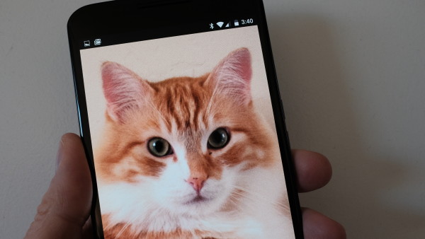
The 13-megapixel camera captures what the eye sees. Contrast, color, and white balance typically satisfy, even in low-light, using the default Google Camera app. Photos look spectacular on the ultra-HD display. Supporting that and your big-screen TV is 4K video capture at 30 frames per second—and bold sound to match.
My audio-listening expectations were modest, when first connecting my Grado Labs Rs1e headphones and streaming from Google Music. Soundstage and detail exceed streaming from iTunes to iPhone 6, or—I do not lie—listening to music stored on MacBook Pro with Retina Display. The differences in detail are shockingly apparent. On all three devices, graphic equalizer is not enabled.
I often watch videos while exercising on the stationary bike. The front-facing speakers give great audio, too; I have already repeatedly raved about the spectacular screen.
I could go on and on.
The overall Nexus 6 user experience is so good, my contention is confirmed: Google chose wrongly by selling Motorola to Lenovo. The integration of hardware, software, and connected services is tight, delivering better contextual consumption experience than iPhone 6 or 6 Plus. Motorola’s value to Google is, or was, immeasurable from research and product development perspectives. The search and information giant squandered a valuable long-term asset to, presumably, minimize short-term sags on overall financial performance.
Contextual consumption is the point—the underlying design philosophy that makes Nexus 6 exceptional. If you hadn’t noticed, this review is organized differently than every other I have written. It’s more free-form, rather than check-listing features and benefits. That’s because Nexus 6 is an experience. That is a contextual consumption, and some creation, experience.
Context is core to Google’s corporate cultural DNA. Search, and the advertising business model built around it, is all about context. Where context matters most is the mobile device you always carry, by providing what is meaningful to you anytime and anywhere as what you need changes based on situation, or location. N6 delivers balanced features—battery life, camera, connected services, operating system, screen, wireless, and more—packaged in a device large enough to carry and enjoyably consume content contextually.
Nexus 6 is my constant contextual companion, like no other device ever. The more I use it, the more it feels like an extension of my psyche, of myself.
But I am skeptical that Google can achieve such greatness again working with an independent OEM, which Motorola wasn’t when this device was developed.
Editor’s Note: A version of this story appears on BetaNews.
