HomePod arrived yesterday at 9:40 a.m. PST; thank-you UPS for prompt delivery of my preorder. The device replaces Google Home, which will be dispatched to a new owner (hopefully), via Craigslist or NextDoor. Perhaps Big G’s assistant would have satisfied more if I lived the Google lifestyle like during my Android and Chromebook days. But I walk the Apple Way today, for better or for worse.
My initial reaction: Wow and uh-oh. The wow harkens back to the original iPod, which Apple released in October 2001. The company’s design ethic treated the overall experience as the user interface: Attach FireWire cable to Mac and device, music syncs. iTunes manages music on the Mac; for iPod, a simple scroll-wheel navigates tracks displayed on a small screen. The uncomplicated and understated approach defied the UX of every other MP3 sold by all other manufacturers. HomePod is a defining, roots-return that’s well-deserving of the portion of name in common with its forebear; both share in common emphasis on music listening as primary benefit.
Wow and Uh-oh
To start using HomePod for the first time, I held iPhone nearby, which prompted to “setup”. I tapped the icon, chose living room form a list, disabled “Personal Requests”, and waited a few seconds for final linking to my iCloud account. That’s it! “Hey Siri, play Maroon 5 Sunday Morning” and surprisingly satisfying sound boomed from the device’s woofer and seven tweeters. The experience, while sharing voice interaction-UI approach with Amazon Echo and Google Home, is superiorly gratifying (yes, based on my using all three). That said, only long-term use will be enough to properly evaluate the UX experience and HomePod’s broader benefits, which must include interaction with Siri.
The streaming speaker system also revives another design ethic from Apple’s past, and that’s where my uh-oh comes from. For Verge, Vlad Savov writes the story I’ve been waiting to see somewhere—and it is a topic that I would have opined about weeks ago, if still full-time tech reporting. Headline and dek: “The HomePod is the point of no return for Apple fans: This speaker is openly hostile to any hardware or service not made by Apple”. Yep. His point, better stated than I could make: “If you thought you were locked inside the Apple ecosystem before, buying a HomePod is like adding an iron ball to those chains”.
The original iPod required users to have a Mac, which anchored Apple’s “digital hub” strategy starting at the turn of the Millennium. Windows support followed in summer 2002. Similarly, HomePod setup starts with an iOS device—and an iCloud account subscribed to either Apple Music or iTunes Match is necessary, too. Respectively, they cost $9.99 monthly or $24.99 yearly. At this time, and perhaps the future, HomePod is a closed system within Apple’s devices and services arena.
In 2018, iCloud is Apple’s “digital hub”, with iOS devices acting as primary user conduit—much like the Mac and iTunes once were. The concepts are little different. What matters more is the consistency and simplicity of the delivered digital lifestyle. Amazon, Google, and (even) Microsoft offer digital lifestyle silos, but with one major difference: They support devices outside their respective end-to-end offerings. Will Apple do likewise with HomePod, as it did with iPod in 2002 and does today with iPhone? We shall see.
For now, though, I expect that HomePod will remain part of a closed content and cloud services system until at least all major features are made available. For example, the fruit-logo company has announced support for stereo sound (with two HomePods) and for AirPlay 2. Neither is immediately available, but promised as “coming later this year”.
Be a Better Beta?
Looking at these and other capabilities to come, HomePod is a work in progress. Dare I suggest that Apple, ah, borrows from Google’s playbook, by promising future features that will improve the HomePod user experience? Since Gmail debuted in Spring 2004 and stayed in beta state for 5 years, Big G has treated nearly every new thing as beta, by continually adding new features on an ongoing basis.
Apple’s streaming speaker system seems similar, with hardware in place and future software updates planned to unlock additional benefits. But perhaps, instead, the company continues its longstanding design ethic of incremental improvements. In the past, the approach better fitted hardware and making the next revision a little better and cheaper than the last. HomePod, as a new product category for Apple but one where there are increasingly entrenched competitors, maybe isn’t about surging sales volume so much as ensuring customer satisfaction that fits into and extends an existing digital lifestyle.
The company benefits from buyers being better customers, by their purchasing more pieces that complete the digital lifestyle puzzle. From that perspective, Apple’s lock-in approach is sensible. For now. The most committed customers—and maybe, just maybe, the most loyal—will spend $349 per single HomePod. The device’s so-called (because more personal testing is needed) auto-sensing audio acoustic adjustments are among the features focused on one primary design objective: Superior satisfaction to anything else in the device category, among enthusiasts most likely to evangelize across the social Internet.
But make no mistake about early buyers’ role: They are all beta testers and will be as long as HomePod supports single iCloud accounts only and announced capabilities aren’t all available. That’s one of many reasons why I won’t review HomePod, after less than 40 hours in the home. Will wow or uh-oh be the axiom in a few weeks? I will let you know.
Picture Perfect
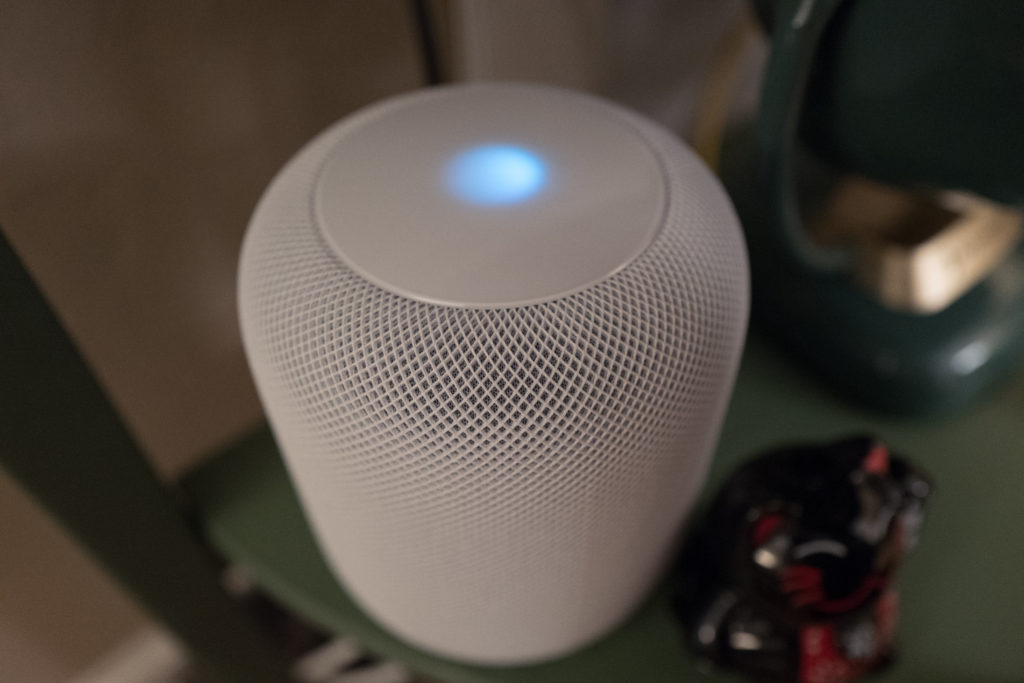
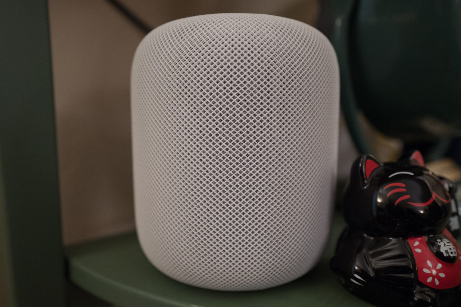
Wrapping up, I’d like to discuss the Featured Image and its companion. We placed HomePod on the second shelf of the IKEA stand used for the television. Apple recommends at least 6 inches clearance around the device, which the location mostly, but not completely, provides. I neglected to take photos out of the box, later deciding not to break down the setup for product portraits now. They can come with future, final HomePod review.
I purposely waited until last evening to capture pics of the device, wanting in low-light to get a natural noisy (e.g. grainy) look to complement background blur (i.e., bokeh). I used Leica Q‘s fabulous Macro mode—acrtivated by turning the lens ring closest to the body—to capture both images, which are presented as composed, with the Temperature tweaked.
The shallow depth of field is intentional and helps achieve an ambiance of mystique—like the original iPod, white that boasts its presence against natural colors. Vitals for the first: f/2.8, ISO 4000, 1/60 sec, 28mm; 9:15 p.m. PST. The other is same, except for ISO 3200.
Editor’s Note: A version of this story appears on BetaNews.

