It’s April Fools’ Day, and I’m not joking. But that doesn’t mean we can’t have some fun, by comparing and contrasting Apple old with Apple new. 🙂 Last night I posted to Betanews: “What 1984 Macintosh marketing reveals about iPad,” which is based in part on my April 2006 post “When Magazines Mattered,” about Apple buying all the ad pages—39 of them—in the Newsweek 1984 election issue. Magazines mattered to Apple for promoting Macintosh during its launch year. Now iPad matters to magazines, for which some publishers hope to turnaround sagging readership (and ad revenues). Ha, who’s paying whom now?
In looking over the marketing material for Macintosh and iPad, I found some similarities surprising. In the Betanews post, I touch on how similar is the aspirational marketing. But the design concepts are similar, too. Apple seeks to achieve with iPad many of the design concepts applied to Macintosh—and even Lisa before it. These same concepts apply to other Apple products, including iPhone.
Apple’s approach to computer/device design is consistent and pervasive: Humanization. Apple design seeks to humanize complex technological products. There has been much—way, way too much—written about Apple design in context of products that look good. Related: Improved functionality through design. But there is something more fundamental to Apple’s approach: Designing products that are easy to use by making them more an extension of the human being—making them more part of you.
Apple didn’t invent the mouse concept but most certainly brought it to market first in a more meaningful way. Early Macintosh marketing emphasized the importance of the mouse, in conjunction with the graphical user interface, as an extension of your finger. From the 1984 Newsweek ad spread:
If you can point, you can use Macintosh, too. It’s probably safe to assume, at this point, that you can point. And having mastered the oldest known method of making yourself understood, you’ve also mastered using the most sophisticated business computer yet developed. Macintosh….Macintosh lets you create something as complex as a vertical bar chart. With something as simple as your finger.
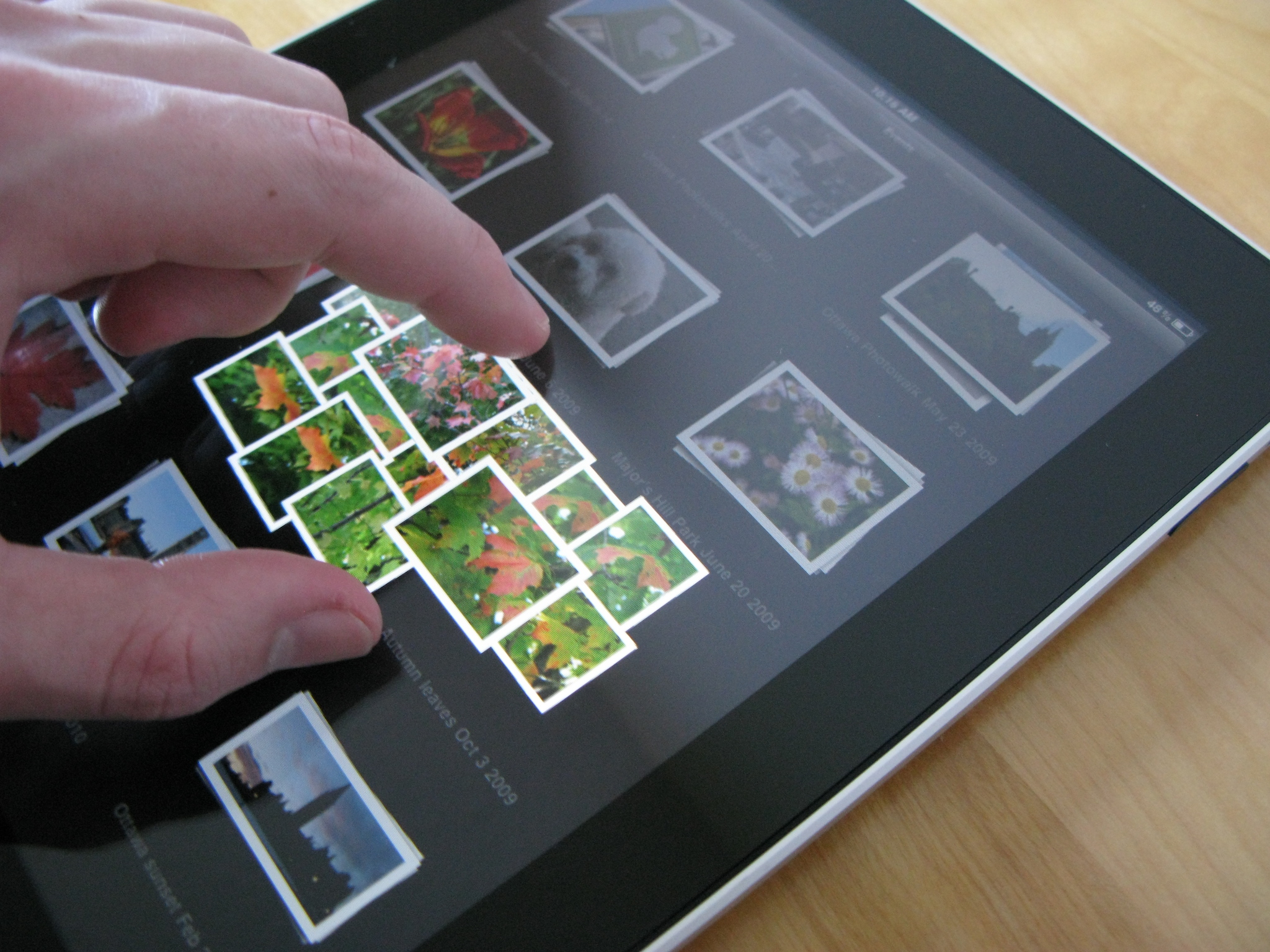
Now compare to iPhone marketing: “Control everything on iPhone with a tap, a flick, or a pinch of your fingers.” Or to iPad: “Navigating the Web has never been easier or more intuitive, because you use the most natural pointing device there is: Your finger.”
The concepts are similar—as are repeated references to the “finger” 26 years ago and today. The one example is enough to make the point: Apple continues on the same humanization user interface design course today it started in the 1980s.
See Me, Feel Me, Touch Me
It’s all very sensible. Human beings are tool users who experience and manipulate the world through five senses. Apple products appeal to the eyes through design, whether it’s the software GUI or hardware appearance. But the eyes are passive instruments. Hands and fingers are more important because they are active—they’re how people tactilely manipulate the world around them.
For example, how important is touch? Watching how people interact with items for sale reveals much. First people look—and then they touch. Surely, many retailers find all that touching and handling of their goods to be irritating. People examine objects they desire as much with their hands as their eyes.
Too many technological devices are too difficult to use because they expose too much complexity. Compare to the human body: The underlying biological mechanisms behind hand movement may be complex, but for most people the complexity is largely hidden. The keyboard is unnatural user interface; it exposes too much complexity. There is little in human biological or cultural experience that supports use of the keyboard. It’s a particularly unnatural construct, in which organization is based on the number of times letters are likely to be used. The mouse is more natural than the keyboard, because of the hand and finger-clicking movement. But the mouse is still a makeshift extension of the human being.
The finger and touch are more natural, because they extend you. Good user interfaces build on the familiar—and there is nothing more familiar than me, myself and I. See, say, hear and touch. Apple’s approach to non-Mac devices—iPad, iPhone and iPod touch—more naturally extends the hands, fingers, eyes and even mouth (for voice activation). Successful user interfaces of the future will have similar attributes.
In his iPad review, veteran technology reviewer Walt Mossberg asserts that Apple’s tablet “could even help, eventually, to propel the finger-driven, multitouch user interface ahead of the mouse-driven interface that has prevailed for decades.”
If Walt is right, Apple will extend touchy-feeling concepts—the device as extension of you—more than two-and-a-half decades in the making.
Photo Credit: Jon Fingas
