My previous post in this series begins: “I cannot presently recommend Apple’s big-ass tablet as a laptop replacement—using the official-issue Smart Keyboard”. The statement is retracted.
Apple PR contacted me after the story published, asserting that the short battery life I experienced was abnormal behavior. Seeing as it was the last day to return iPad Pro under T-Mobile’s buyer’s remorse policy, I took the assertion at face value and returned the rig. The exchange interrupted my plans to use the tablet as my primary PC for a month. From today, the clock resets to zero, and I start over.
Do-Over
To recap: Apple positions its largest and costliest tablet as a laptop replacement. Call me a skeptical but willing test subject. I see the potential, much as I did with Chromebook five years ago when embarking on a smiliar experiment. Later, I adopted the Chromie lifestyle after the platform matured enough to provide adequate webapps for my needs.
With respect to apps, iOS is considerably more mature, but the utility of a tablet turned PC differs drastically from a laptop with browser as primary user interface. However, with battery life consistently clocking four hours with keyboard attached but taking more than six to recharge, iPad Pro was a non-starter as laptop replacement. The second unit delivers vastly better battery performance.
My first tablet was a lemon. It happens.
Battery life is exceptional, whether or not using Smart Keyboard—but remarkable without it. The difference disturbs me and raises concerns about any product reviews: How broad are the variances among any mobile devices, regardless of manufacturer? iOS versions and apps are identical on both devices, and I swapped keyboards, too. I now can get a full workday from the kit and several more when used only as a tablet.
Standby impresses, too. I let the tablet set all day yesterday. Twenty-four hours later, battery depleted to 94 percent from full. Putting praise aside, most modern laptops, particularly in similar price range, will outlast iPad Pro and Smart Keyboard.
I start over. February 24th is the new Day One in my quest to use iPad Pro as my primary, and perhaps at some point only, PC. Like Chromebook, the overly-large tablet isn’t for everyone, and maybe not most anyone. Apple has produced a reference design for its vision of the so-called post-PC era. Quirks are aplenty, and the app platform must, ah, expand to meet the screen’s 12.9 inches. Future posts will expand the themes.
Hardware Specs
Apple manufactures three configuration: 32GB and 128GB WiFi, for $799 and $949, respectively; 128GB WiFi and LTE, for $1,079. All three are available in gold, space grey, or silver. Mine, like the first, is the cellular config in grey. For anyone purchasing iPad Pro to do serious productivity work, I recommend 128GB. Most buyers will also want either the $99 Pencil (for drawing) or $169 Smart Keyboard (for typing), if not both.
[yellow_box] Also in this series:
- “Meeting Apple’s Big-ass Tablet“
- “iPad Pro is Bigger Than You Think“
- “How Apple iPad Pro Frustrates Me“
- “The Ways Apple iPad Pro Delights Me“
- “iPad Pro’s Shouldn’t-be Battery Problem“
[/yellow_box]
Configuration: 12.9-inch multi-touchscreen, 2732-by-2048 resolution at 264 pixels per inch and 424-nit brightness; Apple A9X microprocessor and M9 graphics; 4GB RAM; 32GB or 128GB non-expandable storage; two microphones; four speakers (two on each screen-flanking bezel); 8-megapixel, f/2.4 rear camera that also records 1080p video at 30 frames per second; 1.2MP f/2.2 front camera that shoots 720p vids; fingerprint reader; WiFi ac; Bluetooth 4.2; cellular with assisted GPS and GLONASS (one model); accelerometer; ambient-light sensor; barometer; compass; gyroscope; proximity sensors.
iPad Pro measures 305.7 x 220.6 x 6.9 mm (12 x 8.68 x .27 inches). The cellular plus WiFi variant weights 723 grams (1.59 pounds), while the non-LTE tab is 10 grams less (1.57 pounds). However, Apple’s Smart Keyboard cover makes the heft more like 12-inch MacBook, which weighs 920 grams (2.03 pounds).
Apple’s Smart Keyboard doubles as a stand, but the angle is fixed. I find it to be perfect, and I touch-type with ease. The front-facing camera is poorly placed, however. In keeping with the design of iPhone and smaller iPads, the thang is meant to be used in portrait mode, which is unwieldily given the tablet’s size and sideways fit into the keyboard kit. I understand the reasoning for conforming with the other iOS devices’ design and apps primed for it. But the front camera would be better placed center-top in landscape mode, rather than portrait.
News to Me
At this stage of my retesting, content consumption is the killer application. This is the device for which Apple’s News app was made for. Presentation is fantastic. Clicking any headline expands the story into pleasing format that typically exceeds the source’s original presentation.
The longer I use iPad Pro, the more time I spend in News than any other app. My written-word consumption is way, way up, while my RSS feeder use is way, way down. The reading experience is personal and intimate in ways I can’t easily describe. For now.
Discreet content apps benefit, too. Pinch and zoom is rarely necessary now. Websites, but more particularly news and magazine apps, are life-size readable in portrait mode. The expansive screen and 4:3 aspect ratio elevate iPad Pro above any other devices used to read anything from any source.
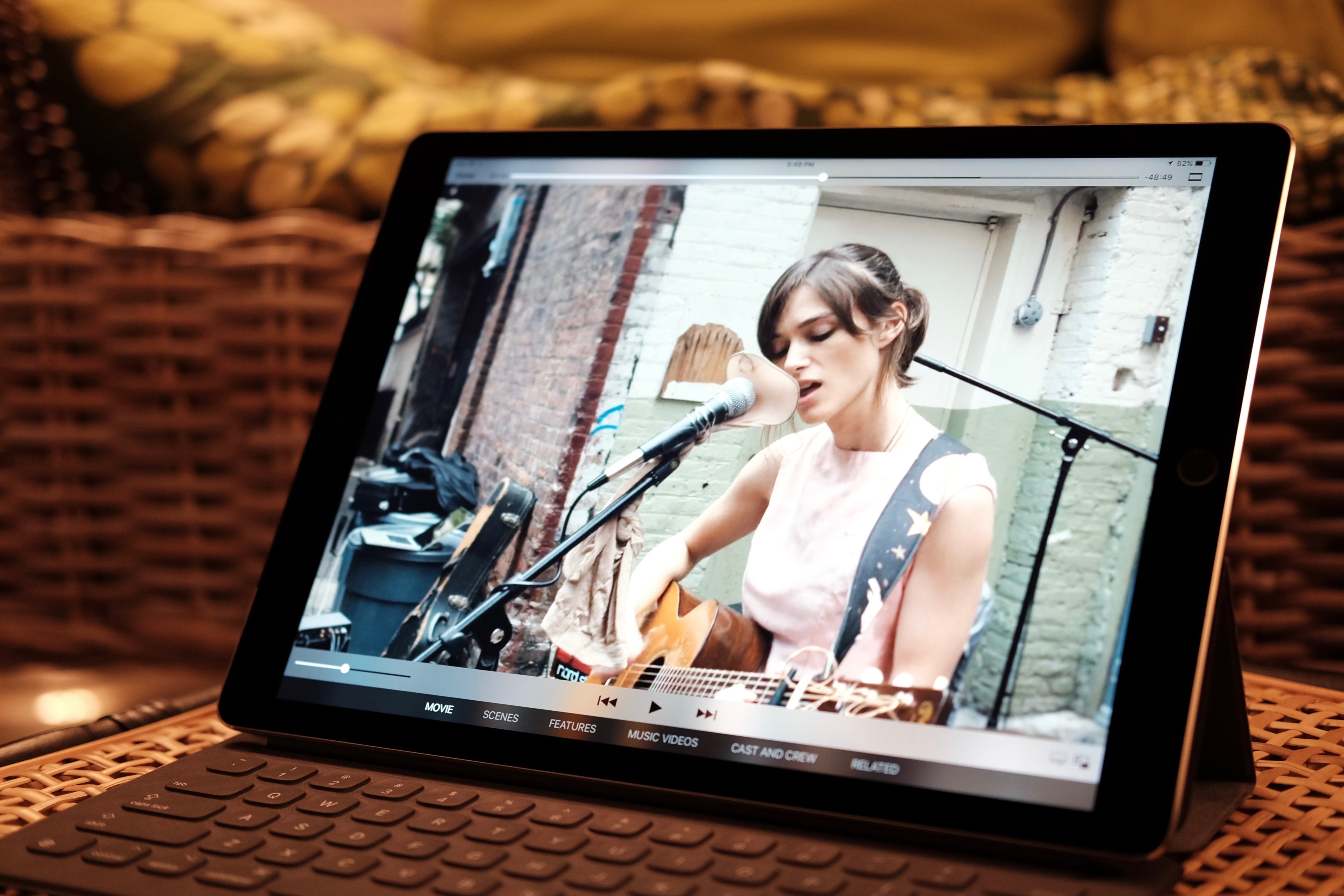
Video is as good, if not better, regardless from where. Rendering is smooth, colors are vibrant, and the speakers deliver warm audio and dynamic soundstage.
As the retesting continues, I will get nitty-gritty into app usability and finally will discuss the Pencil’s benefits. But for Day 1 re-do, that’s a wrap.
Editor’s Note: A version of this story appears on BetaNews.
