Yesterday afternoon, I received Google’s newest Android tablet, which HTC manufactures, for review. The companies unveiled Nexus 9 in mid-October 2014, and sales started as Americans prepared to vote in November’s mid-term elections. So I am late in the reviews cycle. My eventual write-up will post to BetaNews, and also here—keeping with my sentiment that writers should own/control their content.
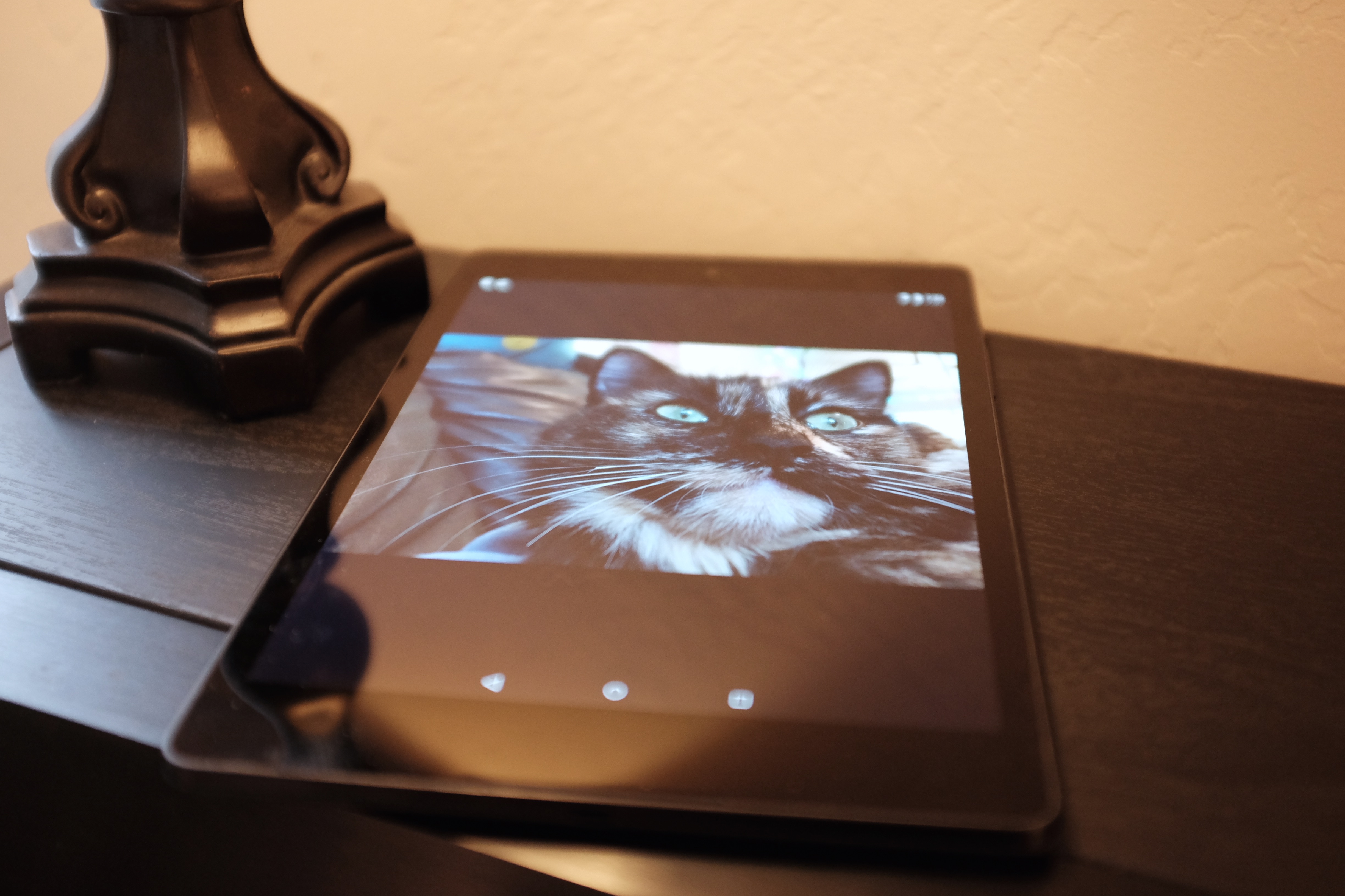
What follows is my thinking out loud, as I begin to process Nexus 9’s benefits and detriments. Some of my opinions will likely change during the reviews process. For anyone who cares about photos: I shot the tablet with the Fujifilm X100T. The pic is from the JPEG, with slight adjustment to the temperature. Okay, let’s get to first-impressions.
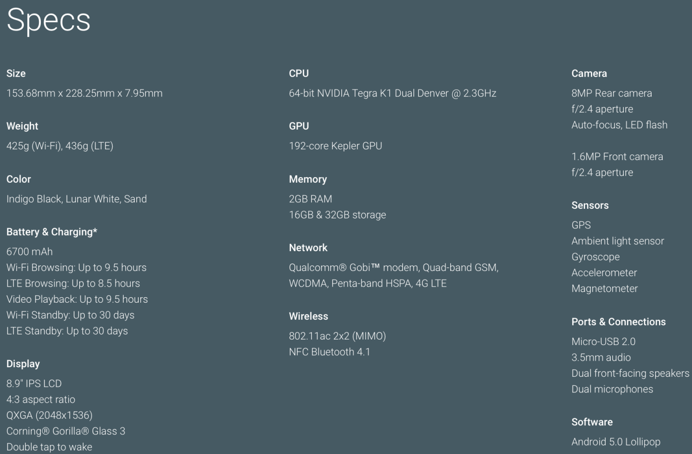
1. The tablet feels heavier than I expected: 425 grams. The comparably-sized Kindle Fire HDX 8.9 is just 375 grams, while the larger iPad Air 2 is 437 grams. By comparison, my original iPad Air is 475 grams. That’s with LTE. The WiFi model, which is more comparable to the Nexus 9 that I have, is 469 grams.
2. Nexus 9 isn’t as thin as the HDX 8.9. They measure 153.7 x 228.3 x 7.95 mm and 231 x 158 x 7.8 mm, respectively. I could feel the difference immediately. I wouldn’t have noticed, if not for the extra heft. My iPad Air is thinner than both (7.5mm), which is another reason for the first-impression. But I nitpick. The differences won’t matter much to most buyers. For the category—tablets with 8.9-inch screens—Nexus 9’s size and weight are comparable-enough benefits.
3. The tablet feels great in the hands. The rubbery texture is much like the Nexus 5 smartphone (I haven’t handled the N6). By comparison, iPads are cold, because of the metal backs. I much prefer the Nexus 9, which gives great friction. This isn’t a tab that easily slips out of one hand.
4. The shape is just right. The feel-goodness also comes from dimensional changes. The smaller Nexus 7’s screen was 16:9 aspect ratio, which made the tablet long and narrow. In some respects, this benefitted one-handed use, but made viewing web content and consuming many apps awkward. Nexus 9’s 4:3 is better all the way around.
5. I initially thought the screen was defective. The goddamn thing wouldn’t respond to touch. I banged my finger frustratingly against the Corning Gorilla Glass 3 with chug-a-lug responsiveness. Think old geezer stick-shift auto starting and stopping repeatedly on a cold morning. Turns out restoring from backup, and later updating apps, consumed too much processing power and memory. If you buy Nexus 9, and have similar experience, don’t return it in a huff. The touchscreen will delight your fingers, once the updating finishes.
6. Nexus 9 feels fast. By comparison, my iPad Air seems slow, and I can’t say what the experience would be with the successor, which like Nexus 9 packs 2GB RAM. The CPU is the 64-bit NVIDIA Tegra K1 Dual Denver and GPU the 192-core Kepler. The real responsiveness, once those pesky updates finish, creeps me out, and that’s meant as praise. Strangely. Service Google Now attempts to anticipate what you want before you ask (e.g. search for it). But this tablet is so fast to the touch—almost like it responds before I touch—there’s eerie sense of mind-reading or being watched.

7. The 16GB or 32GB storage isn’t enough. As I expressed last week, Apple gives great benefit by offering up to 128GB. Nexus 9 offers no microSD slot, so memory isn’t expandable like many other Androids. I understand Google’s cloud-orientation, but apps and content consume space. I cannot directly confirm, but the 16GB N9 has only 11GB usable storage. From storage value perspective, Nexus 9 32GB WiFi is overpriced at $479 when iPad mini 3 doubles capacity for $20 more. Same for LTE models, where the Android 32GB is $599 and the Apple 64GB $629.
8. The front-facing speakers are fantastic. My expectations were low because my experience with Nexus 7 (2013 model) audio was so awesome. You won’t get booming bass, but separation and soundstage satisfy immensely. Any iPad’s single speaker is just noise, by comparison.
9. Hey, video pleases, too. The YouTube app on this thing rocks, by the way. Google gives taste of its new YT music service. For example, I slurped up Echosmith‘s music vid “Cool Kids“, which looks clean and smooth and sounds really good. Videos benefit from the display’s high resolution (2048×1536) and pixel density (281 ppi). By comparison: HDX 8.9 (339 ppi), iPad mini 3 (329 ppi), and iPad Air 2 (264 ppi). The Kindle tablet also packs higher resolution in the size class (2560 x 1600), and, as such, it’s visual experience outclasses competitors. But when matched with audio, I prefer Nexus 9. So far.
[youtube=https://www.youtube.com/watch?v=SSCzDykng4g]
10. Lollipop is a little too sweet. That is for my middle-aged tastes. Google’s color choices for icons and some cartoonish qualities don’t appeal to me. I find transparency—default in the last couple Android versions—to be better for, say, pull-down notifications. The UI is more consistent now, but it will have to grow on me, and it may. Tune into the full, future review to see if it does.
Putting aside complaints, Android 5’s flat-design is sensible and follows Apple’s lead. Modern computing screens are 2D, not 3D, making the skeuomorphic approach an anachronism at best and user hindrance at worst. Building on the familiarity of 3D objects made some sense during the early days of PC acceptance but has no useful benefit on websites or devices that use touchscreens. Flat is better, which Lollipop gives, despite the little 3D lift from the card motif many Google apps use.
11. Google gives great integration. Home-grown apps are tight, and for the first Android version I find them to look and respond better than those Google develops for iOS. Then there is the utility of voice-response. Just say “Okay, Google” to search, set reminders, and get other information or initiate additional tasks. That capability is available on other Android devices, but Lollipop on N9 is sweeter.
12. I would buy this tablet for kids rather than any iPad. The truest test of my eventual review is whether this sentiment stands. There’s a metaphor here in my choosing to watch “Cool Kids” as the first video on Nexus 9. iPad Air or mini are the cool kids. Nexus 9 struggles to fit in. But Google’s great informational utility (homework, baby), Lollipop’s user interface (cute), and pleasing video and super-satisfying audio (YouTube it!), among other attributes, make Nexus 9 a better-rounded choice for the K-12 set. That is if you think geek is cool, too, (and it is).
