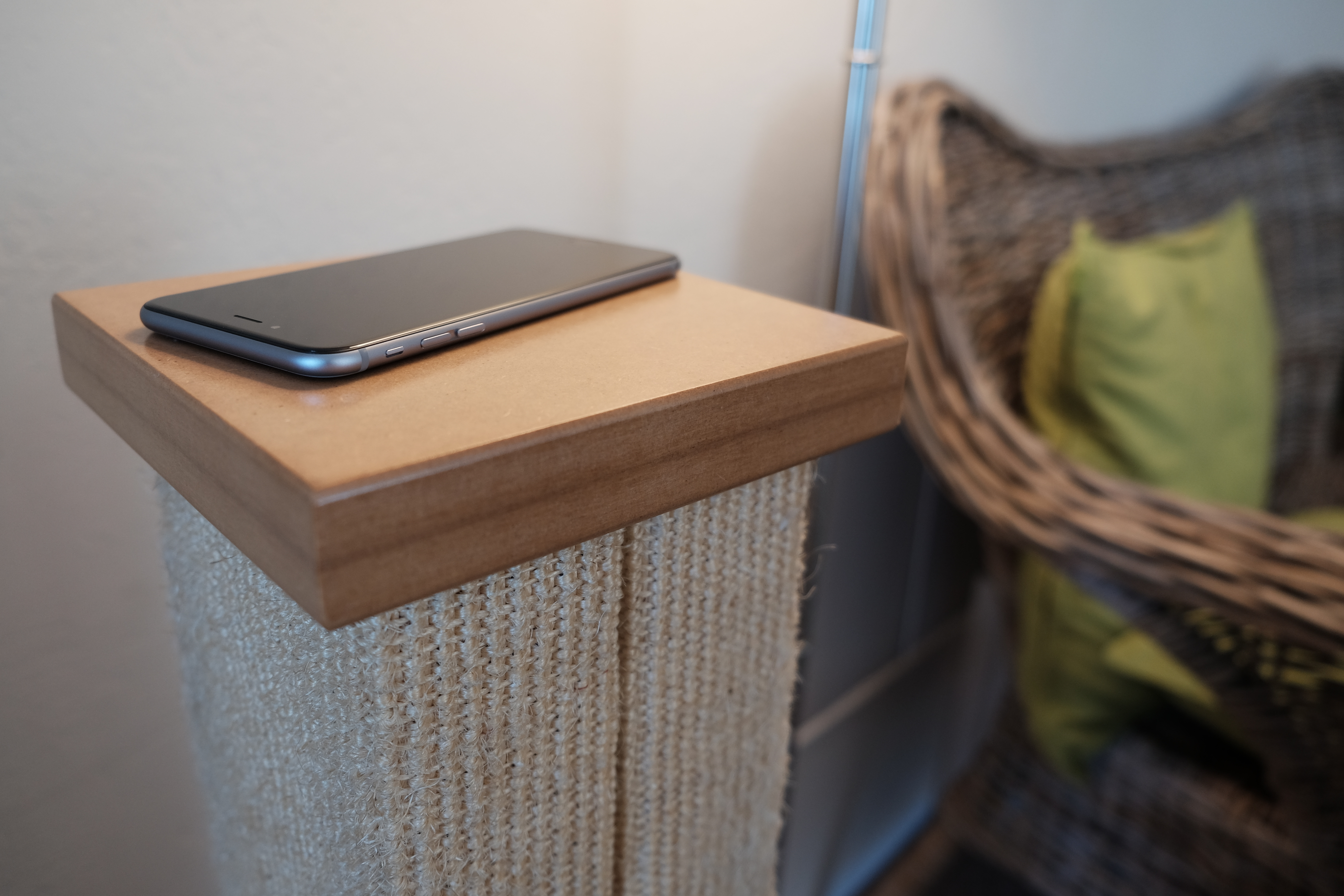
Sometime within the next few weeks, Apple should announce successors to iPhone 6 and 6 Plus, and my review of the latter device is long overdue. Let’s get to it finally and present the key finding first: If size matters, as in you want a phone with larger screen but that doesn’t feel humongous, the 5.5-inch iPhone 6 Plus is a worthy choice. By measures that matter most—benefits from apps, calling, camera, data, performance, screen, and storage—the phablet is best of class.
As expressed in my iPhone 6 review, I regretted not buying the larger device after handing it. The Plus is big, but not overly large for my tastes. Hell, I bought Motorola-made and Google-branded Nexus 6 in January 2015 to replace iPhone 6; the screen is even bigger than Plus, at whopping 6 inches. I gained great value using either of the larger handsets, but gave up one for the other.
That’s right. I switched from Nexus 6 in June 2015, and not for dissatisfaction. I love the phone. By the specs, the Google phablet is superior to iPhone 6 Plus, but both deliver exceptional user experience. Google groupies laugh at iPhone 6 or the Plus as “Me-too” devices that catch up to or fall behind other high-end smartphones. That’s because these people mistake the forest for the trees, using a cliché. The trees are features and the forest are benefits, which are finely balanced—and that’s this review’s major focal point: Benefits.
Repeating for the umpteenth time: Your Starbucks coffee cup is one of the best illustrations of the difference between benefits and features. The wrapper that goes round the cup is a feature. Protecting your hand from burning is a benefit. Features and benefits are absolutely conjoined in things designed well. But they are nevertheless separate, and particularly among tech companies there is too much emphasis on features, when benefits matter more.
A smartphone or phablet isn’t the sum of its features but balance of benefits. Apple understands this principle and handsomely applies it to both 6 variants. Google gets it, too, which is why Nexus devices are so wonderful.
Why I bought iPhone 6 Plus
My decision to abandon Nexus 6 started with a convergence of seemingly unrelated events, all within about 10 days:
- Apple announced OX 10.11 and iOS 9, and I wanted to test them
- Apple unveiled its streaming music service, which I also wanted to test
- My sister decided to give up Nokia Lumia Icon and needed a new handset
- A freak electrical problem damaged my wife’s Chromebook Pixel and required replacement.
If not for my wife’s Chromebook coming to untimely end, I would likely still own Nexus 6 today and would have taken advantage of the Project Fi invite that Google finally sent last week. Instead, my wife inherited Chromebook Pixel LS, which she loves; my sister bought the Nexus 6; and I used the proceeds from insurance and sis to replace both, with 13-inch MacBook Pro Retina Display and the Apple phablet.
Sizing up the Digital Lifestyle
iPhone 6 Plus and Nexus 6 are both exceptional phablets, and choosing one or the other is as much about digital lifestyle as device. Apple and Google sell lifestyle platforms around which someone builds stuff. The bitten-fruit company demands the more inclusive lifestyle, which hugely influenced my decision to give up the LS and N6 that I enjoyed and fit my more cloud-oriented lifestyle. For example, Apple Music isn’t available without iTunes or iOS device; I couldn’t test otherwise.
That said, more because of other developers’ commitment, Apple is the Switzerland of mobile apps and cloud computing. I call iOS the “eat your cake and have it, too” platform. You can jump into the Apple lifestyle, while choosing from Google’s. Meanwhile, the majority of the newest, third-party cloud-connected lifestyle apps are available for iOS before Android. Yum. Yum.
Google groupies will wave the comparable number of Android apps and selection. But it’s not how many but which ones that matter. Number of apps is a feature, while meaningful selection is a benefit. The most useful Android apps also are available for iOS, or exclusively.
Let’s cherry-pick pieces from the Apple lifestyle, which would be relevant to any iPhone 6 Plus buying decision, with caveat: iOS 9 is testing and final release is close. This list is based on the current version, iOS 8.4, and the next rev will offer additional lifestyle benefits.
Command me. iOS gives good speech-to-text capabilities, like Android, but Siri still sucks. If she was a living employee, the company would have fired her long ago. In the past, when Siri couldn’t directly answer a question, I relied on the web searches she presented. But with iOS 7—and, sadly, carried forward to iOS 8—Bing is the search engine. Sorry, Google delivers more meaningful results.
Griping aside, Siri will get you around town and provide relevant, contextual information—there, Apple Maps is a help rather than hindrance (no more misdirections). She’s not as proactive as Google Now, but as such not as snoopy. There’s something stalker-like about Big G’s app/service that creeps me out.
Still, Siri steers me wrong too often and can’t compete with Google Now. Yesterday, my daughter wanted treats from Nomad Donuts. My wife and I were driving, and I asked Siri about the shop. Wow! It was just a few blocks away. But we arrived at, ahem, a less classy confectionary. That bitch brought me to the closest donut shop rather than the one requested.
If self-punishment is your thing, Siri is a great lifestyle companion. Our relationship is like Charlie Brown and Lucy. She promises that this time, she won’t pull away the football when I run to kick it.
Cover me. As the Switzerland of mobile platforms, iOS offers the best cloud cover of them all. These benefits aren’t exclusive to iPhone 6, but I would be remiss ignoring them, since they’re core to any digital lifestyle. Simply stated: Connected-apps are aplenty.
For simplicity, let’s focus on the Apple Way—iCloud Drive, which is new with iOS 8. The service is almost simple to a fault, because it’s not obvious on iOS devices; access is from apps rather than a file manager (which is available on Yosemite or iCloud for Windows).
iCloud Drive finally catches competitors offering content access anytime, anywhere, and on anything (well, for the latter if an Apple-supported platform). Sync is excellent, based on my testing. “Set it, and forget it” is the design ethic, an attribute that made the original iPod so compelling. Simple sync is a huge benefit, and it works well with other Apple apps and services, such as calendar, contacts, and mail.
Grumble. Keeping with Apple’s “You should always pay more” design ethic, the cloud costs. During San Diego Comic Con last month, I quickly exceeded my 20GB cloud storage and had to buy more: 200GB for $3.99 a month. By contrast, Google Photos storage is free for files less than 16MB. Pic syncing is what maxed out iCloud.
Share me. With this platform release cycle, Apple introduces the super useful Family Sharing. Think of it as “fair-use” applied to personal, digital content. I’ve complained for years about ebooks, music, movies, and the like being tied to a single account and not easily shared. Hey, mom can buy a CD or DVD and let the kids watch or lend it to grandma—but not her digital downloads. Sharing is a humungous benefit.
According to Apple: “Once you set up Family Sharing, family members get immediate access to each other’s music, movies, TV shows, books, and apps. Download what you want with a tap anytime you like. All without having to share an Apple ID or passwords”.
This benefit alone is reason to consider iPhone 6 Plus or another iOS device and Apple’s reward to long-time content buyers. Six people can share.
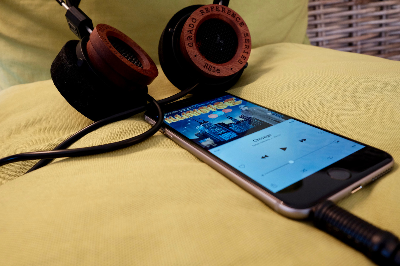
Play me. That brings us to Apple Music, which isn’t available for non-iOS mobile devices. The streaming service in some respects supersedes Family Sharing. You can have both, but may not need to. The service is free during the first three months of operation and will later cost $9.99 individually or $14.99 for family fare.
You won’t get much better music experience outside the Apple lifestyle, unless cost is limiting factor. In my testing, the streaming service offers broad selection, and the curated playlists are simply fantastic. Apple uses, gasp, real people rather than algorithms to curate music. I can’t say enough positive about the overall experience but will try in my eventual full review.
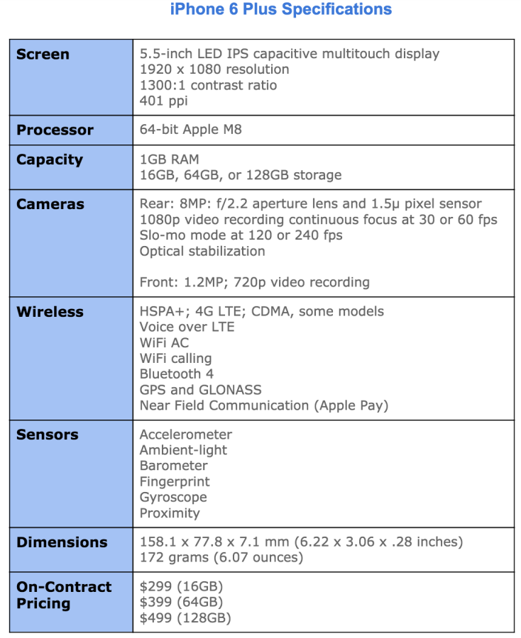
Watch me. If you would like to use Android Wear smartwatch with a mobile phone, you better buy into the Google lifestyle. Similarly, you’ll want iPhone for Apple Watch. The data timepiece is fabulous companion for 6 Plus. The phone is large—158.1 x 77.8 x 7.1 mm (6.22 x 3.08 x .28 inches)—and the watch allows fast interaction with content or people without hauling the lug from your pocket.
Of course, this all fits into Apple’s “You can always pay more” philosophy. Why buy one thing when you can get two, eh? I discuss user benefits in the next subhead, and screen-quality and size give many. But that means using a honking cellular carryall that may offend the hands of some users more accustomed to iPhone 5s-size handsets. Apple Watch makes getting phablet benefits a workable compromise: Big when you need it, small when you don’t. That is, if you’re willing to buy two thangs when one was good enough before.
Big Benefits in Plus Size
Perhaps you read this far and wonder where the hell is the hardware discussion. You got it this subhead, and the back-to-front approach is deliberate, because digital lifestyle and benefits should be first considerations when buying any modern handset, not price or features. The limited list sets the stage for features and benefits, which fit into a larger lifestyle lexicon.
Aesthetics. The design of the 6 Plus is reminiscent of iPhone classic—the original sold starting in June 2007. Rounded corners and curvy frame are the visible characteristics they share. Other reviewers point to iPod touch similarities, which is true of thinness, but the prominent aesthetic—rounded corners—inherits from the original.
The similarities only begin there. iPhone 6 Plus finely balances benefits against features in ways much like the classic. In 2007, Apple stripped back features available on other phones, such as 3G and MMS, to balance others: battery life and responsive interaction of the new sensors and touchscreen.
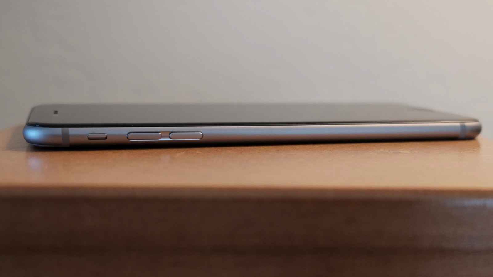
Balance is the overall design aesthetic and priority placed delivering benefits before the fanciest features. By the specs, iPhone 6 Plus is inferior to newer Motorola and Samsung flagship handsets.
However, my experience favors Apple’s decision to deliver more by giving less. iPhone 6 Plus is extremely enjoyable to use, and joy is a benefit often overlooked in tech design. How you feel using a device matters much more than how you think about features. There, balance—how all the features fit together to deliver benefits—and the device’s design mean everything.
The iPhone 6 Plus design is understated, which is a long-standing Apple aesthetic (see my June 2005 analysis). I’ve seen some complaints online about the plainness and critics calling the top and bottom back bans ugly. Picky. Picky.
Plainness isn’t the problem. Apple is sometimes guilty of putting form before function, and this is where aesthetics can undermine usability. How a phone feels and how well it stays in hands and fingers are intertwined benefits. While I find that both newer iPhones feel quite good to hold and can be operated with one hand, the surface is too slick. I can’t get good enough grip, and the curved rather than flat frame is one reason why. Both are the first iPhones for which I strongly encourage using some kind of case. Either will eventually slip from your hands otherwise, and Apple should be faulted for squandering benefits.
Sight. The screen delivers some of any smartphone’s most important benefits. As such, I obviously wondered what the experience would be stepping down from the Nexus, which 6-inch display is 2560 x 1440 resolution and 493 pixels per inch. iPhone 6 Plus: 1920 x 1080 resolution and 401 ppi. I have no complaints, because the experience is excellent.
Some of that comes from a difference best described compared to iPhone 6, which resolution is 1334 x 750. The larger phone’s screen is crisper, the glass seemingly less reflective, and the desktop so vivid it looks painted on. When first compared at Apple Store, I had to check to ensure I hadn’t picked up a dummy phone with paper mockup pasted on. The three qualities deliver extreme benefits, particularly the muted reflectiveness.
Pretty much anything viewed on the iPhone 6 Plus screen looks superb. People upgrading from iPhone 3/G/GS or 4/4S might be overwhelmed by the spaciousness, while most 5/5s users will be pleased. Nice touch: Standard and Zoom modes. For my ailing, aging eyes Standard is just fine, however.
Sound. iPhone 6 Plus gives great audio—if you attach headphones or speakers. But the tinny, internal single speaker lacks much, particularly for someone steeping down from Nexus 6’s dual front-facing speakers. That said, placement on the bottom frame (in vertical orientation) assures that notifications and phone rings can be heard.
Connected to headphones, Apple Music streaming sounds fantastic. There’s an immediacy to fullness and breadth of soundstage that’s good to a fault. For example, with quality cans—Grado RS1e—I hear imperfections in the encoding, which on some tracks my ears perceive as over-modulation or muffled vocals.
Photography. More megapixels is meaningless, as I have asserted for years. Apple wisely sticks to 8MP, which is the reasonable limit, because cameraphone sensors are tiny (I would prefer 5MP). The greater packed the sensor with pixels, the more artifacts and other aberrations appear in photos. Like iPhone 5s, the 6 offers 1.5 micron pixels, which, among other benefits, let in more light than the standard 1.1 micron pixels, which tightly pack on 16MP phone shooters.
The f/2.2 aperture lens is good choice, and in my testing finely balances with sensor and software. I can’t emphasize the importance of the latter and choices made when shooting and post-processing. In 2012, I used the 5MP Samsung Galaxy Nexus to shoot San Diego Comic-Con. One reason: The phone produced surprisingly good photos in low light, mainly because of the superb balance of features and wise settings choices made in auto mode. Something else: Google promised and the smartphone delivered instant-shutter response.
The catchup capability is one of iPhone 6 Plus’s best photography benefits, particularly in HDR mode. Shutter response is fast. Immediate. But there is more: In my testing, the smartphone smartly chooses aperture, ISO, and shutter speed—and that’s best observed in low-light settings. Color accuracy and white balance are generally spot on.
Most people are not professional photographers. They wouldn’t know f-stop from exposure compensation. Rather than presenting confusing controls and numbers, Apple provides a nifty slider for adjusting exposure—lightness or darkness the user sees in the screen preview. Just tap the display. Other niceties, many carried forward from iPhone 5s and iOS 7 or long available elsewhere, include auto stabilization, face detection, and panorama mode.
Optical stabilization is available on iPhone 6 Plus, but not the smaller handset, and it’s a differentiator that will be valuable to some shooters but not everyone. The technology is rather nifty, using the gyroscope in conjunction with the lens, which position changes, to reduce camera shaking that often blurs photos. Jim Harmer’s Plus photo review is excellent primer for understanding the benefits.
Gripe: The handset’s body is thinner than the camera can accommodate, such that the lens juts out from the enclosure. It’s an unacceptable design compromise that puts the lens at greater risk of damage and is, unfortunately, another reason to buy a back-fitting case. If cynical, you can chalk it up to the “You can always pay more” design ethic. Meaning: Back cover case is near necessity by design.
Most people will find iPhone 6 Plus photography to be satisfying at the least. There is no non-pro compact camera with fixed lens—meaning without telephoto—that I would recommend over this smartphone. Last week, I sold my beloved Fuji X100T, which is fixed lens. I rely on the Apple phablet when on the go, or for more demanding needs the interchangeable lens Fuji X-T1, which in July I bought during Comic-Con.

Videography. Apple delivers some nifty tricks shooting videos, and one is desperately-needed catchup: Continuous focus, a feature found on most major flagship smartphones. Fixed focus is one of older iPhones’ biggest videography handicaps. On the 5 and 5s, you can tap to focus to start but there’s trouble if you or the subject moves. In my testing, iPhone 6 Plus adjusts focus as promised. Finally!
Neat trick: Slow-motion at 120 fps or 240 fps. Slo-mo is super fun, but good luck easily exporting clips and keeping the slow speed. Direct upload from phone to YouTube is my method, as prescribed by phoneArena’s helpful how-to guide.
The videocam can capture 1080p at 30 or 60 fps, and the latter is beneficial for shooting moving objects or finer-editing later on. Time-lapse videography enables other creative options, and Apple claims something called “Cinematic Video Stabilization”, which supposedly lets you GoPro without buying one.
Longevity. Question everyone should ask about a smartphone: “How long can I use it before the battery dies?” Long enough is my answer. Time period between charges is so great, I can’t keep track. Even when using Apple Maps, which should be a battery killer, iPhone 6 Plus keeps going and going.
Apple claims 24-hour talk time over 3G, 14 hours watching videos, or 12 hours Internet over LTE or WiFi. I care about shooting photos and videos and uploading them to the cloud, while rumbling across social networks. These functions are more meaningful measures—and I easily get through the day with juice left over.
Responsiveness. Performance is an important benefit, and subjectively either elicits joy or generates frustration—and the latter emotion is one every manufacturer should avoid. I smile and assume you will, too: iPhone 6 Plus is speedy enough, even short a couple cores compared to Nexus 6. Either scrolling or opening apps and browsers is fluid and fast.
If you’re looking for benchmarks, apologies but there are none here. They are for geeks hung up comparing features rather than looking at benefits. What matters more: How the device does daily tasks that are most important to you. By that measure, I have no complaints about subjective speed. However, I would say same about iPhone 5s. If you own the device and performance is your major buying criteria, expect to be surprised by the subjective speed sameness.
The Verdict Is In
I am satisfied enough with iPhone 6 Plus and believe that most buyers will be, too. That assumes they live the Apple lifestyle, or even an Apple-Google hybrid. Make digital lifestyle and assessment of benefits you want the first reasons for choosing smartphone or tablet. Specs don’t matter, and they distract from what does.
Editor’s Note: A version of this story appears on BetaNews.
