Category: Gear

Read More

Google Pixel XL First Impressions

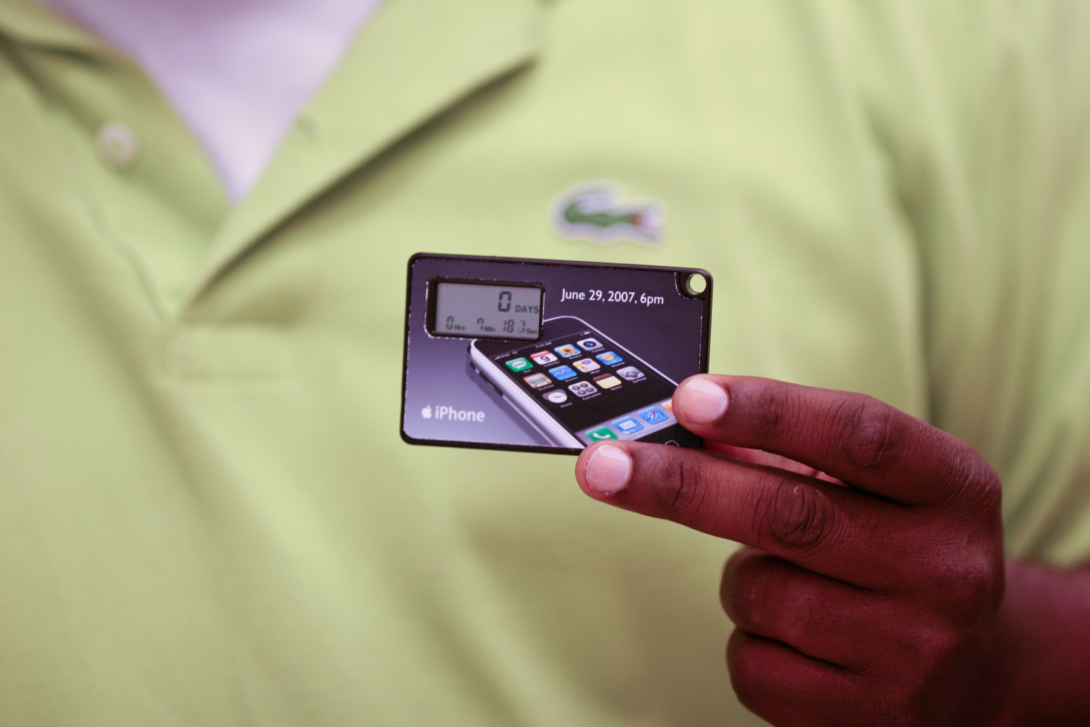
Next week, iPhone is 10 years old; sales started on June 29, 2007. Please see my post about that day—”The iPhone Moment“—and another on the tenth anniversary of the device’s unveiling, “The iPhone Metaphor“, from January of this year. Strangely, I celebrate by abandonment. Twelve days ago, my family switched to Verizon from T-Mobile, and in process I gave up iPhone 7 Plus.

Appropriately perhaps, as I write this sentence, Talk Talk’s “Living in Another World” streams from Tidal. Yeah, that’s me, with respect to iPhone 7 Minus—what I started calling the thing after learning that Apple makes two models, one of which in part is incompatible with Verizon and other CDMA carriers. You want model A1661 and not A1784. Rather than get another Minus, I chose to try something else: Google Pixel XL, which overall user experience is as good and in many respects so much superior. 

Read More

Letting Pixel C, and also Chromebook Pixel, Languish is Foolhardy

To celebrate the launch of Apple’s new 10.5-inch iPad Pro, I ordered Pixel C, which arrived three days ago. Worst case, the tablet can be returned for refund during the buyer’s remorse period; there ain’t any regrets so far—just the opposite. To my pleasant surprise, the tab is much more enjoyable than I remember, because Nougat is so pretty, efficient, and buttery smooth than was Marshmallow on the device. The screen scorches any available iPad, Pro or otherwise, and the performance is shockingly nimble. My Pixel C shipped with Android 7.1.1 and quickly updated to 7.1.2. I will soon install Android O; Google released Developer Preview 3 yesterday.

There’s a certain insanity to the purchase. I reviewed Google’s Android slate 15 months ago; that makes the thang ancient as measured in computing years. But Big G still sells the tab, and there must be a reason, right? I got another because a college student took possession of my first Pixel C in early 2016. With keyboard cover, the tablet makes a helluva handy carry-along on campus. 

Read More

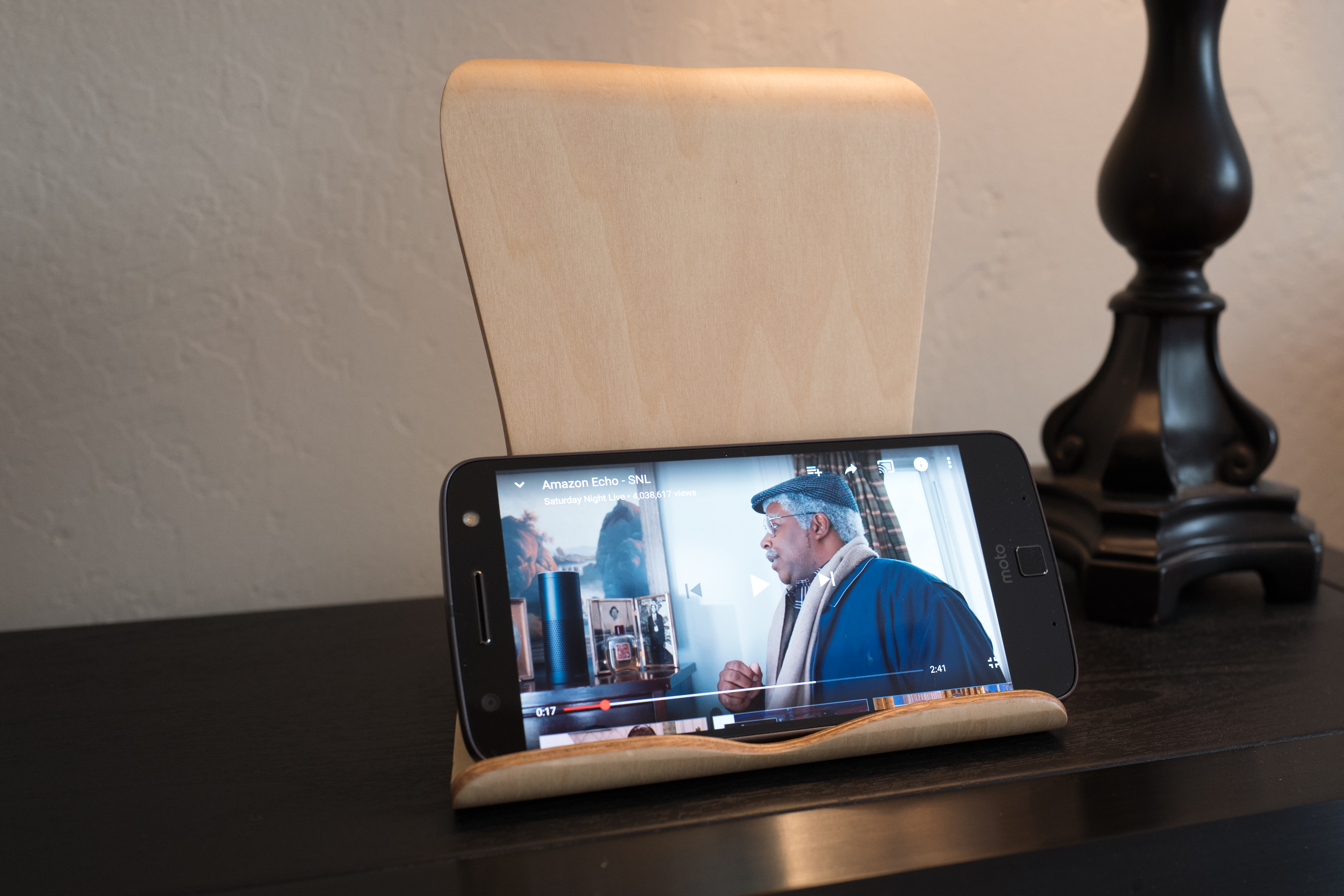
Moto Z Force Droid Review

If you asked why the Moto Z Force Droid Edition appeals to me, I couldn’t identify one thing, which arguably is odd considering this is a review. Benefits and features feel finely balanced, which is a hallmark of good product design. Oh, and that satisfaction is for the pure smartphone experience, which is premium by nearly every measure that matters; I didn’t test Moto Mods that expand capabilities.

Lenovo/Motorola and Verizon released the smartphone in July 2016, so this exploration is belated—and then some. Apologies, the delay was necessary. In mid-December 2016, Verizon sent a holiday review package unexpectedly. At the time, my father-in-law’s health rapidly declined—and he passed away about 30 days later. In the months following, as we settled his estate and finalized other matters, I occasionally recharged the battery and picked up the Droid but had no real time to test it. Still, something about how well the Moto Z Force feels and fits in the hand compelled me to handle it. Often. To caress the ridged bezel. To read blog posts and news stories on the beautiful display. 

Read More

Busy Bee

I am in process of completing a review of the Moto Z Force Droid, which is a Verizon Wireless exclusive. This afternoon, I shot some nectaring bee photos with the smartphone and iPhone 7 Plus for comparison. My wife and I went on a walk with both devices, stopping at what we affectionately call the Butterfly House. The residence is a mini-wildlife refuge for Monarchs, hummingbirds, and other flying things; oh, and chickens, too.

The Featured Image comes from the Droid, which packs a 21-megapixel camera. Vitals: f/1.8, ISO 50, 1/465 sec, 4.51mm; 3:01 p.m. PDT. However, the image is only 16MP because the default setting, which I neglected to check, is 16:9 rather than 4:3. No matter, focus is spot on, IQ high, bokeh beautiful, and color accurate. I’m pleasantly surprised. 

Read More

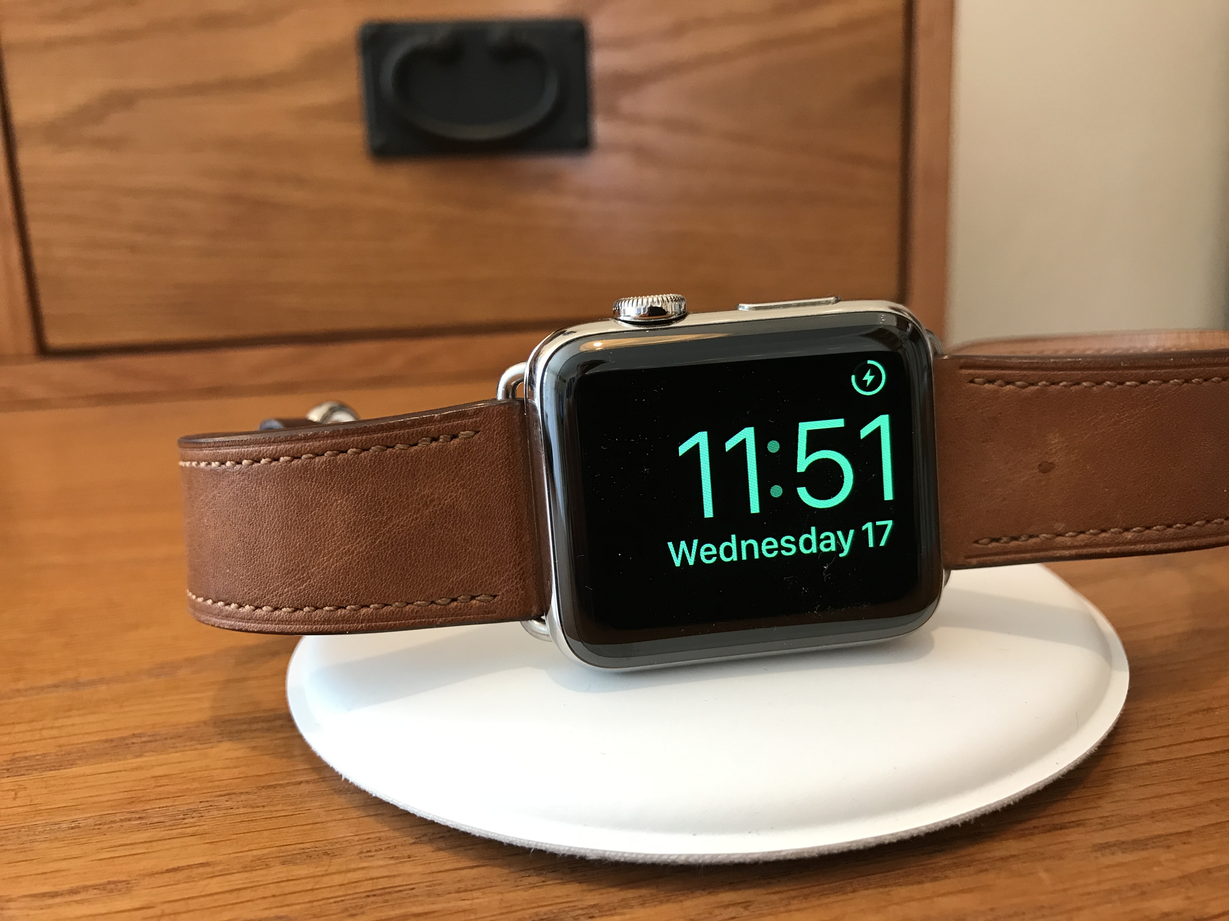
Bye Bye Apple Watch

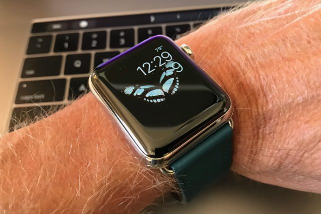
I suffer from phantom smartwatch syndrome—an ailment that hopefully will disappear over time. Nearly four weeks ago, I put aside Apple Watch 2 stainless steel and replaced it with the simple but appealing ManchesterWatchWorks Iconik 3. Problem: Almost any shifting movement of the timepiece causes me to reflexively flip my wrist and look down; there is false perception of hepatic sensation. Apple has trained me well, and I’m tired of being its dog doing tricks. Woof. Woof. Growl.

I feel free! Gone are the nagging alerts—and I had them barreled down to a minimum of approved services: Some for breaking news; emails from a half-dozen people; and text messages. Among this still seeming torrent, the Activity app annoyed with congratulatory badges and prompts that one of the four main exercise goals (Calories, Exercise Time, Stands, and Steps)—Apple’s athletic lifestyle version of the four food groups—would soon be achieved. The badges are about as infantile as gold stars that teachers give kindergarteners and with similar purpose: To make the recipient feel good, whether or not deserved. The achievement badge for Earth Day flipped my goat. Seriously? I ordered the Iconik 3 that evening. 

Read More

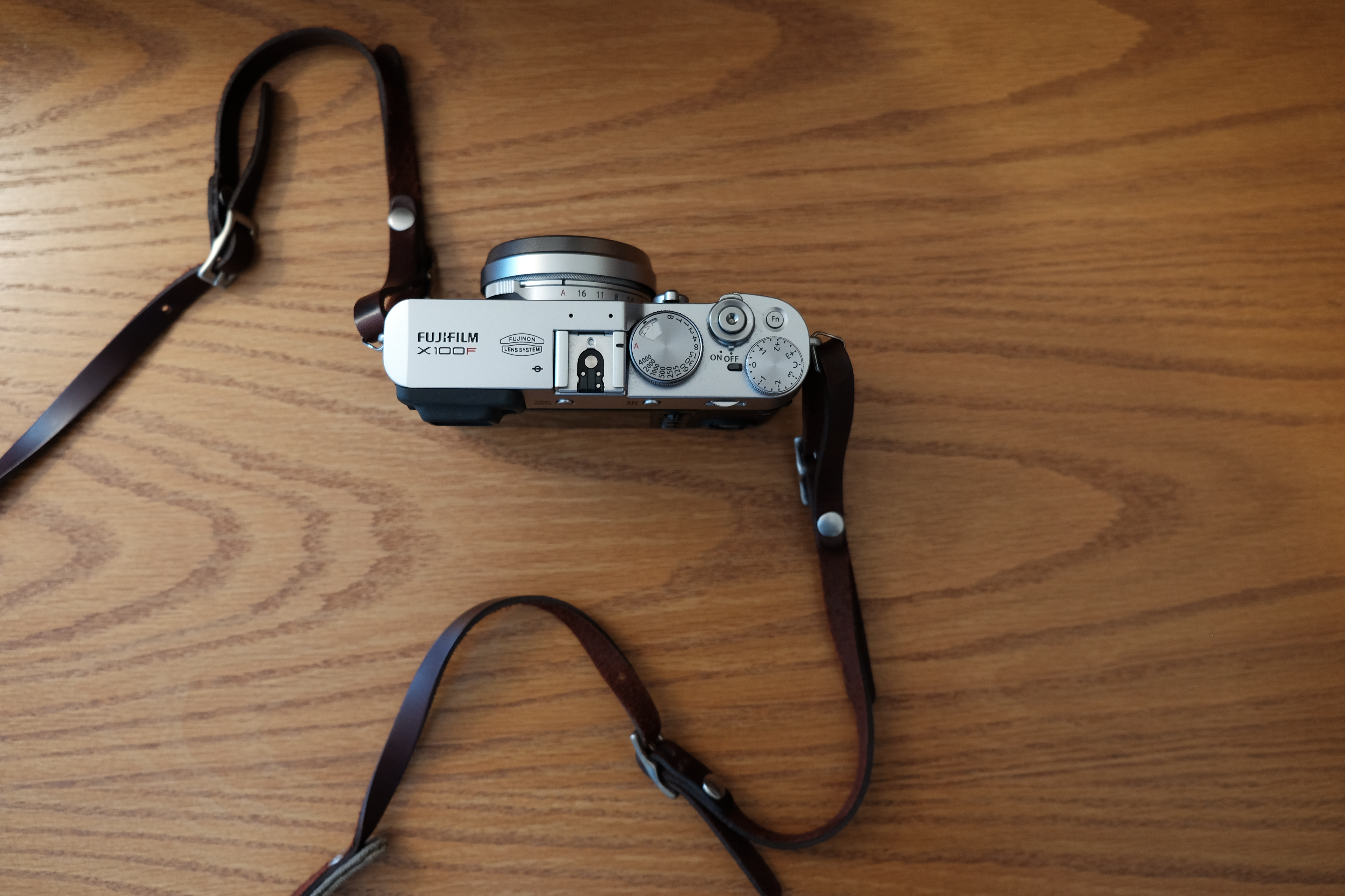
Fujifilm X100F Review

During the camera film era, Fujifilm battled kingpin Kodak with brighter, more vibrant colors that either photographers loved or hated—perhaps both. That was last century. In the 21st, Kodak is a shadow cast against aged Kodachrome, while its rival has successfully transitioned from print to digital—and with amazing bravado. Fuji’s transformation started six years ago with the cleverly-engineered, retro-designed X100, which I reviewed in May 2011.

The compact digital camera’s success led Fuji to develop a series of additional bodies and lenses; all are designed with professional shooters in mind. The X series family features compact, mirrorless designs that incorporate digital SLR-size sensors and manual controls—meaning dials and buttons to directly manipulate settings rather than rely on software menus. The X100 line—from the original to the S, T, and now F—remains the most distinctive for how well features and benefits balance set against truly innovative design concepts. 

Read More

Watch This!

For about 12 months, Apple Watch has served as fitness tracker and personal trainer—that after I had scoffed (still do) at people who are wrist-wear obsessed about calories burned and steps taken. Unquestionably, I am more exercise-aware because of the Activity app but also held back by it. All that counting, coupled with smartwatch features that distract as much as benefit, had me wanting to maintain an active regime without the coaching. Besides, I’m on a quest to simplify. I’ve done this Internet-rushing-around thing now for nearly a quarter-century.

Recent purchase of the Fujifilm X100F fits into my simplification kick, in part seeking that which is atheistically and ergonomically vintage. The digital camera is as old-fashion as it is modern. Similarly, my Grado GS1000e headphones, while oversized, look and sound nostalgic. Yesterday, USPS delivered two Clairefontaine 3.5 x 5.5 Ruled pocket notebooks (think Moleskin but with earthier colors and better paper). I will carry one in a back pocket and use pen to jot down ideas (how marvelously creative). My wallet used to be there, but last year I bought the slim, Saddleback Leather Front Pocket ID Wallet, which will last longer than me. Simplify! Circling back, this afternoon I put aside Apple Watch—perhaps temporarily, maybe forever. 

Read More

Lemonade Stand

The Fujifilm X100F is now my nearly-always outdoor companion—a role iPhone 7 Plus had filled. The camera is compact and light and comfortably slings over the shoulder attached to the ONA Lima strap. Earlier today, my wife and I walked down Maryland Ave. toward The Hub plaza in Hillcrest. Along the way, we passed a lemonade stand, with some kids fundraising for the local elementary school, Alice Birney. They had already raised $60 when I snapped the pic, at 1:15 p.m. PST. Somebody paid more than the requested 25 cents a cup. Hehe.

The Featured Image is a crop of the original, which is visible below the fold. Both versions are unaltered, except for horizontal cropping to the first and straightening of both. The visual cue is different in each, though. The first is aligned vertically with the lemonade stand and the original against the house in the background. 

Read More

Fujifilm X100F

Today, UPS delivered a new toy, from Wolfe’s Camera—my first acquisition there, because everywhere else was out of stock (backordered)—via Amazon. I had originally ordered the Fujifilm X100F on announcement day, Jan. 19, 2017, from Adorama, but foolishly, and accidentally, cancelled on February 16, when the digicam was supposed to release (turned out to be a week later, instead). For now, the new Fuji is companion to the X-T1, which will take secondary street photography role, as I shoot more frequently.

Passing of my father-in-law, who required lots more care than either my wife or I would admit, means more available time for other things. Creative endeavors top the list. Additionally, eye surgery last summer rejuvenated my vision, renewing interest in amateur photography and returning me to professional writing. The X100F will be a documentary tool supporting both efforts. That’s not to complain about the X-T1, which is a fantastic dSLR-like mirrorless—to be used whenever I need interchangeable lenses (there are three in my camera bag). 

Read More

Grado GS1000e

After Grado Labs shipped to me the GS1000e headphones, but before they arrived, I realized my mistake. Big sound comes in matching size. So used to the Brooklyn-based company’s signature on-ear designs, I somehow overlooked that the pricey Statement Series audiophile cans are over-ear and overly large. It’s all about the earcups and pads. The RS1e, which I previously owned and sold, measure 17 x 8 x 19 cm (6.69 x 3.15 x 7.48 inches). The GS1000e: 23.11 x 8.89 x 23.88 cm (9.1 x 3.5 x 9.4 inches). As I feared, the Grados look enormous on my head, unbecoming. But, Hell, I accept the indignity of a big slab of iPhone against my face—why fuss?

Size isn’t the only difference from other Grados. I don’t hear the classic audio signature, but something else. Something better. Out of the box, with no burn-in, sound is smooth, expansive, and detailed. Well-rounded. Finely balanced. The open-air, over-ear styling truly is circumaural, spreading soundstage in placement you can close your eyes and see. Feel. There is an audio authenticity unlike any other headphones ever to touch (or cover) my ears—and that’s with less than 10 hours use. Cans like these improve with age; burn-in is everything.

BTW, I used the Fujifilm X-T1 with Fujinon XF35mmF2 R WR lens to shoot the Featured Image, which I considerably edited to remove some of the yellowish tint from the Jan. 25, 2017 evening capture (8:26 p.m. PST). Vitals: f/4, ISO 5000, 1/60 sec, 35mm.

Read More

Master & Dynamic MW50 Review

Headphone manufacturers must make deliberate audio signature decisions when crafting cans. Some shops, like GradoLabs, adopt a house sound. Relative newcomer Master & Dynamic‘s design ethic seeks to equally please eyes and ears. As such, its flagship wired headphones (MH40) and wireless (MW60) share similar industrial design. Aluminum, lambskin, leather, and stainless steel combine in rugged style that evokes aviators of a bygone era. The newer MW50 Bluetooth headphones strongly resemble the other two, but they’re tuned for younger listeners on the move.

M&D’s earlier cans are over-ear—meaning they cover the lobes, while the MW50 rest on them. The headphones are smaller and lighter than either the MH40 or MW60, but with most of the overall benefits of the latter, including excellent wireless reception. On-ear headphones can be uncomfortable to wear and leak in too much ambient noise. The MW50 push past both typical limitations, which, honestly, surprises me. I personally don’t find the design to be as attractive as the over-the-ear cans. It’s about the earcups, which function matters more, however. The lambskin-covered ear pads are immensely comfortable, and the MW50 arguably are better all-around-wear than their siblings. I would take them outdoors on a walk, for example.  

Read More

The iPhone Metaphor

Today we arrive at the first of two 10-year anniversaries regarding iPhone: Steve Jobs unveiling the handset six months before its release—unusual for Apple’s then-CEO to pre-announce something, but necessary, with the federal regulatory rigmarole that cellular devices go through. Jobs and his management team brought the smartphone to market at great risk: Established and entrenched manufacturers, mainly Nokia, had huge distribution channels and massive amounts of research and development invested in their cellulars. iPhone debuted in one market (United States) and on a single carrier (AT&T, which concurrently rebranded). By most measures of business strategies: Insanity. But risk was a defining characteristic of Jobs’ leadership style running the company.

You will read many “state of iPhone” analyses and commentaries this week spotlighting slowing sales, as buying growth plateaus in major markets (China, Europe, and the United States) and observing that Android continues to gobble global market share. The problem with iPhone is something else, and it’s a metaphor for what’s desperately wrong at Apple as 2017 starts: Loss of innovative mindshare; obsession with an outdated design motif; unwillingness to take meaningful risks. The company’s fortunes rose with iPhone, and they will fall with it.